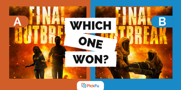
When readers pick up a book about the end of the world, do they want the cover to hint at the ending? Or is that too much information, taking away the thrill of discovery? The best way to know: testing book covers.
One author used PickFu to create a book cover test for a post-apocalyptic thriller.
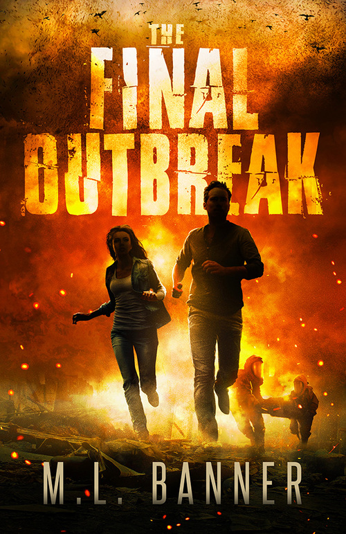
Option A shows a woman and man running away from a burning world, with two people in hazmat suits carrying a stretcher in the background.
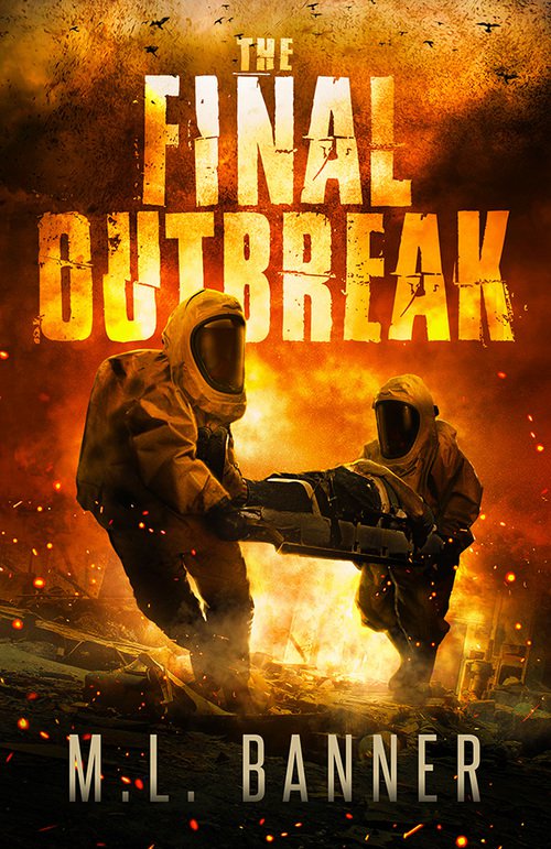
Option B does away with the man and woman and brings the two people in hazmat suits to the foreground.
Can you guess which one won?
And the winner is… Option A! In this book cover test, Option A won with a score of 58 to Option B’s 42. Males respondents tended to like Option B more, while females preferred Option A.
The presence of human faces is hopeful
While some respondents thought Option A’s running people were too generic, many liked seeing actively escaping characters featured on the cover. One respondent wrote that the winning cover offers the reader “hope that one can [outrun] an outbreak.”
Another added that Option B makes it look “like the outcome is negative.” Several respondents expressed the same sentiment: that without the people on the cover, it seems the book is over before it begins.
When testing book covers, even for apocalyptic tales, remember that readers like to know there’s still a problem to solve. They don’t want to see that the world has already been taken over by disease or invaders.
Hazmat suits aren’t relatable
Voters also thought the hazmat suits in Option B put distance between the reader and the story. They said that seeing people on the cover of Option A made them feel they could relate to the characters.
In your own book cover designs, create scenes that invite connection with potential readers—not distance.
When testing book covers, keep tension in mind
In an obvious disaster setting, the absence of protective suits in Option A adds tension to the cover. As one respondent wrote, “running without protective gear is much more frightening than having a hazmat suit on.”
Another respondent said that Option A shows a more layered scene than Option B, with “humans escaping and government/disease control working to contain or stop it.”
Readers like to see an element of danger on the cover. Even better if the scene is tense and layered!
Key takeaways
If you’ve written a thrilling post-apocalyptic book, think about how much you want to hint at with your cover without giving the story’s climax away.
As you move to testing book covers, remember that readers don’t like to feel as though the story is over before it’s begun. The cover in Option B is too final, while Option A offers a scene of danger, thrill, and hope.
The winning cover features characters that are unprotected from the destruction around them, which adds a sense of urgency and action that Option B doesn’t have.
Ready to figure out which cover to use for your own post-apocalyptic novel? Try split-testing by creating your own PickFu poll.


