First impressions matter. When it comes to your mobile app, your logo is the first thing would-be customers will notice when browsing through the app store.
There are 2.29 million apps and games in the Apple app store, and 2.62 million apps and games available in Google Play. That’s a lot of competition for any app developer – so you need a high-impact logo design to capture eyeballs and downloads.
PickFu makes it easy to test your app’s logo with your target audience, thanks to its 15-million-strong panel of market research participants across over 90 demographic segments. In this blog, we’ll walk you through logo testing best practices and how testing through PickFu works.
What is logo testing?
Logo design is one of the final steps of app development. It’s when you take both your brand identity and your app identity and try to distill them into one simple image that grabs consumers’ attention.
Logo testing helps you refine your logo and understand:
- How visually appealing your logo is to your target audience
- How well your logo communicates your brand image and identity
- What your logo tells potential customers about your app
The best way to test a logo is to ask real people for their opinions. However, there are a few best practices you should bear in mind to get the best results from your logo test.
Logo testing best practices
Consistent and accurate results are only possible with a clearly defined and well-structured test. Here are a few best practices to follow when evaluating and testing your app logo.
Keep your questions simple. It can be tempting to ask your audience for a lot of details or stuff multiple questions into one. But the best way to get clear answers from your market testing is through short, simple questions.
Run multiple tests. A good way to keep each question simple, but still gather the information you want, is to ask a series of questions. For example, you might ask an open-ended question to assess what message people get from your logo. You could then run another poll, perhaps a head-to-head comparison, to find out which version of your logo people find most visually appealing.
Understand your target audience. There’s no point in asking people who aren’t in your target audience to rate your logo. Know who your app is for, and only include them in your tests.
Assess and iterate. Logo design and testing is an iterative process. Your tests will hopefully provide you clear feedback to help you adjust and refine your logo. Continue iterating and testing until you find the best version for your audience.
Now that you’ve learned best practices for logo testing, here’s how PickFu can help with your logo tests.
How to run a logo test with PickFu
PickFu is a consumer insights platform that helps app developers, marketers, entrepreneurs and more test their designs and gather feedback from their target audience.
The platform offers a variety of poll types, all of which help you test your logo in different ways. In each case, the basic steps are the same:
- Sign up for a PickFu account if you don’t have one already
- Start a new poll (you can build your own or choose from a variety of templates)
- Enter your question (i.e. “Which app logo design do you prefer, and why?”)
- Upload your logo or multiple logo designs
- Choose how many people you want to poll
- Select your target audience from 90+ demographic segments (including mobile app gamers, coffee drinkers, pet owners, users in specific countries, and many more)
- Pay for and launch your poll
The different poll types will help with different parts of the logo design process. Let’s take a deeper look at them.
Open-Ended polls
An Open-Ended poll has no winner. Instead, respondents give you free-form written responses to your question. For example, you might ask “What type of app do you think this logo is for?” This will help you discover whether your logo accurately and appropriately conveys your app.
This type of concept testing is most useful early in the process because it helps validate the core elements of your logo and gives you general audience feedback before you get too far into your design. Open-Ended polls can also often turn up unexpected insights that change your perspective or even your entire approach to your logo’s design.
In this example of an Open-Ended poll about video game art, one respondent highlighted a similarity between the art shown and an older game. That answer might have given the game designer another reference to compare their product to.
Open-Ended polls are a good way to test new logos early in the design process. You can then fill in your logo testing with other poll types to narrow down your final result.
Begin an Open-Ended poll and get answers in minutes!
Ranked polls
Ranked polls can help guide you through the early design process. They allow you to add up to eight different images in one test and even add a free-text comment box on each image. This gives you both quantitative and qualitative results: you’ll see which logo wins the most votes and also gain insight into why people voted the way they did.
Ranked polls help show patterns in consumer preference. When Beetroot Lab tested characters for its Contest of Heroes mobile game, it noticed a clear preference for the masked figure, whose simple and faceless design helped add a sense of mystery and excitement to the game. This helped them guide the marketing campaign for the game, and that figure now features in promotional content for Contest of Heroes.
A Ranked poll is useful when you have multiple logo prototypes that each go in a different direction. These polls will show you where to direct your efforts and help you choose the best path forward.
Let’s say respondents consistently choose your brightest, happiest colors in the color palette, and your sleeker, more modern designs are ranked lower. Even if you don’t use the winner of this poll in your final design, the insights will help you understand where you should focus and which logos to abandon.
This is why Ranked polls are useful in the early and middle stages of the design process. For the next phase of design validation, you can drill down even further.
See examples of Ranked polls and the types of insights they can provide.
Head-to-Head polls
You can become more granular in the final phases of logo mockup testing to help maximize its impact. Head-to-Head polls allow you to test two logo variations against each other to see which one your audience prefers most.
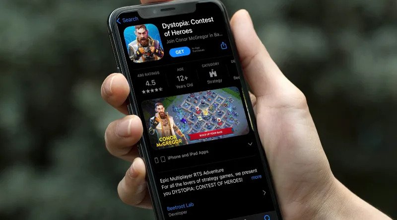
When Dystopia: Contest of Heroes landed famous mixed martial artist Conor McGregor for its game, the designers knew they had to maximize their investment. A series of Head-to-Head polls helped them iterate the McGregor’s character’s look and feel until they arrived at the mobile app logo you see today in Apple’s iOS App Store and Android’s Google Play store.
Head-to-Head polls can break a tie between two app icon designs or help you polish the final logo. You’ll get answers quickly and can use them to tweak your design so your app logo has the biggest impact possible.
Stuck on two app logo designs? Start a Head-to-Head poll and get answers from your key demographic in hours.
AI insights make polls more effective
Every PickFu poll allows you to gather comments from the respondents, and the platform’s artificial intelligence (AI) insights uses natural language processing to help consolidate those insights into one simple summary.
In a poll testing colors for a sheet music app, AI was able to distill 100 free-form answers into a summary to deliver fast, high-quality feedback:
“Across all options, three main topics stood out as important factors influencing participants’ preferences: readability/ease on the eyes, visual appeal/aesthetics, and personal preference. Respondents consistently mentioned that they preferred colors that were easy to read and did not strain their eyes during prolonged use. They also expressed a desire for visually appealing designs that would catch their attention without being overly distracting or gaudy. Personal preference played a role as well since some individuals simply liked one color more than another based on their individual taste.”
Because PickFu’s AI tools are fully automated, it saves you the time and effort of parsing through comments to find themes. This makes it easier and faster to perform market research for apps than ever before.
How will your app perform with an optimized logo? Sign up for PickFu for free to find out.
Other ways to test your logo
Other logo testing methods include:
- Market research surveys
- Focus groups
- Asking friends and family for feedback
- Live A/B testing
The downside of live A/B testing is that it exposes your app to the public without an already-optimized logo, which can cost you customers. However, it does allow you to test your logo options against the other live apps in the marketplace at the same time.
It’s possible to do A/B testing before you launch your app by using PickFu’s Head-to-Head polls to gather direct customer feedback. You can also pull some of your competitors’ logos and use a Ranked poll in PickFu to see which one your audience prefers.
AI tools such as Brandmark.io are another way to do logo testing. Brandmark assesses your logo against millions of other logos using its machine-learning algorithms. It returns a score out of 100 points in four categories:
- Uniqueness
- Legibility
- Color/contrast
- Overall appeal
You can use this information to tune or refine your logo concept – but as Brandmark itself says: “Ultimately, these are simple rules of thumb – there are many well-designed brands that don’t adhere to these standards. Knowing when to depart from the norm comes down to human judgement, which is still beyond current AI.”
That’s why human-powered market research provides the best results.
Pairing these other methods with real-world feedback from customer insights platforms like PickFu will help you elevate your app logo above the competition and stand out from the crowd.
PickFu is affordable, lightning-fast, and effective at gathering vital consumer insights that can help your app launch successfully with the best possible logo.
Sign up for a PickFu account and begin testing your logo designs in just minutes.
FAQs
How do you test the effectiveness of a logo?
The best way to test your logo’s effectiveness is to poll real people within your target audience for their feedback. You can gather real-world feedback from a panel of 15 million survey participants across 90+ demographic subsets with PickFu.
How many colors should my logo have?
The best practice for logos is a simple, sharp design. Some logos (like Apple’s) are monochrome and super-simple, while others (like Google Chrome’s) use a lot of colors. Knowing which one will work best for your brand requires a deep understanding of your target audience. That’s where market research polls and surveys come in.
What is a company logo?
A logo is a symbol of a company and brand – it can tell people what the company is and what it is about in one image. It’s your first exposure to new customers and a recognizable connection for existing customers. The right logo helps people connect to your business by appealing to them and communicating with them no matter where they see it.


