It’s tough to pick a book cover that isn’t too similar to its counterparts, too bland, or too busy. That’s why PickFu is an excellent place to take your self-help book covers when your brain can’t handle the back-and-forth about which one is best anymore.
One author recently took to PickFu to decide between two book covers for nonfiction titled, The Way of the Intelligent Rebel: Succeed Outside the System, Teach Yourself Anything and Achieve Ultimate Freedom.
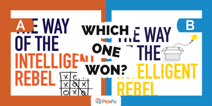
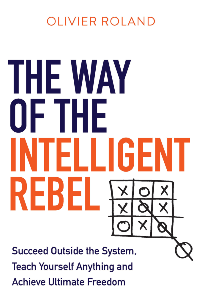
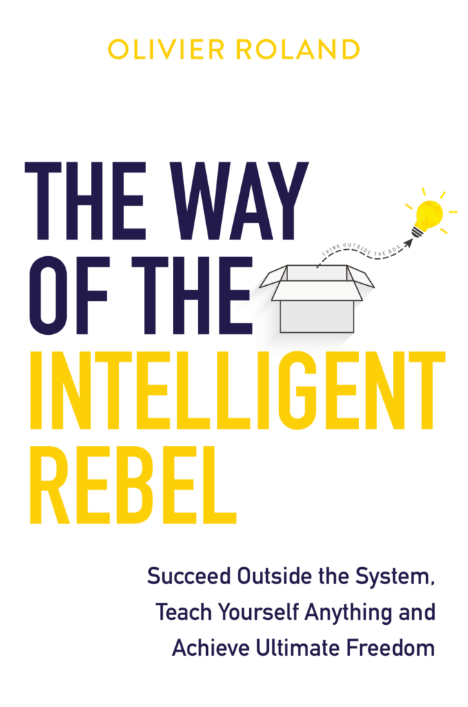
Both covers have a similar font, but one has yellow lettering and an illustration featuring a lightbulb “thinking” outside a box, while the other features a tic-tac-toe box with a rebellious twist.
Can you guess which one won?
And the winner is…Option A! With a total score of 74 to Option B’s 26, respondents clearly loved Option A.
Here’s why.
Daring little rebel
Who can resist the charm of that rebellious little O in Option A’s book cover?
Not many, it turns out.
“I chose Option A…[because] playing tic-tac-toe outside the lines seems a little rebellious,” wrote one respondent.
Another respondent agreed, writing, “I love the picture of the Tic-Tac-Toe where someone drew in the O outside of the matrix. It goes well with the topic of being an intelligent rebel.”
“The graphic of the tic-tac-toe game gives you a good sense of what the book is about,” said one. It’s an immediate, compelling visual.
In short, while Option B is a graphic of literally thinking “outside the box,” Option A thinks outside of thinking outside of the box. In other words, it’s more original.
At the same time, one respondent wrote that “[Option A] looks like it is about cheating and I do not think that is what they want to talk about.”
So that’s something to keep in mind. Still, most seemed to agree with this respondent: “[Option] A just makes you chuckle.”
Indeed.
Color choices
Several respondents preferred Option A’s orange title to Option B’s neon yellow.
“The yellow color in the other option kills my eyes,” wrote one male in the 25-34-year-old age range.
Another male wrote, “The orange is more striking against the white and easy to read.”
Still another wrote, “I think the yellow color used in Option B is too bright. I really like the more soothing orangish color used in Option A. It makes it easier to read without being distracted.”
The last thing you want to do is turn readers away with garishly bright colors.
Self-help book covers: key takeaways
Maybe yellow is this author’s favorite color, but a large reason respondents picked Option A is because of the less harsh color choice.
So when you’re choosing a color scheme for a book cover, consider using warm, inviting tones instead of in-your-face neons.
And make sure you go beyond mere “thinking outside the box.” That’s been (over)done. The tic-tac-toe hopping outside the matrix made respondents smile and brought the book’s concept into sharp focus. The lightbulb made them yawn.
Do you have two or more potential book covers to test? Take your ideas to PickFu and let readers help you choose.
