When you think of retirement, do you feel a sense of happy expectation? Or does the abyss of unemployment freak you out — what in the world will you do with your life?
One author set out to write a book to help us all stress less about retirement called Stop Freaking Out About Retirement: How to Reach New Goals & Enjoy Your Life When Work End
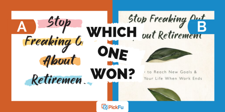
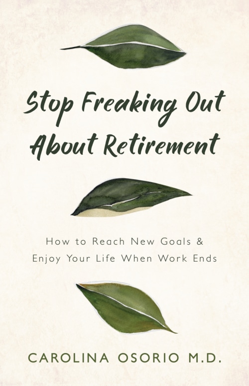
Option A shows brushes of color behind the title, and a mostly blank, white background. Option B removes the color and adds green falling leaves instead.
Can you guess which one won?
And the winner is…Option B! With a score of 66 to Option A’s 34, this self-help book cover design really caught people’s attention. Even more interesting is that respondents ages 65 and over exclusively preferred Option B, and respondents between ages 55 and 64 overwhelmingly preferred it.
Let’s find out why.
The winning self-help book cover design conveys calm
While some respondents didn’t see Option B’s leaves as relevant to retirement in any way, many felt that Option A’s highlighted title font makes it look too urgent.
Option B’s gently falling leaves, on the other hand, give a calming effect.
As one female said, “I prefer [Option] B because it makes me feel less stressed. The colors in [Option} A are very bold and give me anxiety.”
If you’re writing a book about keeping calm as you approach your retirement years, the last thing you want to do is stress potential readers out.
Out of the 33 people who voted for Option B, 14 mentioned that the cover made them feel more relaxed or calm. That’s a theme worth paying attention to!
A trendy cover will go out of trend
It’s true that in the book cover market right now, Option A’s cover design is pretty common. It’s trendy. But that’s only been true in the last several years or so.
Trends change, and before much longer, the self-help book cover design seen in Option A will look like a trend that has passed, and thank goodness.
Leaves, on the other hand, are timeless. And they can signify many things. For one female in the 65+ age range, “the green leaves give a message of growing your ‘green’ money.” For this woman, the leaves represent a financially smart retirement.
For another respondent, the interpretation was different: “The best thing about [Option] B is the leaves on the cover. That made me think of ‘turning over a new leaf’. It reiterated to me the idea of making positive new changes in life.”
No matter how old you are, the leaves seem to say, you can create new goals and dreams to carry you through your retirement years.
Key takeaways
Don’t underestimate your reader’s ability to appreciate a universal image or theme in your book. Instead of putting people off, the green leaves become what the viewer needed them to be.
They attract respondents’ attention and make them want to read the book.
So, if your self-help book seeks to soothe, give the cover a soothing motif. Like leaves. Anything but a boldly highlighted title!
Need help to cho


