The smallest details can make a big difference when it comes to book cover design. So what happens when you have three wildly different cover ideas and you need to pick the best one?
That was the case in this PickFu Ranked poll testing three covers for a book titled, Ascension: Rebellion’s Martyr.
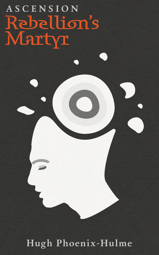
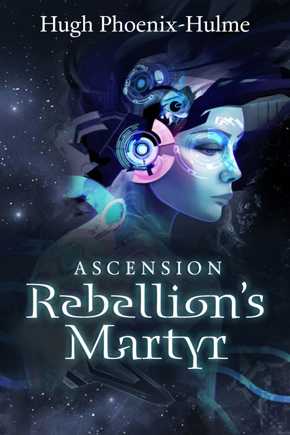
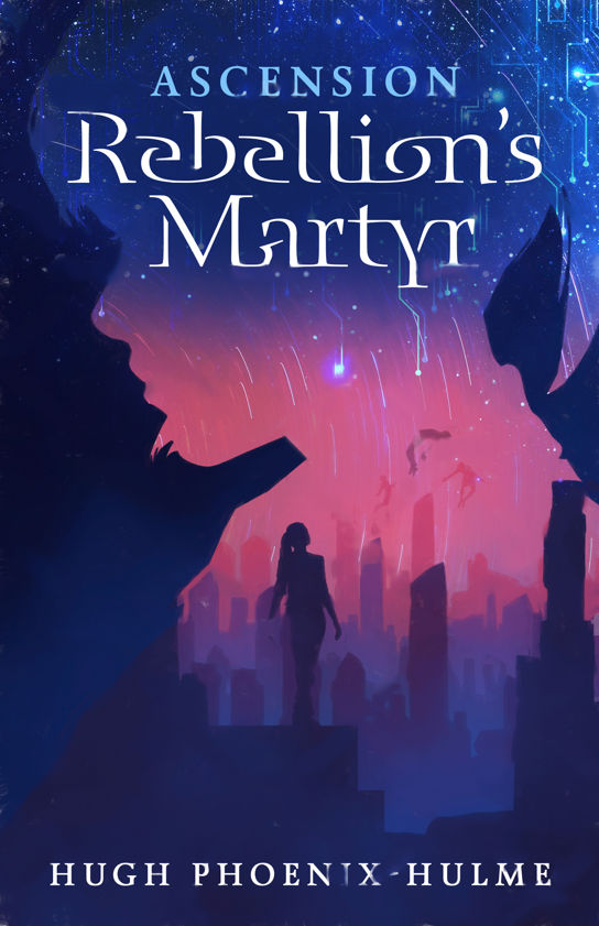
Option A shows a black-and-white, abstract drawing of a person’s head with a circle for a brain. Option B’s fantastical-looking design features a woman’s head with gears for a brain. And Option C, showing a figure at a distance, is the most colorful of the bunch. It’s also somewhat vague.
Can you guess which one won?
And the winner is…Option B, with a score of 52. Option C was close with 48 points, while Option A ended with just 12 points. Let’s look at the results.
Chaos vs. color
Respondents didn’t have much to say about Option A. It simply wasn’t memorable enough. Those who did mention it said it felt “plain” and according to one person, more like the “cover of a self-help book or a post-modern sociology textbook” than a thrilling novel.
Option B was much more intriguing, thanks to the sci-fi look of the illustration, respondents said.
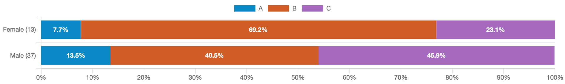
“I can see the chaos going on in the person’s head…and I want to know exactly what is causing the chaos,” a female respondent wrote. (Nearly 70 percent of female respondents preferred Option B over the others — see the full breakdown by gender below.)
As for Option C, respondents who ranked it first said the color scheme made it stand out. A few people also noted that the figure on the cover appears to be “ascending,” which fits the title of the book.
Data highlights
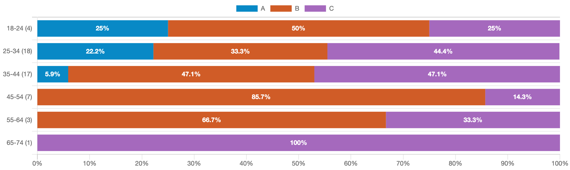
- Not a single person over age 45 voted for Option A
- Female respondents overwhelmingly preferred Option B, but among male respondents, 45.9% liked Option C more than Option B (40.5%)
What they said
“I prefer Option B first because the image of the female character makes me want to learn more about the story and who that character is. I prefer Option C second because the background image of the city makes me want to gather more info about what that city is about and who are the characters that live there.”
“Between Option C and Option B. Good futuristic design. A lot of fun and very imaginative as a whole. Think that Option C is a little better but I’d buy either one of the title covers there.”
“I chose [Option C] first because I like the colors on the cover. The graphics are good, too. [Option B] was my second choice because the graphic of the girl is outstanding and the colors on this cover are nice. [Option A] probably would not capture my attention.”
“I like the droid, Mona Lisa Overdrive look of the replicant in Option B, which is much more enticing than the b/w Option A.”
Key takeaway
When you consider the close score and read through the comments, it’s clear that respondents liked Options B and C almost equally, and for similar reasons.
Option B was technically the winner, but the poll really could’ve gone either way.
In the end, it was up to the author to decide their favorite. And that’s what happened — they went with Option C.
A Ranked poll such as this one will always determine a majority winner. But it’s worth taking a close look at the feedback to see what respondents have to say about the “losing” options. One of them still might be a winner after all.
Want to dive deeper?
Results by commonly used words: