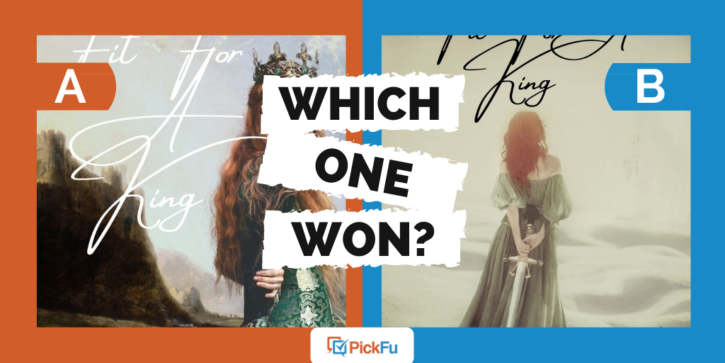
Have you ever run a split test only to end up with inconclusive or statistically insignificant results? You might think of it as a failed poll, but that isn’t the case at all. Let’s look at this PickFu book cover poll to understand why.
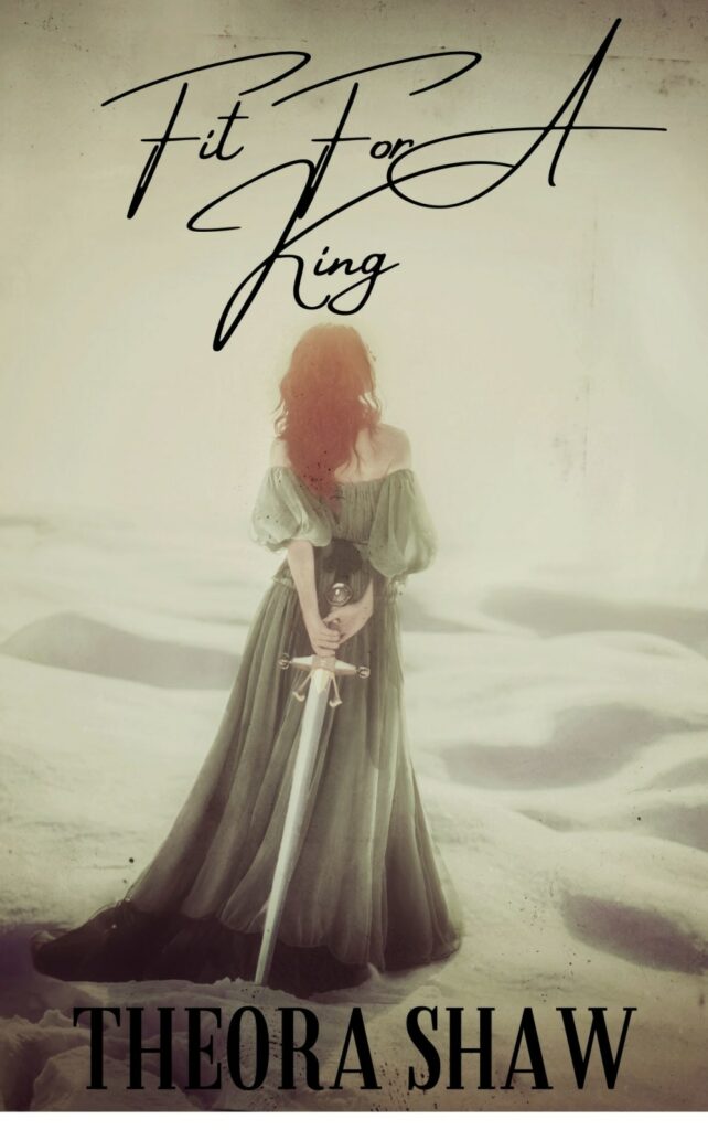
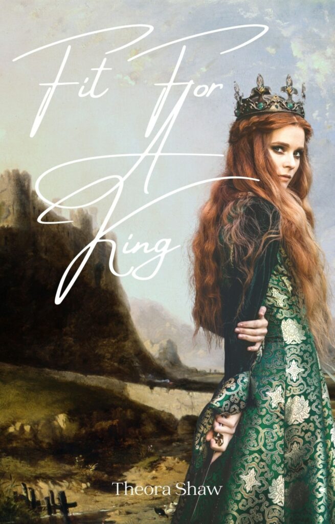
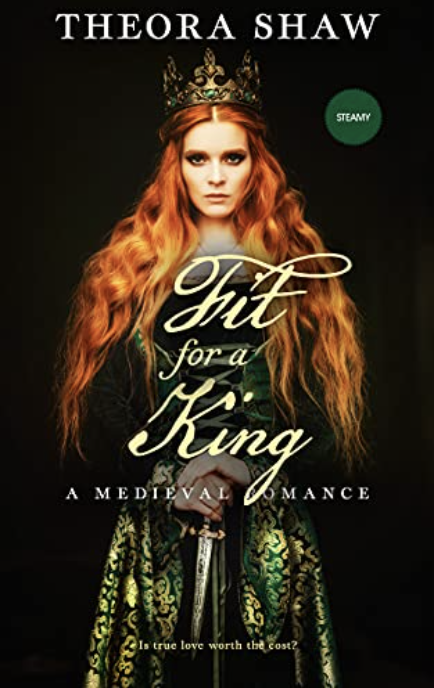
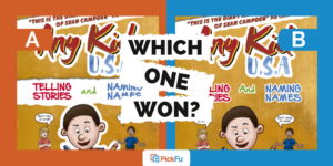
The author tested two historical romance covers with an audience of 50 romance novel readers. Both covers use the same title font. In Option A, a realistically drawn heroine looks over her shoulder at the reader. Option B features a more illustrated design with the woman’s back to the reader.
Can you guess which one won?
And the winner is…Option B, with a score of 58. But with only an eight-vote difference between the two options, it’s not considered a statistically significant result. In other words, respondents easily could have voted in favor of Option A.
Why was this race between two distinctly different cover images so close? Let’s find out.
A little mystery helps
Respondents liked the mysterious vibe of Option B’s illustration. The female character is holding a sword on both covers but it’s only obvious in Option B, which adds to the intrigue, some respondents said.
The way the character is standing with her back to the reader also left an impression on respondents.
“The mystery of the back of a woman’s profile makes my mind want to see and read more,” one person wrote. Others liked that the cover design forced them to imagine her face.
Plus, the black font is easier to read than Option A’s white font, some people said (although a few others didn’t like the font, period).
But here’s something to think about: several respondents who voted for Option A liked seeing the vivid detail on the woman’s dress. They also felt that Option B was too washed out compared with Option A’s rich colors.
What if the designer had made the colors of Option B deeper and richer? Would it have won by a landslide?
Other highlights
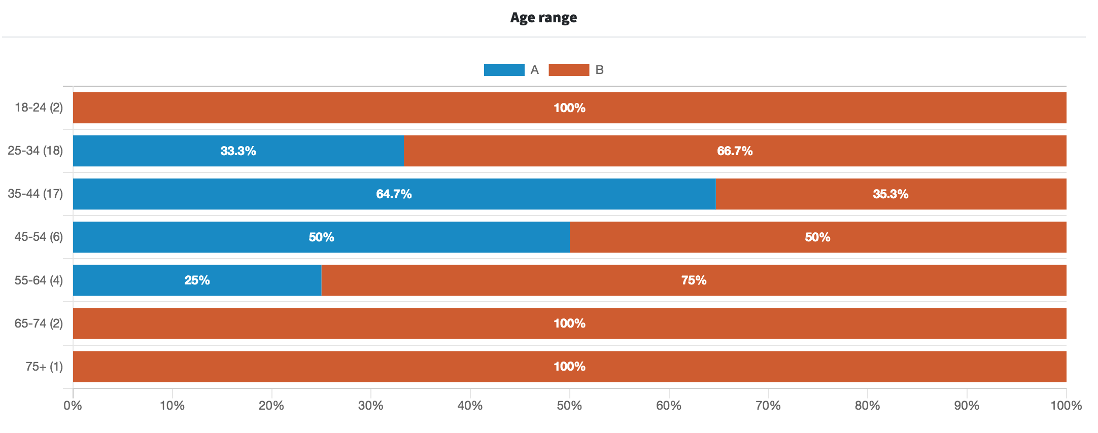
- Male respondents preferred Option B but female voters were split, with 44.2% voting for Option A and 55.8% in favor of Option B
What they said
“I like how Option B is a little bit more dreamy and requires a touch more imagination. I prefer not to see the character’s face on the cover of a book like in Option A because it colors my own imagination and vision of who I’m reading about. Plus the font is a lot stronger in Option B.”
“I chose [Option] B because it immediately struck me as an old timey romance cover. The font of the author’s name and the woman looking away made a big difference.”
“Option A has a richer look with the deeper colors. The placement and font of the title looks better in Option A.”
“Both cover photos are great! That said, I think that the font style and coloring doesn’t really work on either cover. I chose [Option] A over [Option] B because the font coloring and style doesn’t wash out the image as much.”
“Neither are great. They need more color. The name on [Option] A needs to be bigger. The title needs to be bolder and with a shadow so that it doesn’t fade into the background so much. A different font might also make it easier to read.”
Key takeaways
Option B’s illustrative design felt more historical, lent itself to mystery as well as romance, and had clearer font.
Still, Option A had vivid coloring and the dress detail going for it.
In the end, the author went with a more dramatic variation of Option A. The colors are darker and richer. The woman faces the reader, knife in hand. And the font is entirely different.
Despite the statistical insignificance of this poll, the results were insightful, indeed.
Want to dive deeper?
Results by commonly used words:
Learn more about testing book covers (and much more!) in our guide to split testing, and read about how split testing helped debut author Sean Rosensteel make it onto Amazon’s bestseller list.
