Rebrand with a logo redesign: the perfect new brand identity
They say time makes fools of us all, and brand logos are no exception. Even the best logos become outdated, old-fashioned, or simply stagnant with enough time, so an update is necessary sooner or later.
But that’s not a bad thing – a new look can help you stand out, improve brand recognition, and cater to a specific audience. You just need to know how.
Below, we explain how to rebrand your company with an effective logo redesign. Creative design work doesn’t come easily to everyone, so we’ll cover the basics and outline the steps to get the best brand look for your business.
When to rebrand with a new logo
The key to rebranding yourself is knowing when to do it. A brand refresh takes time, effort, and money. Doing it too frequently risks losing brand awareness when people can’t remember your ever changing logos.
So the first step in a successful rebrand is knowing when to take action. For starters, you should review and update your brand identity roughly every 3-5 years, just to keep it fresh. You don’t need a complete makeover or massive overhaul, but you should ensure that it’s current with modern design trends and customer sentiments. Most brands do bigger redesigns or rebrands less frequently (about every 7-10 years).

Notice how you can almost tell the time period from the brand design changes in Apple’s logo – from the colorful 1970s/1980s to the sleek and shiny turn-of-the-century era, settling on a back-to-basics minimalism for our current time.
The logo itself – a bitten apple – remains mostly consistent, but the varying styles reflect the trends of the time. Monitoring logo design trends is smart for any logo redesign, whether you’re looking for a style that’s retro or classic.
Aside from periodic updates, consider a logo redesign if your company is going through a significant change. If you’re trying to reach a different customer base, you’ll need new design choices that coincide with your new audience’s preferences. You can optimize your imagery, slogans, and even company name to suit your target audience, along with graphic design decisions like color and typography.
Even after internal company changes, your business could benefit from a logo redesign. Mergers or new products/services could warrant a logo redesign to show your customers the new company direction.
If your company has received bad press or earned a bad reputation, rebranding is usually advised as a way to distance yourself from your previous mistakes. This often involves an entirely new brand strategy beyond just changing the company logo; you might need new brand guidelines, brand values, or even a new brand name.
The logo rebranding process in 5 steps
How do you rebrand a company? There are many facets of rebranding, from rewriting your brand story to choosing a new name – but in this article, we’re going to focus exclusively on logo redesign.
Below, we list the five key steps to designing a new logo that satisfies your branding and marketing goals while also appealing to your target audience. Let’s dive in.
1. Reevaluate your old logo and current brand strategy

Before fixing your logo, you need to understand what’s broken. What about your current brand design needs improvement? What works and should be carried over?
Your assessment of your current brand identity should include your overall marketing strategy. Are your branding choices hitting home with your new audience? Do they demonstrate what kind of company you are and what your products or services can do?
To get concrete answers, try conducting user tests to find out what your customer base really thinks. For this, PickFu lets you pose questions directly to a built-in panel, which you can filter to represent your target audience. Participants will then answer the question in their own words, giving you valuable insight into how your customer base actually thinks.
If you’re having trouble building your own poll from scratch, you can use one of our templates, such as the business name test or website review.
For minor redesigns, you may not want to change too much – perhaps just a touch-up to appear fresh or an update to a more modern style. Take a close look at your current brand identity and find areas for improvement.
2. Brainstorm a new brand design

Once you identify the problem areas, the next step is thinking up the best solutions. After all, you don’t want to make things worse, as is often the case with bad rebrands.
Most rebrands know what they want to become, but sometimes a brand only knows who it doesn’t want to be. If you’re having trouble pinpointing which direction to go in, try making a list of adjectives that describe your perfect new brand. You can use these as a guide when it’s time to make design decisions.
If you work with professional designers or a design studio, they can give good advice and even pitch ideas. Otherwise, you’ll have to learn some basic graphic design yourself to create the brand logo you need.
As always, base your new ideas on factual data from your actual customer base, rather than guesswork. Consider the evolution of the Starbucks logo: before the company had a firm marketing strategy in place, the first logo was a crude drawing of a bare-chested mermaid/siren, straight from a historic marine map.

The original design wanted to capture the seafaring traditions of Seattle and the Puget Sound, which in a way it did. However, once the company expanded and broadened its target audience, they tested and found a more modern and mainstream version of the mermaid (and less naked, too) worked better with the general public.
Feel free to experiment with different versions and multiple variations — later you can test these with your target audience to see which ideas hit the mark.
3. Create a visual identity to match your new brand strategy

On to more practical matters: it’s time to get your hands dirty with the actual logo redesign. Pay close attention to imagery (i.e., is your logo a mascot, an abstract shape, or just letters?) Different imagery appeals to different people, so keep your target audience in mind when making these decisions. Asking your customers for direct feedback throughout the logo design process is always a good idea.
Likewise, be careful when choosing your new color scheme. According to color theory, colors each have a unique emotional connotation with people: blue suggests trust, red seems urgent, black appears sophisticated, etc. It’s not about picking your favorite color – build your color scheme around what your company wants to be and what your customer base wants to see.
If you’re not working with a professional agency or aren’t familiar with design software, you can use a generic logo maker or hire a designer on Upwork, Fiverr, or Toptal until you’re ready to invest in something more permanent. Logo makers are designed to be used without much design background, perfect for beginners and those who prefer to DIY.
4. Update your typography and fonts

Typography is just as important as the color scheme; your fonts and typeface have a direct effect on the logo redesign’s imagery. Moreover, many logos consist of only the company name, which means your choice of font will make up most of your brand’s visual identity.
When it comes to graphic design, typography works just like the color scheme and other visuals. Some fonts appeal to certain people, while others don’t. You can also use typeface to influence how people perceive your brand. For example, a serif font (those little tags on letters) comes across as more serious and professional: a good choice for legal services, but a bad choice for a toy company.
Consider all the text you want included in your logo. Aside from your company name, you could also include a slogan or tagline, as well as an establishment date or even a very succinct description of what your company does.
With additional text, you can choose a different or modified font to separate it from your company name. Also consider the typeface size – secondary text should be smaller so that it gets read after the main text.
5. Test different versions of your new logo

The problem with logo design is that everything is theoretical until someone outside your company sees it. What looks amazing to you during the rebranding process may be less impressive to your actual customer base.
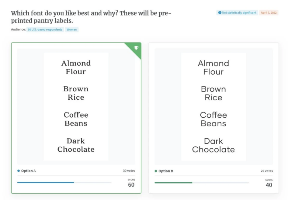
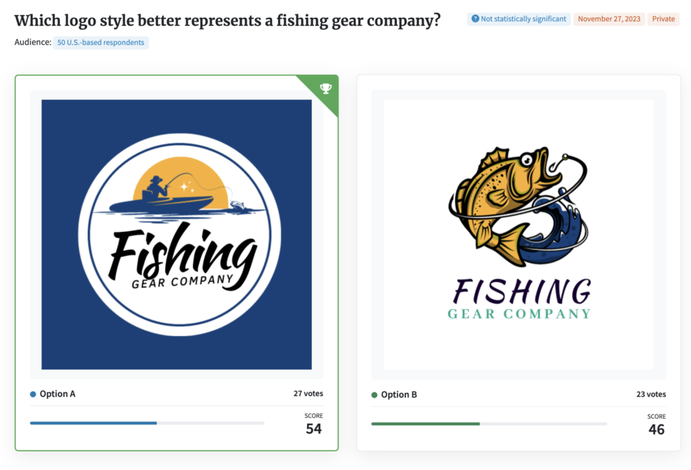
The best way to avoid badly designed logos is to test them with your target audience. PickFu’s A/B testing allows you to share multiple logo design options and ask which one people like best. You can filter respondents by age, income, education, and even hobbies and behaviors, allowing you to truly hone in on your unique audience.
PickFu respondents will also leave written comments explaining their choices, which gives you a deeper understanding of your audience’s opinions and preferences. You can even use the written feedback to fine-tune your logo designs by incorporating ideas from the comments.
If you’ve never run a poll on PickFu before, you can use our logo test template to get started. Simply add your new logo redesign images to the template and filter your participants. You’ll have responses from 50 participants within the day (often as little as 30 minutes).
Iteratively testing your logo with real consumers throughout the design process ensures you make data-driven, audience-backed decisions about your new logo – and avoid costly design mistakes.
Show the world your new brand identity
Logos are the face of your company, and for new customers, your first impression. They can do wonders for brand recognition and building a loyal customer base. Happy customers will associate your logo with the satisfaction of using your products and services, and every time they see your logo, they’re reminded of why they like your company to begin with.
With that in mind, to make the most out of your logo redesign, share it with the world! Use it wherever your company name comes up: product packaging, marketing copy and ads, , social media profiles, business cards, merchandise, and anywhere else your target audience might see it.
Remember that logos work by repetition, so the more people see it, the stronger your brand recognition becomes.


