The ultimate product page optimization guide by PickFu
When shopping online, customers are prone to put away their credit cards and exit a website for the smallest reasons.
Something as minor as a font size that’s too small or an image that looks confusing can lead to fewer sales. You’ll even likely lose 53% of your traffic if your e-commerce site takes longer than three seconds to load!
Fortunately, there’s a powerful fix that will boost your traffic, engagement, and most importantly, your conversion rate.
Product page optimization can save you thousands of dollars that are otherwise lost to poor user experience and small errors. Let’s dive into this ultimate guide on product page optimization so you can create a frictionless buying experience for customers.
What is product page optimization?
Imagine you’re shopping online for professional audio equipment.
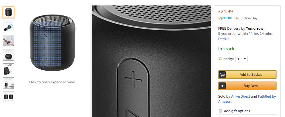
You visit Amazon where you find thousands of recorders, microphones, and other accessories. The product pages are user-friendly and informative. You can check reviews, zoom in on images, and find all the necessary product specs and details. Once you’ve found what you need, you can buy your equipment in just a few minutes.
That’s how well-designed and trustworthy Amazon’s shopping experience is.
Now, you can buy good-quality audio equipment from other platforms too. Online stores like The Pro Audio in the image below offer the same equipment. However, there are a few details that might put you off – like the inconsistent font usage or the more outdated-looking design.
It’s very possible that the lesser-known website can fulfill your requirements just as well as – or even better than – Amazon can. But most people would choose to shop from Amazon anyway because it’s reputable, easy, familiar, and has highly optimized product pages.
Product page optimization is the process of critically examining and improving all aspects of your product listings.
If every element on a product page is just right, the customer will add a product to their cart and complete their purchase.
However, it doesn’t take much for people to lose interest or become wary about buying from you. Product page optimization ensures that everything from product descriptions to the checkout process draws customers into making a purchase.
This process also involves testing different elements like calls-to-action (CTA), images, and text copy to create an optimized product page. You’ll see increased sales but the impact can be even bigger: you can build trust, grow your reputation, and see better performance on search engine results pages (SERPs).
How to optimize your product pages for better conversions
Making even small tweaks to a product page will have a substantial impact on performance. So, it’s worth taking the time to ensure that each product page element captures your audience’s attention.
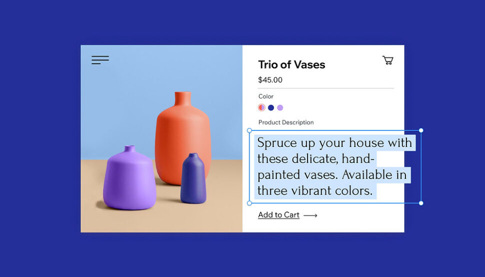
1. Craft compelling product titles and descriptions
The first element to catch your audience’s attention is the product title.
At a glance, it needs to inform your audience about the product and give them a compelling reason to stay on the page.
If a potential customer finds your product title interesting, they’ll explore the product description next – giving you a chance to make a strong case for why they should buy your product.
Here are some key tips to ensure your product title and description keep customers hooked:
- Keep the title concise and informative. Use relevant keywords to make it easy for customers to find your product in search results.
- Use power words and emotional triggers like “best” or “easy” to evoke curiosity and interest in your product.
- Highlight unique selling points and benefits that set your product apart from competitors. This helps you add unique content for SEO and rank higher in search results.
- Use bullet points and short paragraphs for an easy-to-read description that quickly grabs attention.
Let’s look at an example below.
A fitness expert who wants to sell books on Amazon used PickFu’s polling and survey platform to test three different book titles.
The respondents overwhelmingly chose B, Time Crunch Fitness: Quick Workouts for Busy Professionals as the winner. They said that the short, snappy, and informative title was perfect for people who need quick workout material.
Similarly, one PickFu client created a poll to learn which product title and description would drive more conversions.
People chose Option A over B even though they were very similar because A included the term “lifetime warranty” which made it more appealing.
Clearly, the right combination of product titles and descriptions can drive up conversion rates. The extra effort needed to create and test the right title will help you sell more products, including audiobooks on Amazon.
2. Create attractive call-to-action (CTA) buttons
The CTA text and button is one of the most important parts of your product page. It drives people to take action i.e. subscribe to a newsletter, download an app, or buy your product.
So, how can you create an effective CTA? Here are some key tips to follow:
- Keep the CTA text short and clear. Use action words that tell people exactly what to do.
- Place the CTA in a visible and prominent location – usually above the fold. Also, make the CTA “sticky” so that it’s visible even when customers scroll down the page.
- Make the CTA button stand out with a contrasting color and a clear font.
- Test different versions of CTAs and track which one performs best.
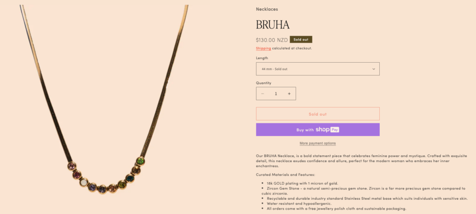
Check out an example below from a jewelry store – this is what your CTA should not look like.
For starters, the call to action is well below the fold of the product page. It should be higher, more visible, and attract attention right away. The e-commerce owner only needs to move or reduce the product description to make the CTA visible.
Notice, also, that the “Add to cart” option doesn’t stand out while the “Buy with ShopPay” button is from an entirely different color palette. The ShopPay option may put customers off since it forces people to create an account and they may want to use other payment options.
These small design issues can leave customers without a clear line of action to follow.
CTAs matter and they can completely alter your product page performance. A good CTA helps you boost sales and gives customers the confidence to take action.
3. Use high-quality images and videos
Your audience can’t feel or touch products in your e-commerce store. They have to rely on screenshots and videos to decide if they should buy from you.
It goes without saying that product images must be high-resolution and clear. But there are more factors to take into account:
- Multiple angles: show the product from different perspectives and angles so customers get a complete view of the product.
- Lifestyle pics: display the product in real-life settings and feature product variants. For example, if you’re selling a dress in different colors, add images for each one.
- Zoom in: allow customers to examine fine details by zooming into your product.
- 360-degree views: enable product rotation for a full view.
- Short videos: include videos showing the product in use. This helps people understand a product’s functionality and size.
- AR/VR: use augmented or virtual reality for virtual try-outs.
- Consistent backgrounds: use uniform backgrounds for all images.
Optimize your product images with these tips and you’ll convert more of your e-commerce business visitors into satisfied customers.
However, don’t just upload images on your Temu, Amazon, or self-hosted site and leave things to chance. Reinforce your product image choices by running tests and getting feedback.
Amazon A/B Testing is particularly useful for sellers using the platform. Check out this poll run by an Amazon seller – they showcased two images for decorative books and asked poll respondents which one they’d be more likely to buy.
The winner was Option B, with respondents saying things like “I prefer that there is an array of colors that compliment each other, as opposed to just a stark white. I think it would make a shelf look more interesting.”
Remember to optimize your e-commerce store pages with contextually relevant images. Use Amazon product research tools to do research and learn the best ways to showcase product images.
You could see an instant improvement in sales just like Leap Stores did. This Amazon agency increased traffic to their client’s Amazon listing by optimizing their main product image with competitor testing and customer feedback.
4. Add social proof and trust indicators
Social proof refers to the influence that others have on our behavior. We tend to feel comfortable and safe when we see many people taking similar actions.
This phenomenon is helpful when we understand that potential buyers are unlikely to trust an unfamiliar e-commerce store, social media ad, or app store product page at first.
However, including social proof and trust indicators on an e-commerce product page overcomes discomfort and distrust and makes it more likely that a customer will buy from you.
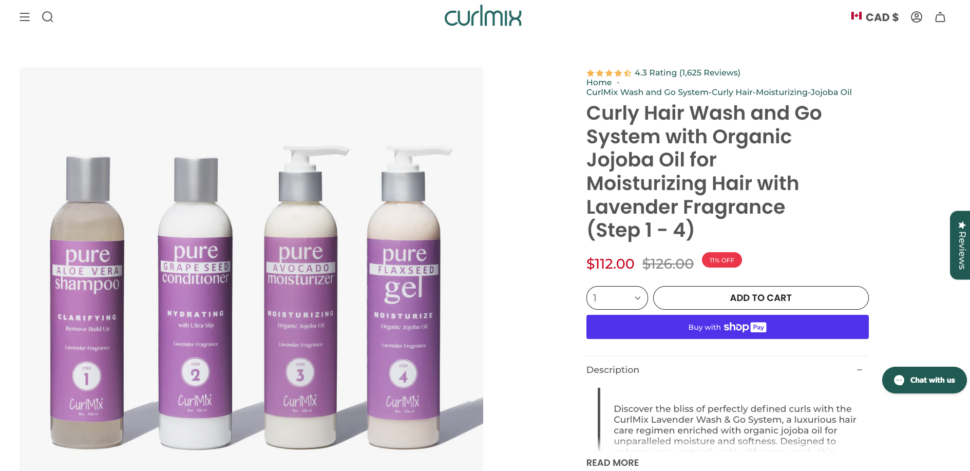
All it involves is adding customer reviews, testimonials, and star ratings. You could showcase case study snippets and video endorsements. Check out a product page by Curlmix below – it features product ratings and a short review below the main CTA.
You could even add small pop-ups like the one in the image below showing customers a recent positive review from a third-party website.
Add proof like awards, certifications, success stories, and media mentions. Display trust signals such as security badges, money-back guarantees, and clear return policies. These elements will reassure your customers and reinforce their purchasing decisions.
5. Improve product page load speed
While design and user experience matter, they’re still only part of a well-optimized product page.
Your e-commerce web pages and app must perform well in terms of metrics like page load time, mobile-friendliness, and engagement.
As mentioned earlier, even a slight delay in page load time can drastically reduce conversions.
Ensuring that your product pages load quickly is crucial. Compress images with a plugin, leverage browser caching, and use a content delivery network (CDN) to improve load times.
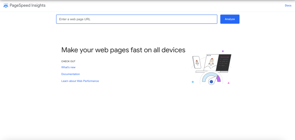
Use tools like Google PageSpeed Insights to check your current load times and get recommendations for improvements.
Improving the load time and performance of your product pages isn’t just good for user experience, it also contributes to SEO (search engine optimization) and boosts your content rankings in SERPs.
6. Optimize for mobile
Managing your overall website or app experience for different devices is just as important as optimizing individual product pages. After all, mobile transactions make up 60% of all e-commerce sales today!
Follow these tips to ensure that your e-commerce website or app supports a positive buying experience and creates sales:
- Design a clean and distinct app icon. It’s one of the first things potential users will notice. Make it clear, professional, and easily identifiable to stand out in crowded app store listings.
- Add app previews and screenshots that highlight key features and the user experience. This gives potential users a glimpse of what your app offers and how it functions. Add enough product details and high-quality visuals to help customers make buying decisions.
- Encourage satisfied users to leave positive reviews and promptly address any negative feedback. App reviews significantly impact user trust and the overall success of your app.
- Track your mobile performance via app analytics on Apple’s App Store Connect and Google Play Console.
- Use your dashboard to manage your app’s metadata, submit new app versions and updates, and monitor overall performance.
- Gather insights from your app analytics on user behavior, sales, and trends which can inform your optimization strategies.
Overall, keep your mobile app (or the mobile version of your website) updated and take care of bugs and poor reviews to create a consistent experience for users.
Personalization and recommendations
One of the key ways to improve your product pages is by cross-selling relevant products and offering personalized recommendations.
You’ve likely seen this when shopping on Amazon. Every product listing has “Frequently bought together” and “Get instant recommendations” sections at the bottom.
For example, Amazon suggests chef knives and other cutting boards when shopping for chopping blocks.
Such recommendations are important because they can increase the final order value. Also, if a customer isn’t satisfied with the product page they’ve landed on, it’s still possible to convert them by offering related products that better fit their needs.
Personalization is a critical tool to improve user experience on your website or app. It shows customers that you understand their interests and preferences and can cater to them.
How can you include such recommendations and personalization on your online store or app?
That depends on the platform you use. Shopify, Woocommerce, and other online store platforms have recommendation algorithms that suggest relevant products as part of the template. You can also manually add products to each listing.
In this way, you can configure a personalized shopping experience and help buyers discover related products to buy.
Increase sales and optimize your product pages with PickFu
Optimizing your product pages is crucial for driving traffic, increasing engagement, and boosting sales.
The good news is that you can easily increase all these metrics by following the tips shared here.
A key part of making product page optimization successful is testing every element. Use PickFu’s polls and surveys to create the perfect product title, write a great description, and choose the right images to hook your customers. You can even test against your competitors and gather feedback before you launch to put your best foot (AKA, product page) forward.
You can also run more tests like market validation, prototype testing, or validating your SaaS idea with PickFu. Not to mention that the platform is affordable and easy to use, making it a great tool for businesses of all sizes.
Ready to see your conversions soar? Start applying these optimization techniques today – use PickFu to optimize your product page!
FAQs
What are the best practices for improving conversion rates on product pages?
You can improve conversion rates by focusing on clear product descriptions, high-quality images, fast load times, and customer reviews. Also, incorporate localization to ensure content is tailored to the specific language and cultural nuances of your target audience and location.
What Is SEO – Search Engine Optimization?
SEO involves optimizing your website’s content and structure to improve its visibility on search engines. By using effective meta tags, creating original content, and adding relevant keywords, you can increase organic traffic and enhance your ecommerce store or site’s rankings on search engine results pages.
How to optimize product page SEO?
You can optimize your product page SEO by including the right keywords in your product titles and descriptions. Use free Amazon product research tools to identify keywords customers use and create custom product pages that match your audience’s needs. A good research tool can also help you assess if using Amazon FBA is worth it. Focus on providing value, adding practical content on how your product works, and encouraging customer reviews.
