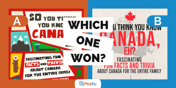
While PickFu is incredibly useful for ebook authors, it’s also a vital testing tool for authors who plan to publish their books in print. One author recently tested four print book cover design options for a book about Canadian facts and trivia. She specifically asked poll respondents which cover they’d pick up in a store.
Option A crowds its cover with chunky illustrations and playful font.
Option B has a cleaner look, with the subtitle set in a circle surrounded by Canadian landmarks.
Option C is similar to Option B but with a different color scheme and illustration.
Option D neatly lays out the Canadian landmarks illustration on the bottom half of the page.
Can you guess which one won?
And the winner is… Option D! After three rounds of voting, Option D won with a score of 58 to Option B’s 42, Option A’s 30, and Option C’s 16.
Let’s figure out why this print book cover design spoke to the poll respondents.
The design fits best on a print cover
Each of the four covers features fun illustrations that evoke Canada. But respondents thought that Option D would look best on a bookstore or tourist-shop shelf.
It’s got a lighter background, bold yet not-too-playful title and subtitle font, and an easy-to-see illustration of all the things you can do in Canada.
One respondent said, “[Option] D seems like the clearest and most
Respondents also found that Option D struck the best balance between kid- and adult-friendly.
Illustrations should be clear to interpret
Many respondents thought that the circular illustrations offered in Options B and C were difficult to interpret, while Option A looked too childlike.
Another added, “[Option D] just looks more clear as to the things that are offered to you in Canada and the things you can do.”
If you’re writing a trivia book about any country, you’ll want the illustration to be easily decipherable. Viewers should be able to glance at it and get a solid idea of which country the book features.
For Options B and C, readers in a store would have to turn their heads upside down to clearly see half the illustration on the cover!
Print book cover design: Key takeaways
Fact and trivia book covers should appeal to kids, definitely, but they should also attract the whole family’s attention. Especially when “Fun Facts and Trivia About Canada for the Entire Family” is part of the subtitle!
Appealing to the whole family will also make parents more willing to purchase this book for their kids if they’re all in a bookshop. Instead of the kids potentially losing interest in the book after a few minutes, they’re guaranteed many fun afternoons or evenings reading aloud together.
Also, making the illustrations easy to understand is important for a
If you’ve written a book that you intend to put on store shelves, bring your covers to PickFu and create your own poll to see which one your potential


