If you’ve written a book on a highly
That’s what one author did for his book about collecting and selling art titled, Own a Fraction, Earn a Fortune: The Complete Guide to Co-Investing in Art and Collectibles.
He selected a target audience of 100 respondents who likely have the means to buy and sell collectible art. These were people between the ages of 25-64 who have a bachelor’s or graduate degree and earn between $61,000-$101,000+.
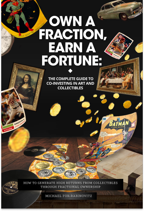
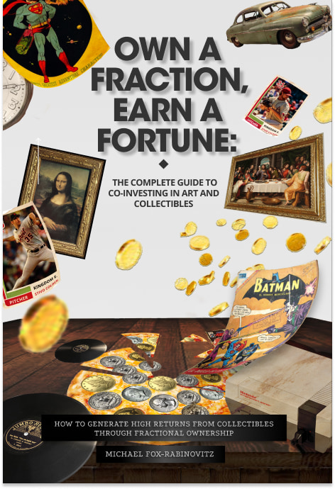
He posted nearly identical versions of the covers and asked, “Which book cover is better?”
The book covers have the same art and font, but Option A features a black background with white font while Option B is the opposite.
Can you guess which one won?
And the winner is…Option A! With a score of 67 to Option B’s 33, the majority of the author’s target audience preferred Option A.
Let’s find out why.
Bold background
Several respondents liked that the black background in Option A made the art and collectibles on the cover pop.
“The black background provides a better contrast with the pictured objects and
The white lettering against the black background helped.
“The bright bold white words are easier to read on [Option A] and that makes it catch the eye before the [Option B] does,” wrote one respondent. Another said the grayish wording in Option B looked less professional: “The title letters in [Option A] are NOT shadowed, as they are in the [Option B]. The shadows in the letter make me feel like it was done in Word and feels very amateur.”
When designing or choosing a cover for your book, make sure the background lets the font and art stand out.
A hint of luxury
A surprising amount of respondents felt that Option A looked “elegant,” “rich,” and “luxurious” compared to Option B. The black background contributed to that, said one respondent.
Another fleshed out this idea, saying that “having the black background really makes the gold coins shine. As the book is about investing in art and collectibles, I feel it is a good idea to have the gold coins really stand out, since we’re talking about making money.”
So, not only does the black background make the images easier to see, it plays up the luxury appeal and hints at the promise of wealth.
Key takeaways
The author took the smart first step by narrowing his audience to people likely to be interested in collecting and selling art. If you’ve written a niche book, make sure you select a target audience that’s relevant to your book’s topic.
Keep in mind that a dark background with light font pops. If your book is about making money, cover images that hint at luxury will stand out.
If you have ideas or designs for your book cover and need detailed feedback, split-test your top choices on PickFu.


