What do shoppers look for in a logo? The answer is anything but clear cut, as this PickFu poll suggests.
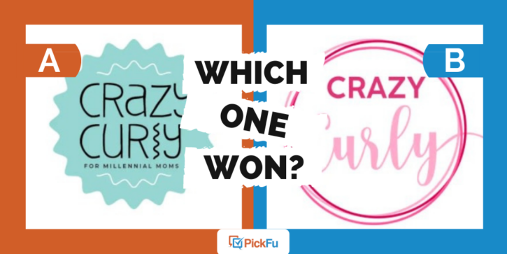
A brand wanted feedback on two completely different logos for a curly hair product line called Crazy Curly. It polled an audience of 50 women between the ages of 25 to 44 who have one or more kids.
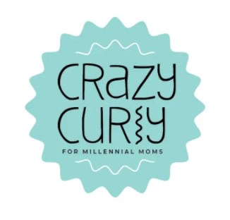
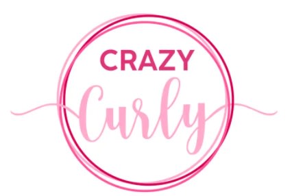
Option A features a turquoise, wavy-edged design, with a squiggly line for the letter l in Curly and the phrase, “For millennial moms.” Option B is a circular pink logo with the word Curly in fancy font.
Can you guess which one won?
And the winner is…Option A, with 29 of 50 votes and a final score of 58. Option B scored 42.
However, the results weren’t statistically significant, meaning respondents found little difference between the two options.
Let’s take a look at what they had to say.
Dreaming of curls
Respondents who voted for Option A liked the quirky l in the word Curly because it reminds them of a curly strand of hair. So did the logo’s wavy edging.
But Option B is more readable, other respondents said. One woman said the squiggle in Option A makes the name look like Crazy Cury, something the brand should think about as it moves forward with this product.
Respondents also had strong opinions about Option A’s tagline, “For millennial moms” — even those who voted for it.
“The extra words at the bottom aren’t necessary because it makes it seem like this product is only For Millennial Moms. That’s not cool,” wrote one respondent in the 25-34 age group.
She has a point. People of all ages, parents and non-parents alike, have curly hair. Why wouldn’t this product be OK for anyone with curly hair to use?
And, as another respondent pointed out, millennial is a loaded word. Even if millennial moms are the brand’s intended audience, it might want to reconsider using the phrase.
Other highlights
- 75% of Asian respondents voted for Option B, while those of other racial and ethnic identities (Black, Hispanic, white, other) preferred Option A
- Option A was the favorite among respondents with a high school degree or higher
- Those who earn $31-60k and $61-100k were evenly split between the two options; among the highest earners ($101k+), none voted for Option B
What they said
“If you have a product that states ‘for millennial moms’ you are excluding Gen X, Z, boomers, and everyone else. It’s just not smart business, especially where millennial is a dirty word to some of these other generations.”
“Option B: looks clean, simplistic, without being overly done and wasteful in design. Makes me think of a prestigious salon brand. Easy to read and follow along. Option A: reminds me of a kid’s shampoo, specially the 3 in 1 shower/shampoo watermelon smell from the brand Suave.”
“Ummmm…first of all, why is Option A only marketed to millennial moms? Older and younger people have curly hair. So that’s one reason I don’t like that logo. I also don’t like the ‘l’ in the word Curly, so Option B is my favorite by a mile!”
“Option A is definitely more original, transforming the L into a curl. Option B is quite boring, nothing special about it. Could be for any product, not related to curls.”
Key takeaways
First things first: even if your product is geared toward millennial women, don’t say so.
Do you wonder what the results of this poll would’ve been if Option A didn’t include that tagline? Maybe respondents would have chosen it in a landslide, instead of a trickle.
Also, think hard before choosing a quirky design like Option A. While you want your logo to be unique, consumers should still be able to read it.
Option A may have won this poll. But that doesn’t mean respondents had only good things to say about it, or that there isn’t value in the rest of the feedback.
Read our guide to testing logos for more help on choosing a logo. And if your poll doesn’t have a clear winner, this article explains how to interpret the results.
Want to dive deeper?
Results filtered by commonly used words:
Results filtered by race and ethnicity:
Results filtered by education level:
