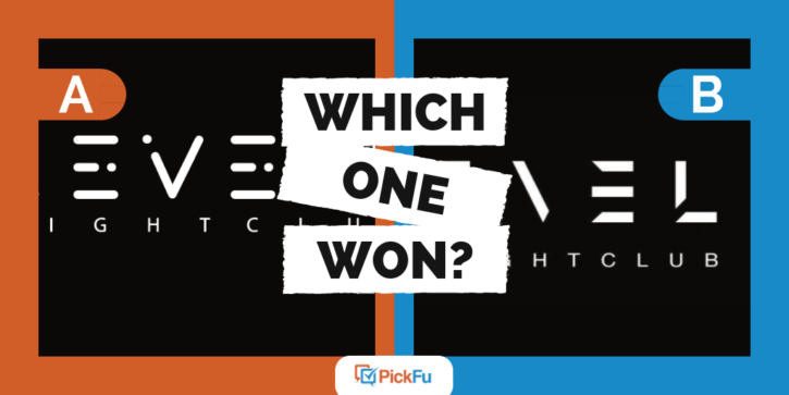
Certain businesses and industries naturally have a particular vibe, such as a floral shop being pretty or the construction industry being rugged. When creating logos and branding for your business, it’s important to match the feel customers expect. In this PickFu poll, the entrepreneurs behind a nightclub tested out two designs for a modern logo. Both options have the same color palette and feature the business name Levels Nightclub.
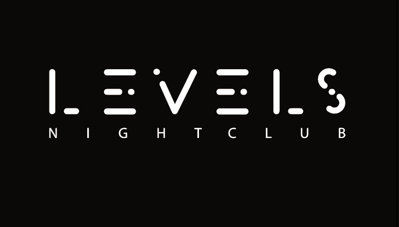
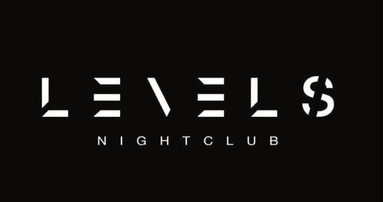
However, each modern logo design features different fonts and spacing. Option A uses a rounded, bubbly font for the word Levels, while Option B uses a sharper, edgier font. These seemingly small differences give each logo a different look.
Which modern logo won?
Between the two logos, Option B won the poll with 64% of the vote. Out of 50 total votes, Option A got just 18 votes while Option B came away with 32.
Let’s take a closer look at why Option B won this poll.
Customers expect a sleek image
Customers expect a nightclub to come across as sleek, sophisticated, and trendy. The branding for Levels Nightclub needs to meet that expectation. Looking through the comments from respondents, Option B won because it was closer to what they were expecting to see.
A young man commented, “This one seems more edgy, more sophisticated, more classy and upscale.” Another man had similar thoughts, saying he liked “the sharper line in the font on Choice B. It just gives it that style that I’d associate with a nightclub more than the rounded font of Choice A.”
Keep your modern logo easy to read
While Option B won the poll, both logos had a lot of feedback around the readability of the fonts. There were several comments for Option B including, “I prefer B. I think it’s easier to read,” “I think that this one is easier to read,” and “B because it is easier to read for me.”
However, Option A had similar comments. Respondents left comments like, “You can read this one a lot better,” “It is more clear than the other option,” and “I liked A better because you can see more of each letter clearly than in B.”
The lesson from this feedback is that the logo you decide on must be clear and easy to read. As clever as you want to be with your design, you can’t sacrifice the legibility of a business logo. You only have a split second to capture the attention of a new audience, so the first impression your logo makes is important.
Run a poll to test your logo designs
When you’re working on a logo and branding for your business, you’re often too close to the project to make unbiased decisions. That’s where PickFu polls come in handy!
For as little as $50, you’ll receive anonymous feedback on your logo designs. Best of all, you get results in just minutes!
