Mobile app designs are a crucial component of user engagement. Everything from your app icon to the user interface can affect how addictive an app becomes and whether it drives revenue. In a pay-to-play game, your in-game store must be visually appealing and easy to use in order to encourage more purchases.
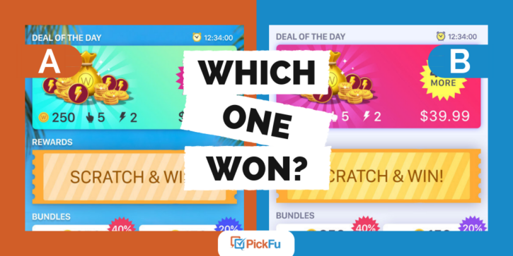
A mobile app developer created two mobile app designs and tested them in this PickFu poll. The two in-game shops had different color schemes. Option A had a tropical background while Option B had a plain background. The differences were fairly subtle but made a big difference in the poll results.
Do you know which mobile app design won?
Option A won the poll with a convincing 76% of the vote. 38 out of 50 respondents chose Option A, while just 12 people preferred Option B.
Why did Option A win by so much? Let’s take a look at what the respondents had to say about each design.
A themed background adds appeal
The right color scheme makes all the difference. Several respondents preferred the blue of Option A over the pink used in Option B. As one male stated, “the bright blue color in the background makes it look more exciting.”
Speaking of the background, that’s the difference that made Option A the winner. The overwhelming feedback showed that voters preferred the palm tree background. “I love the background for it, it makes it way more interesting to look at,” one respondent said. Another said, “I chose [Option] A because the colorful background made the deals stand out more.”
Keep your store design clean and bright
While Option B only got 12 votes, this mobile app design had a couple of strengths that shouldn’t be overlooked. Two women liked the bright pink used in this design and another one thought the sparkles around the treasure stood out better against the pink.
The more common appeal of Option B was the plain background. A younger woman commented, “Option B is more ‘down to business.’ There is no distraction of a beautiful background. This makes my eye go straight to the numbers. I like it.” A handful of similar responses echoed appreciation for the clean look and minimal design.
The feedback from both designs reminds us to balance an eye-catching design with a minimalist approach. You want your store design to fit in with the rest of the game but not distract from its main purpose – driving more in-game purchases.
Test your app designs
When you’re in the middle of creating a mobile app, you might be too close to the project to objectively choose the best designs. Fortunately, running a PickFu poll solves the problem! You can set up a poll with a real-world audience of mobile gamers or with people based on their mobile device (iOS or Android). They’ll give you specific feedback on the designs and enable you to move forward with confidence.
Free download: PickFu/Utopia Analytics report on
toxic behavior in online gaming


