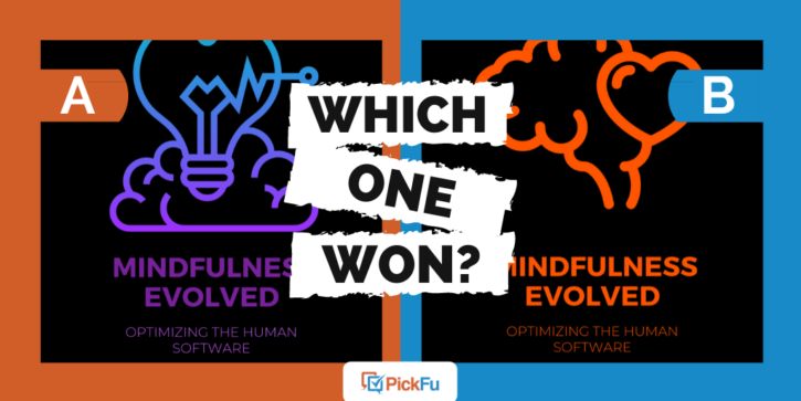
No pun intended, but mindfulness books should really make you think. Let’s see what happened when this author took two cover designs for a book about mindfulness to PickFu. Which one piqued the most curiosity?
The author kindly asked 50 people, “Please take a look at the cover art for my book, Mindfulness Evolved: Optimizing the Human Software. It’s about how to transform your brain and life with Mindfulness. Offering personal stories, tools & practices. Pick the cover most appeals to you, why?”
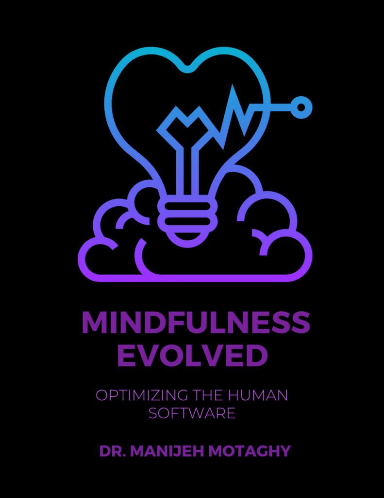
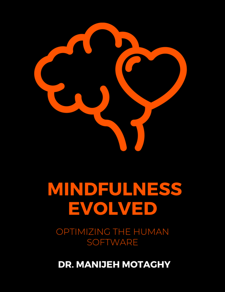
Options A and B feature a similar theme: a black cover with a minimalist neon illustration and neon font.
Option A’s font is purple-blue, whereas Option B’s is orange. The illustrations differ; one features a heart-shaped lightbulb over a cloud, while the other uses a heart and a cloud in the shape of a brain.
Can you guess which one won?
And the winner is…Option A! With a score of 72 to Option B’s 28, it’s clear readers greatly prefer Option A.
But why?
Mindfulness books should be relaxing, not harsh
It turns out that the font color made a huge impact on PickFu respondents.
Many respondents found Option B’s orange coloring “harsh,” “threatening,” “violent,” and “aggressive.” One respondent even found Option B evocative of prisons, saying, “The colors orange and black mixed together makes me think of the prison show on Netflix, Orange I
Option A, on the other hand, had “a more relaxing and inviting feel” that felt “modern,” “calming,” “relaxing,” and “soothing.”
Respondents also loved the ombre effect of the colors. One female said, “I think choice A is the most appealing for a cover because it has more than one color tone.”
Another added, “I liked Option A because the gradient colors draw my eye up to the bulb. I liked the concept of the thought going up from the mind to the bulb when it is a fully formed idea.”
In short, Option A’s color scheme is calming and pleasing to look at, it helps bring the reader’s eye up to the logo, and may even have symbolic value.
Lots of love for the lightbulb
Not many respondents favored Option B’s logo with its brain-shaped cloud because they couldn’t quite figure out the meaning of it. One respondent wrote, “I understand the graphics of [Option] A more. I am not clear what [Option] B graphics are supposed to be.”
On the other hand, several loved Option A’s heart-shaped lightbulb. Said one respondent, “I like Choice A due to the light-bulb signifying turning on your mind. Let’s flip that switch with mindfulness!”
Another added, “I like how a brain, a heart, and a lightbulb are incorporated into the graphic.” This comment prompted us to look at Option A again to see if there really is a brain there. Or is it a cloud?
It might be a good idea for the author to go back and make it look more brain-ish, because respondents loved the idea of a brain, a lightbulb, and a heart together. Then again, perhaps leaving it open to interpretation reinforces mindfulness even more.
Mindfulness books: Key takeaways
In a book about practicing mindfulness, audience members greatly prefer soothing colors as opposed to bold, bright ones. If you’re working on a mental health-oriented self-help book, stick with a calming font and color scheme.
Pay attention to your iconography. Does your cover design evoke the idea of mindfulness, like a lightbulb, heart, and brain/cloud do? Or does it confuse your readers?
Find out what readers think of your book covers by creating a poll on PickFu. Make sure to scour the comments for any suggestions to make your colors calmer and your illustrations clearer, and you’ll be set for better sales.
