A nightlight can soothe young children to sleep. But in a crowded marketplace like Amazon, how do sellers capture the attention of their parents?
Sellers understand that perfecting an Amazon listing can boost the chance of making a sale. Amazon optimization requires getting every aspect of that listing right, from the name of the product to the images featured.
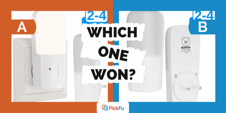
In this PickFu poll, a seller asked 100 people to shine a light on which product image was most attractive.
Which option do you think won?
Which One Won?
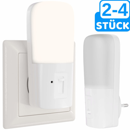
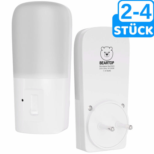
Though the two main images are similar, there was one crucial difference. Option A shows the nightlight in action, helping it to win the PickFu poll by an almost 2-to-1 margin. Respondents felt that Option A would help them to make a more informed decision.
Here’s some of the feedback that the seller got from the poll:
- “I chose Option A as the design that is more usable because the image shows how the product is used, and the design looks more durable overall.”
- “I think that Option A displays the product in a better light because it shows it in use and how it would be used if purchased. I think I could be confused as to what the product was if I only saw Option B, so for that reason, I would surely be more likely to click on Option A and think that the design shown in Option A is more usable.”
- “I chose Option A because it looks a whole lot better than Option B, and it shows what the item is for. Option B looks confusing with the way it is pictured. I like that Option A has the socket depicting that this item plugs in. Option B doesn’t have a clear picture that gives consumers an idea of what this product is meant to do.”
- “In my opinion, design Option A is more usable because I can see how it’s used in a real outlet and how it would work if it were plugged in, so it gives me an idea of how to make it work in my home.”
- “They look the same, just different angles. The one showing the functionality is more helpful.”
Customers felt that both pictures were “usable,” as the seller asked. Both images adhere to Amazon image guidelines and look professional. But to then, Option A prevailed because it showed the product in use. Additionally, the second picture left some people questioning what the product was.
Shining a light on your customers
Choosing the right main image for your product listing can be a difficult choice. It can make the difference in capturing shoppers’ attention and improving your listing’s click-through rate.
If you’re struggling to decide which image you should be using on Amazon, or if you have some other aspect of your business that you need to put to the test, try a PickFu poll of your own.


