When you’re building a brand, your logo is an important first impression to customers. Whether online or offline, your logo quickly becomes the calling card of a business. However, judging logo design ideas is never easy.
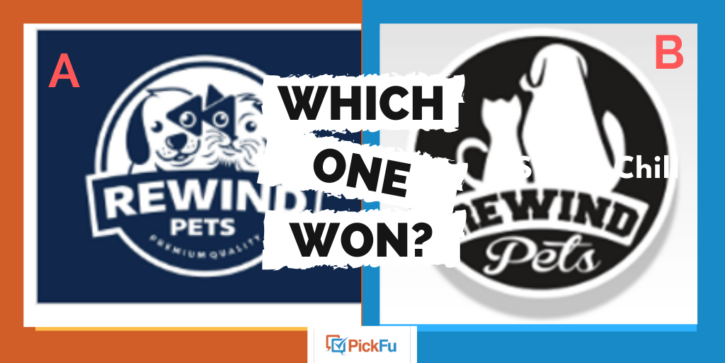
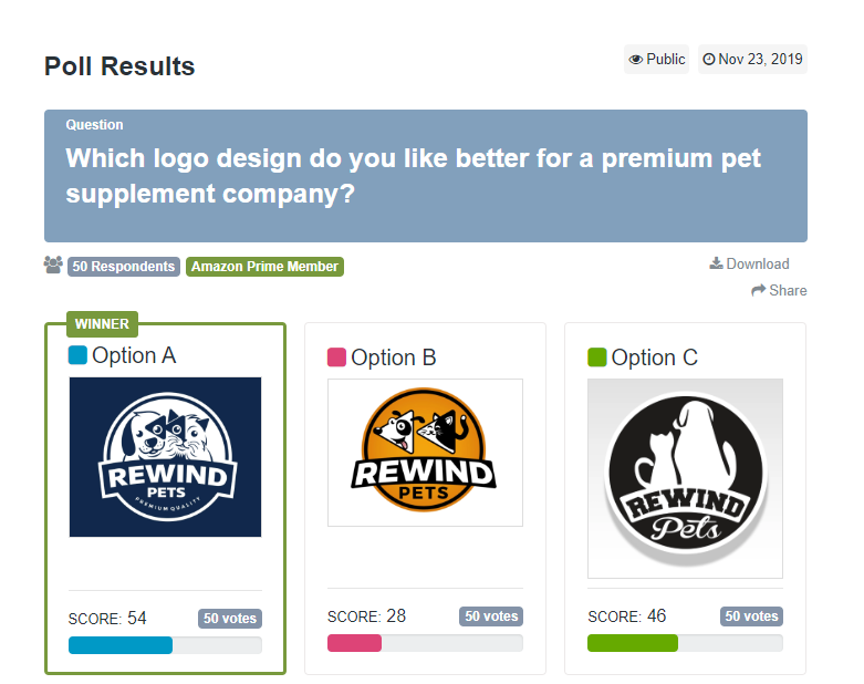
In this PickFu poll, a premium pet supplement company asked for insights from Amazon Prime shoppers about which logo they prefer. Of the three logo design ideas offered, which do you think came out on top?
Which One Won?
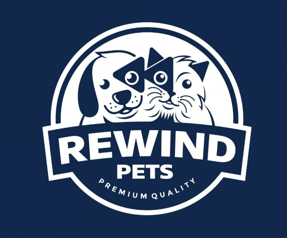
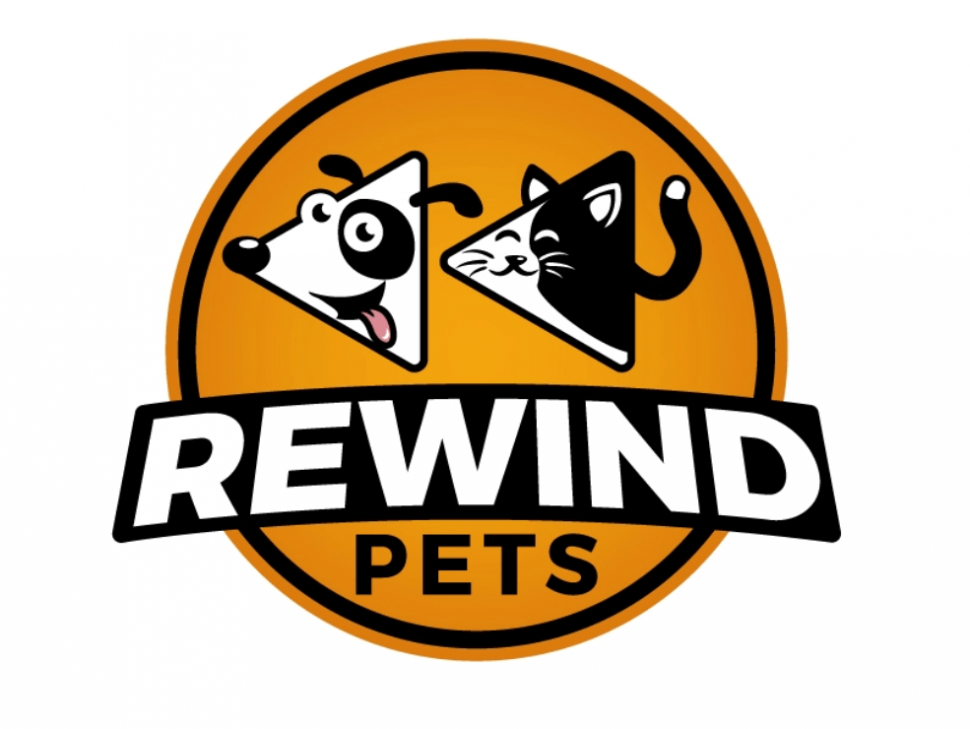
Option A stood out as the #1 choice among all the 50 respondents, with a score of 54 out of 100. The choice just beat Option C, with a score of 46.
The poll asked each participant to rank their favorite logo design idea from their first to third choice. Options A and C both got positive feedback in this poll, making it a tough call for the business owner.
Let’s see what the respondents had to say.
Choosing the perfect logo design idea
The close call between Option A and Option C in this poll highlights how difficult it can be to choose the right logo for a growing brand.
The 50 Amazon Prime members polled offered in-depth comments, for instance:
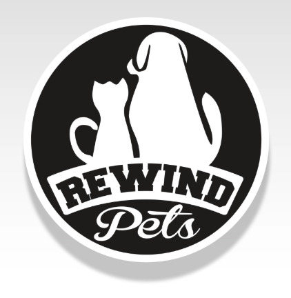
- “Option C is my first choice because it gets to the point. The other options I had to look at for a couple seconds to understand what I was looking at. Option C also reminds me of the search pictures they have on animal shelter sites, so it is kind of familiar when looking at it. Option A is my second choice because it states premium quality and it’s easier to make out what the picture is. Last would be Option B because I had to take the longest looking at it to figure out what it was trying to portray.”
- “Although I think the orange [in Option B] will catch a lot of eyes, the dark blue design [of Option A] is professional and very aesthetically pleasing. I love the cat and dog illustrations, and it is incredibly inviting to the consumer. I like how the rewind symbol is secretly embedded into the spots on the animal’s faces too. Really cool logo overall that encompasses the name of the company.”
- “Choice A is the most appealing because the cat and dog are well-illustrated, and the use of the rewind icon helps integrate the concept. Choice B is a close second for the same reasons, but the illustration isn’t as nice. Choice C is kind of generic and less appealing as a result.”
This extensive written feedback gives entrepreneurs a better idea of how customers react to different logo design ideas. Overall, the color scheme, style of illustration, and clever incorporation of the rewind symbol helped Option A to claim the top spot.
Choose your ideal logo design with PickFu
A logo needs to contain the essence of what you want customers to know about your brand into a single, easy-to-consume image.
By asking customers directly, you can easily ensure that you’re choosing a design that appeals to their unique preferences. If you’re having trouble finding the right logo for your brand, a PickFu poll could be just the help that you need. This seller could even have run a poll of Amazon Prime members who are also dog and cat owners!
Read these tips and then give PickFu a try.
