Need help choosing your LinkedIn profile and cover photos? Maybe you’re new to LinkedIn, or maybe you’re finding it harder to pick photos than you thought it would be.
It’s not like LinkedIn is Facebook, after all. You can’t just post a cute bathroom selfie.
LinkedIn is all about your professional life. It’s the place to showcase who you are in the working world. When you put your best self out there, you can make strong business connections that lead to career development opportunities.
Your LinkedIn image starts with your profile and cover photos. Here are our tips for choosing the best ones.
Profile photos
You know how to make a Facebook profile photo look good. But what about a profile photo for LinkedIn? Should you smile? Does a selfie work? What should you do to make sure your photo looks professional?
Let’s break it down.
What are the important features of a professional profile picture?
The most important thing to remember is that your profile picture should look like you. Pretend someone snapped a photo of you just after you came into the office on a Monday morning, fresh and ready to go for the day.
Wear professional attire in the photo — or if you don’t want to go full suit-and-tie, business casual works well.
If you wear glasses every day, leave them on for the photo. Same goes for your hairstyle. It’s tempting to make yourself look more glamorous, but the goal is for potential contacts to be able to recognize you in person (or via Zoom) based on your LinkedIn profile photo.
So keep it current and true to you.
Other important things to remember:
- Let your face take up the frame. Your LinkedIn photo is all about letting people get to know your face, so don’t be shy. Let it take up space — about 60% of the frame.
- Keep other people out of the photo. Featuring more than one person can be confusing. Your viewers might wonder which one is you.
- Avoid selfies. Unless you have a small tripod and can use a timer and a remote to get a good picture, ask someone else to snap a photo of you. An obvious selfie screams teenager, and that’s not what you want. But it’s totally OK to take a photo with your phone.
Should I smile in my profile picture?
The short answer is yes! Smiles mean friendliness, and even in a professional space, friendliness makes an impact. Whether you’re connecting with future employees or employers, you want to look approachable.
Keep your personal brand as well as your professional image in mind. If you are the director of a funeral home, for example, you might not want to flash the most cheerful smile in the world. Aim for a kind, compassionate smile instead.
Practice a few different expressions in front of the camera until you find one that fits and feels natural.
What’s the best color to wear for headshots?
Whether you use your iPhone or hire a professional photographer to take headshots for you, wear colors that go well with your chosen background.
In general, avoid distracting prints and choose solid colors instead. Make sure that whatever colors you wear don’t blend in with the backdrop; instead, the colors should complement each other or contrast, making your photo pop.
Should I use filters on my LinkedIn profile picture?
LinkedIn allows you to choose from several filters when uploading your profile picture, but that doesn’t mean you have to use them. If you think the photo looks good as it is,
Sometimes, digitally enhancing your photo makes it look better…and sometimes it doesn’t. Use your best judgment.
How to add a profile photo to LinkedIn
On the upper right-hand corner of your home page, click the Me drop link and select View Profile.
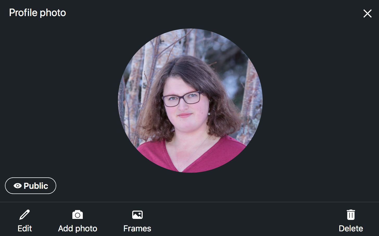
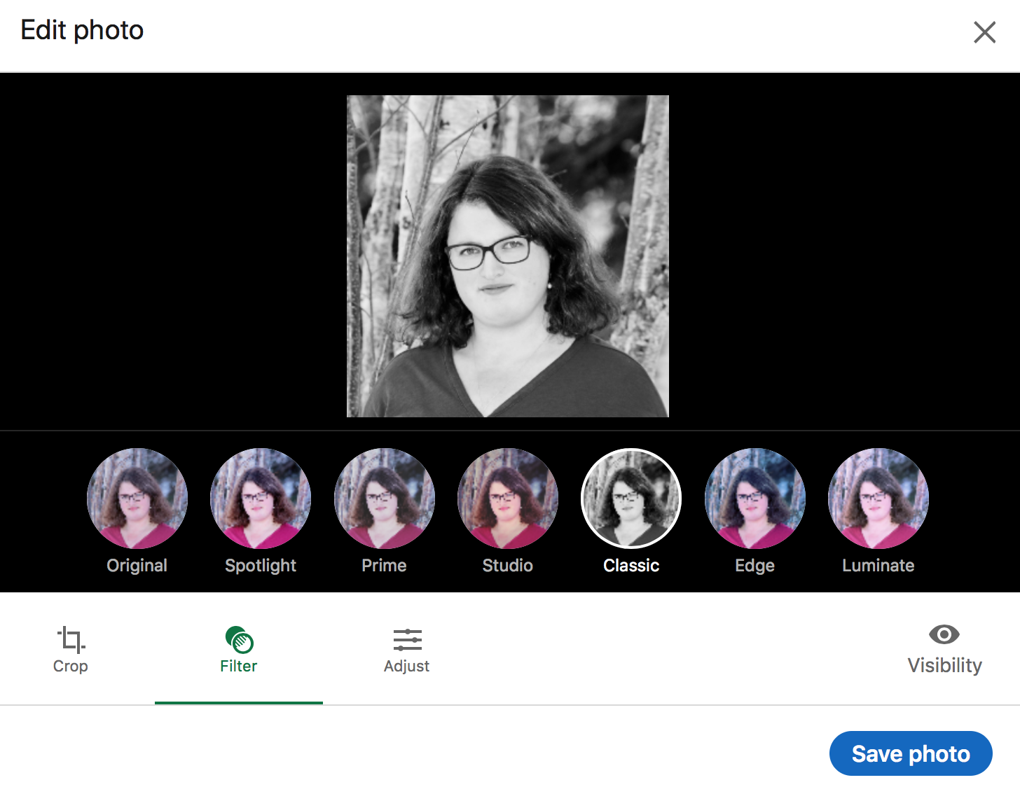
Click directly on your profile photo. This window will pop up:
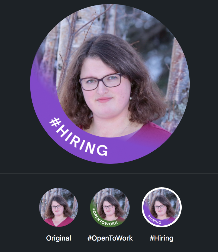
From here, you can edit the existing photo, add a new one, or even choose a frame to go over the picture.
LinkedIn offers two frame choices: #Hiring and #OpenToWork.
This is also the place where you can apply a filter to your photo.
For best results, use a high-resolution photo that’s 400×400 pixels. These are LinkedIn’s recommended profile picture dimensions.
Whatever you do, don’t upload a photo that isn’t an image of you. LinkedIn will remove images of words, landscapes, animals, and company logos.
Cover photos
Now that you know what to use as your LinkedIn profile picture, what should you do about your cover photo? Leave it blank? Add a landscape? What’s the point of a cover photo anyway?
Why add a cover photo on LinkedIn?
Think of your cover photo as the spirited sibling to your profile photo. She reinforces the best parts of you. She’s got a bit more space for personality, and that’s exactly what you should give her.
Your profile photo takes care of the business part of your LinkedIn page. Your cover photo gives your connections and recruiters an extra layer of insight into what makes
It might be tempting to leave the cover image blank, but a drab gray or blue cover photo next to your perfect profile picture won’t leave the best impression.
What does your LinkedIn background image say about you?
Think of the background image as a book cover. It catches the viewer’s eye and draws them in to read the rest of your profile page. And it gives them a sense of who you are as a person.
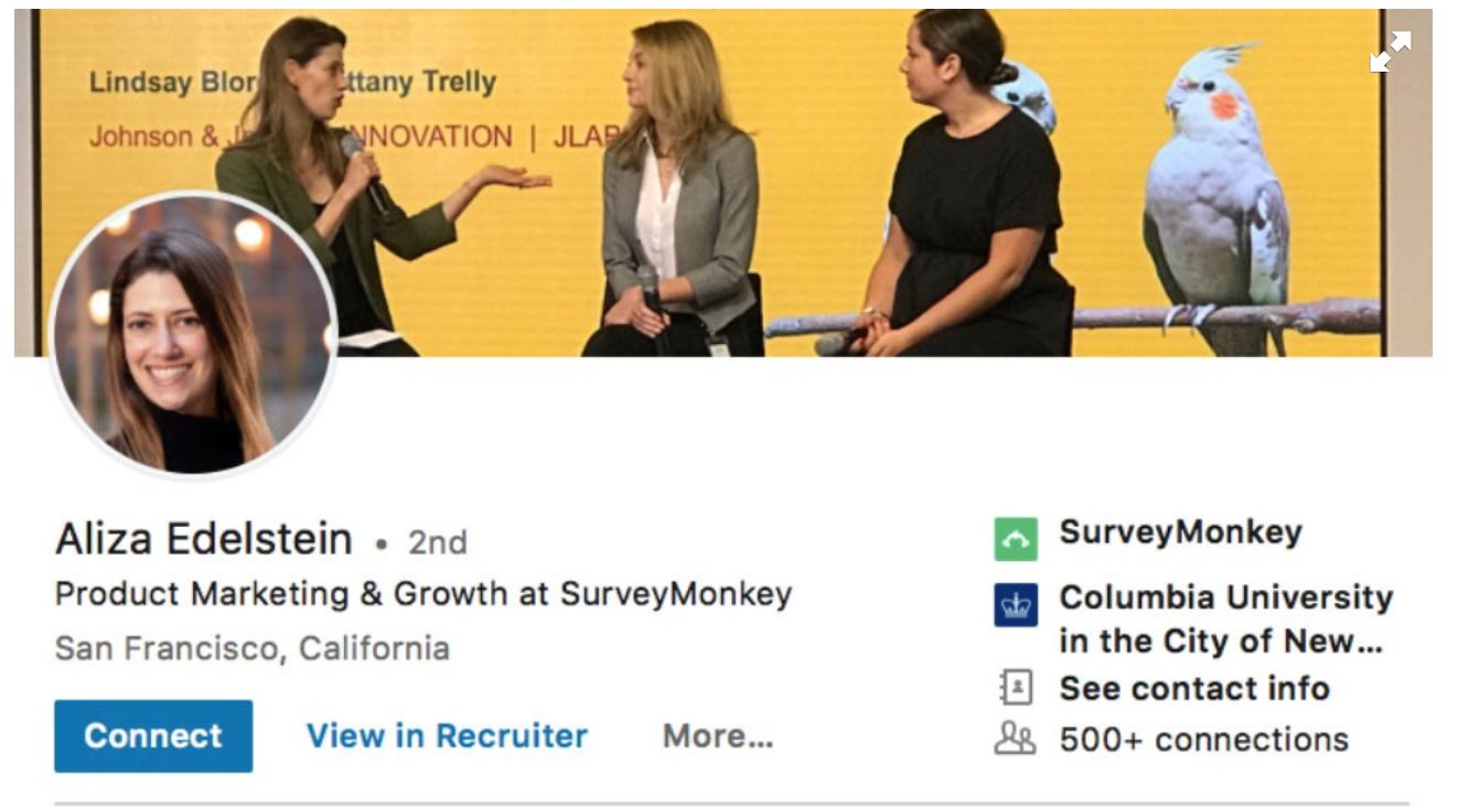
Do you have a photo of you and your coworkers? Use it as your background image to show connections that you work well with others.
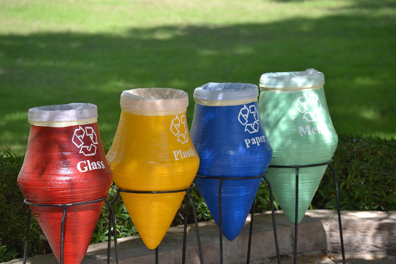
Is your work or personal brand geared towards a particular cause like recycling or clean energy? Choose a background image that reflects that.
You can also show potential clients what your goal is as a professional through your background image. If you’re a speech therapist, you might choose an image of a child happily communicating with a parent, for example.
If you’re considering creating a graphic as your background image that shows viewers a portion of your resume, remember that you’re going to cover those points in the written part of your profile.
What makes a good LinkedIn banner?
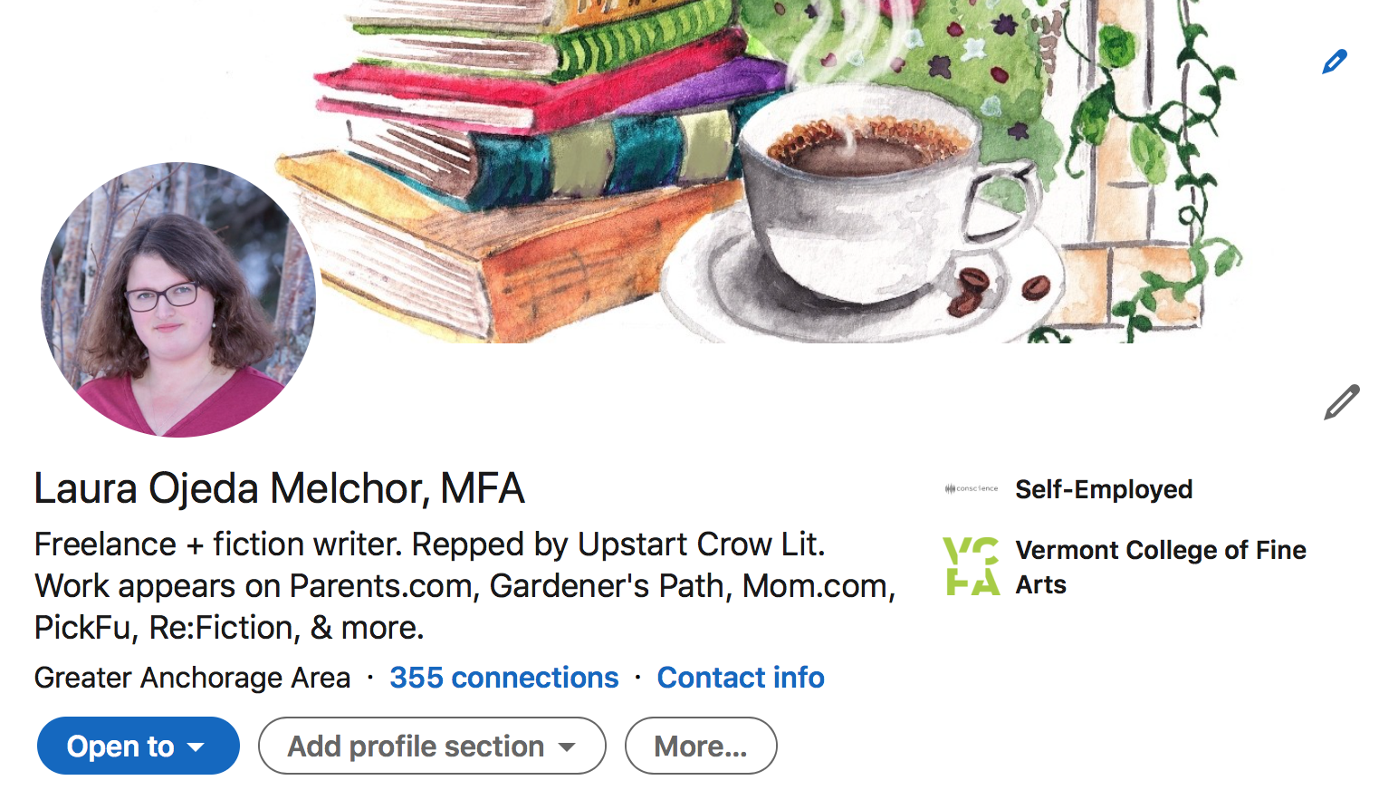
A good LinkedIn banner complements or reinforces your brand. Are you an author? Your latest book cover or a photo of your writing desk would make a perfect banner. Do you teach cycling classes? An image of a person cycling on a gorgeous landscape would attract the eye.
Brainstorm a few ideas, then head to a free site like Unsplash or Pixabay, or a paid site like Getty Images or Shutterstock, to find a high-quality, high-resolution fit.
Play around with a few different images that have varying textures, colors, and styles until you find one that fits your LinkedIn profile. You can work a motivational quote or a favorite line of poetry into your banner. Just try to avoid sounding too salesperson-y, as that might drive potential connections away.
If you have the skill set, use Adobe Photoshop to create a banner that’s unique to you. Canva is a useful option for those without Adobe skills. It offers a free LinkedIn banner template.
If you’re at a loss, choose an abstract image to add interest to your profile. Truly, anything is better than no banner at all.
How to add a cover photo to LinkedIn
Once you’re ready to upload your new photo, navigate to the Me button in the upper right-hand corner and click View Profile.
Click the camera icon on the cover image to upload and edit your photo.
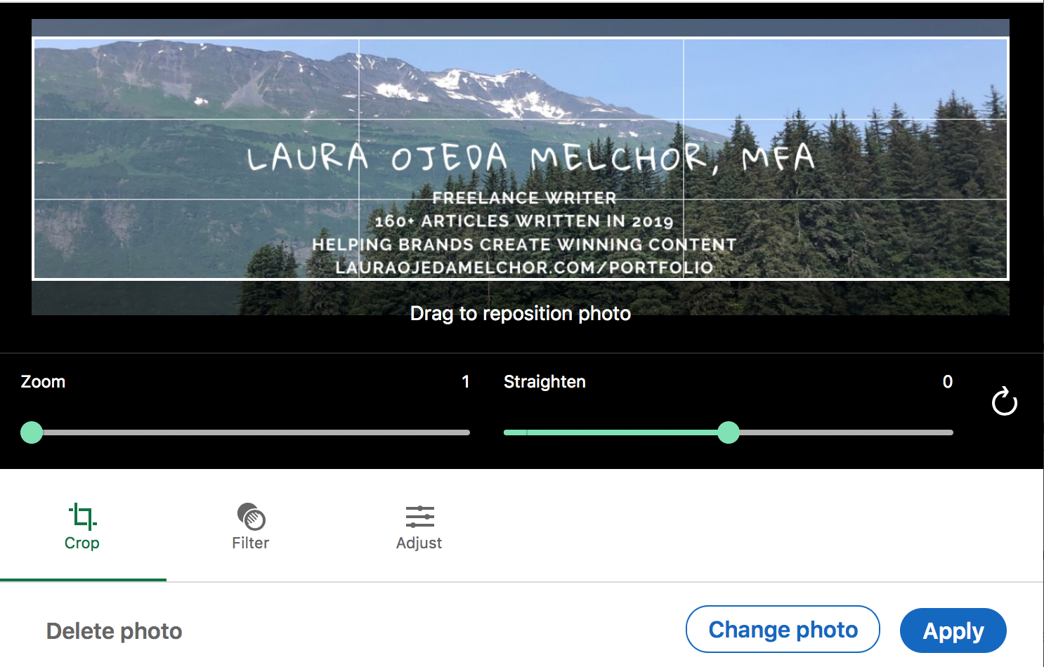
LinkedIn’s recommended dimensions are 1128 (w) x 191 (h) pixels for a cover photo. Upload your new photo, adjust as needed, and voila! You’ve got a new cover photo.
How to use PickFu to choose your LinkedIn profile and cover photos
If you want to make sure that your profile and cover photos will attract connections on LinkedIn, split test them on PickFu with an audience of U.S.-based respondents.
Even better, choose a target audience that reflects the field you work in to get more relevant feedback on your photos. Respondents will vote and submit written comments explaining their vote.
A 50-person poll starts at $50. You’ll start to get results within minutes of publishing your poll.
With this information, you can make the best decision for your LinkedIn cover and profile photos. Happy connecting!
