When it comes to book cover design, it might seem like only the major details matter. But as one author discovered in this PickFu poll, the most minute details can sometimes make the biggest difference.
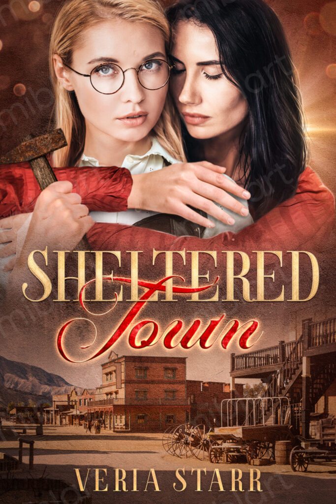
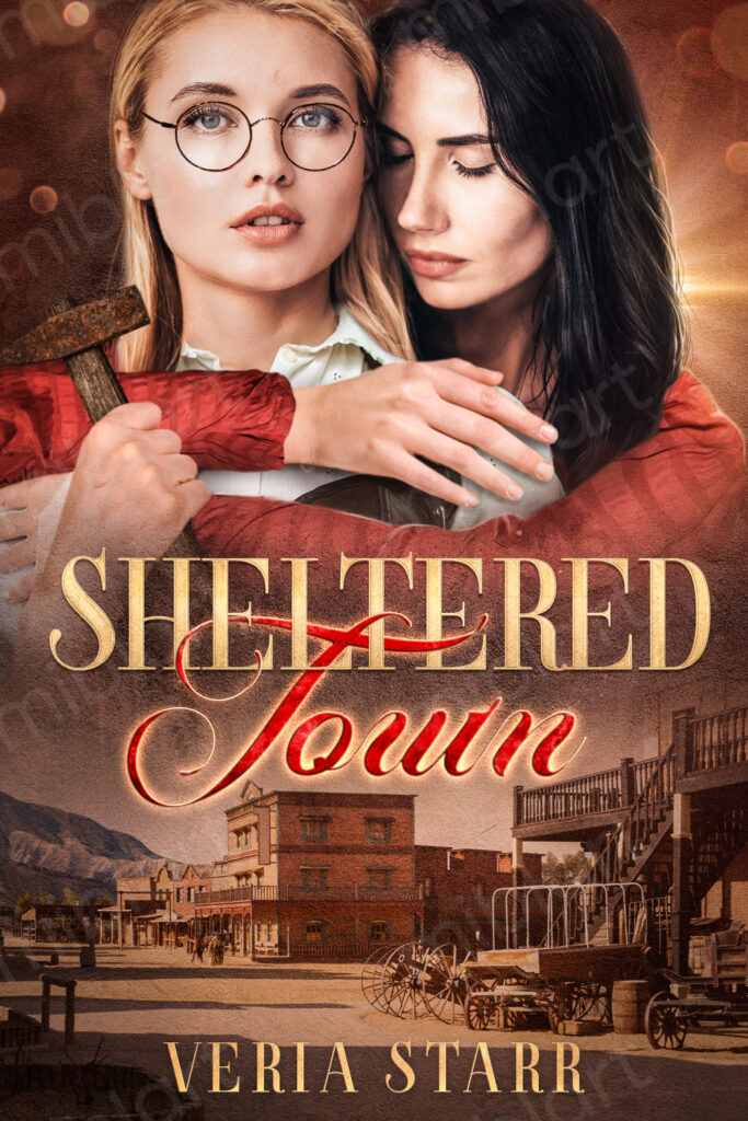
The author asked 50 LBGT+ respondents which of two cover designs they would choose for a book titled, Sheltered Town. Both covers feature one woman embracing another. The only difference is that in Option A, the blonde woman’s head is tilted downward. In Option B, she’s facing the camera head-on.
Can you guess which one won?
And the winner is…Option A, with a score of 68 to Option B’s 32. That’s a hefty win for Option A. Let’s take a look at the results.
The tilted chin is telling
With her slightly unfocused gaze and parted mouth, the blonde woman in Option B looks “dazed” and “detached,” some respondents said.
In Option A, on the other hand, the tilt of her chin makes her look sexy. Alluring. Mysterious. Interesting. Everything a reader could want from what we can assume is a romance novel.
This brings up an interesting point about what the covers convey about the relationship between the two women. It also helps explain why respondents voted the way they did. In Option A, the women appear to be committed to the relationship, whereas it feels one-sided in Option B, some wrote. The brunette woman is almost an afterthought.
But one respondent who said they work in publishing wrote that both covers are “incredibly bad,” in part because the font is difficult to read. This is just one opinion, but it’s something for the author to consider given the respondent’s background.
Other highlights
- The proportion of respondents who voted for Option A increased as income level rose
- The majority of those with a bachelor’s degree or higher preferred Option A, while those with vocational training or a high school degree preferred Option B
- 81% of male respondents preferred Option A, compared to 60.7% of female respondents; the sole nonbinary respondent voted for Option B
What they said
“The cover [Option A] is more intriguing when the blonde’s head is slightly downward, as though there are secrets to reveal!”
“The look on the blonde woman’s face in this cover [Option A] makes me more curious about the relationship that they have.”
“I prefer Option B because I felt that the blonde-haired woman on the cover looked strong and independent. On the cover of Option A, I felt she looked like she was trying too hard to look demure and helpless, which doesn’t go very well with the image of her holding the hammer.”
“By tilting her head down [in Option A], the woman looks like she might be about to do something dramatic with that mallet.”
Key takeaway
Even the smallest differences in the design of a book cover can positively or negatively impact your audience and give them different ideas about the plot and characters.
Make sure the cover complements what’s written on the page. You don’t want to disappoint your reader!
Need help making sure your book attracts readers once it’s out in the world? Check out these resources for self-published authors.
Want to dive deeper?
Results by commonly used words:
Results by race/ethnicity:


