What’s one way to stand out in a saturated market? Create a logo that stands out.
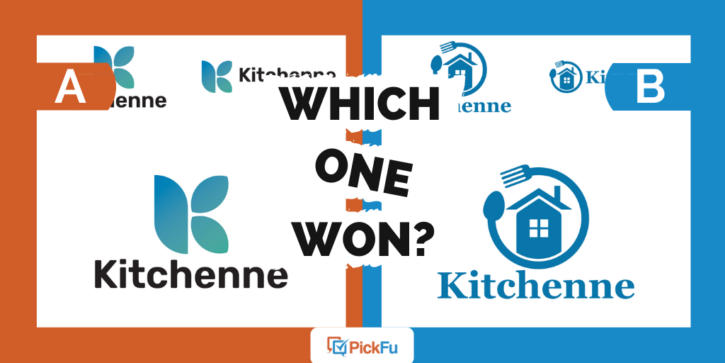
In this PickFu poll, the user asked 50 respondents to rank three sets of logos for a kitchen appliance brand named Kitchenne.
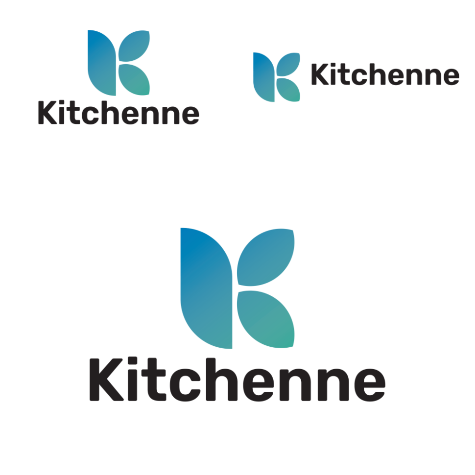
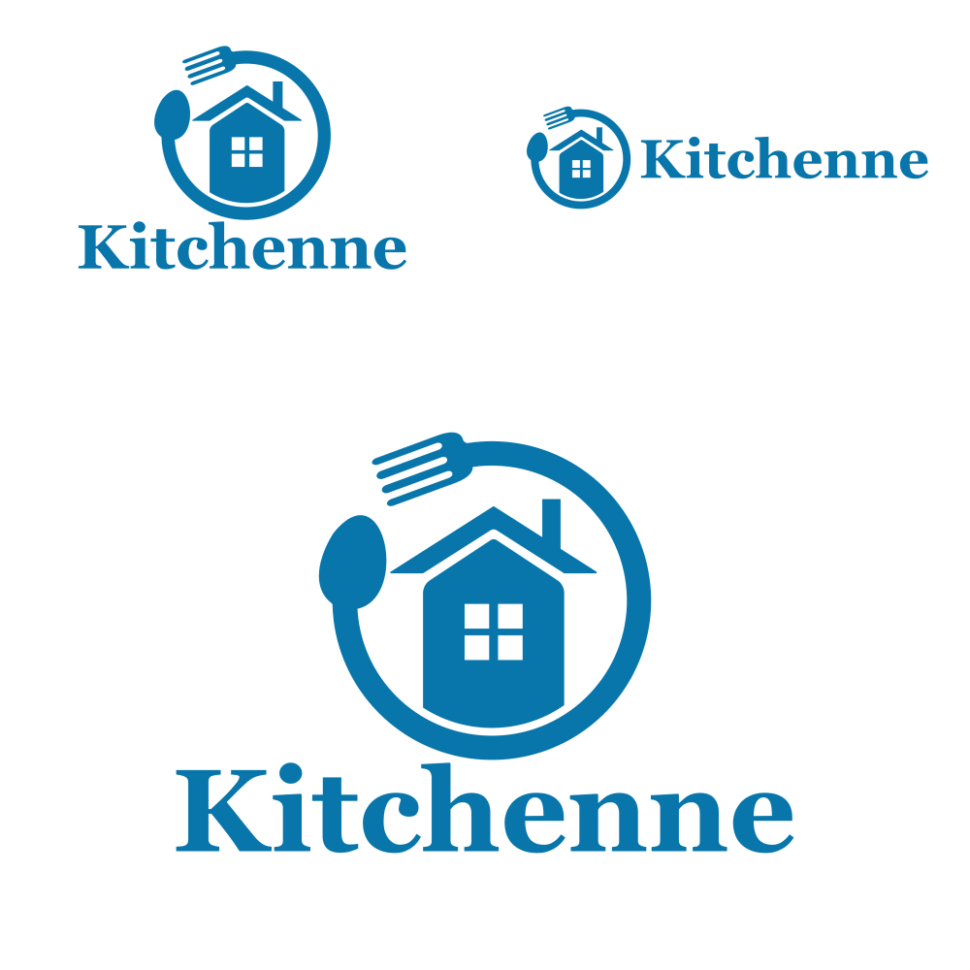
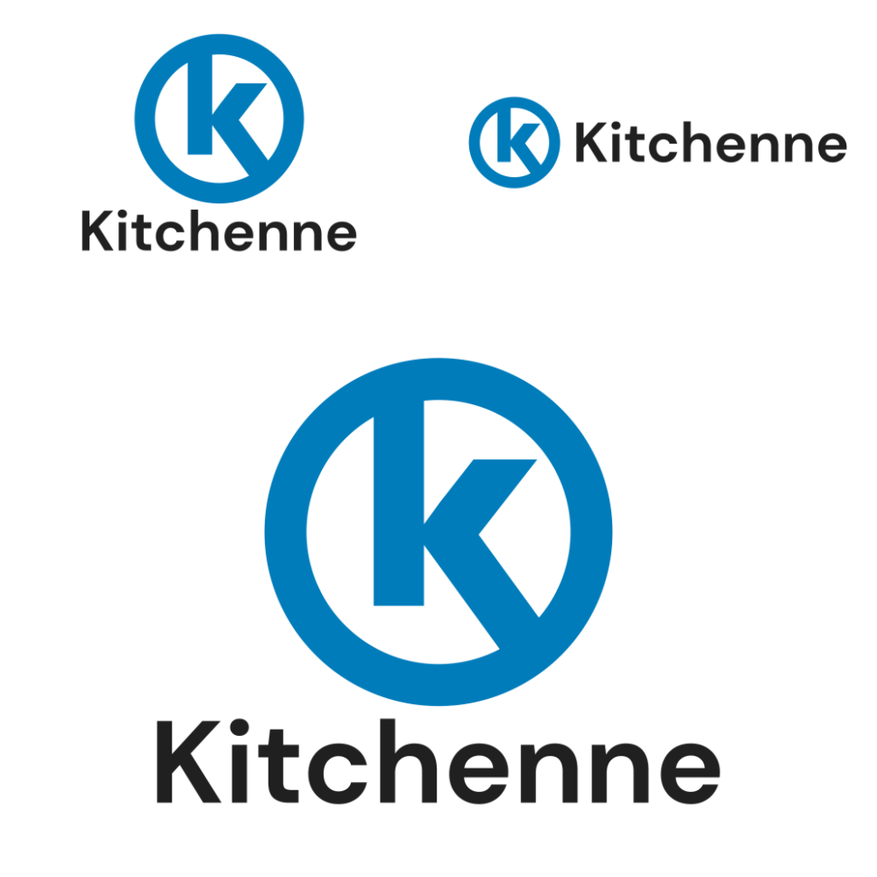
The first logo features a greenish-blue K in a leaf-like shape. In the second design, a spoon and fork form a circle around a house. The third option shows a circle with a K inside.
Can you guess which one won?
And the winner is…Option A with 56% of the vote, edging out Option B’s score of 44. Option C came in last with a score of 16.
Let’s find out why the race was so close between Options A and B.
A gas station or a kitchen supply company?
Several respondents pointed out the similarities between Option C and the logo for the Circle K gas station.
This probably isn’t what the business owner (or Circle K) wants, and it helps explain why Options A and B got more votes than Option C.
As for why respondents preferred Option A over Option B, or vice versa?
Those who voted for Option A liked its color combo and said it looked the most modern while Option B’s fork and spoon motif felt dated.
Option A “gives the feel of high-quality products,” one person wrote. “[Option] B seems cheaply designed and would make me think it’s a knock-off brand.”
On the other hand, respondents who ranked Option B first liked its “homey” design, which they say makes clear what the company sells.
Other highlights
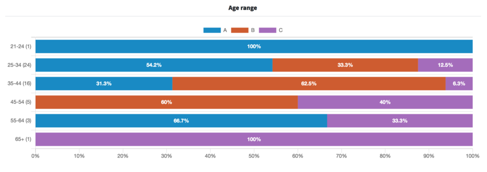
- 35-to-54-year-olds made up the bulk of respondents who preferred Option B
- Female respondents favored Option B over Options A and C, while male respondents ranked Option A first, followed by Options B and C

What they said
“[Option] B is perfect, it sums up what you are doing in the entire logo. I would not go with Option C it looks like the Circle K store.”
“Option B is so cool, and with the fork meeting the spoon, it indicates KITCHEN much more than do the other two options.”
“[Option] A is BY FAR the best. Easy to remember and modern and stylish. Doesn’t look cheap like [Option] C or old fashioned like [Option] B.”
“I really didn’t like any of the choices because they all felt either too ugly and/or did not say anything about the brand. Option A and Option C’s logo does not communicate anything about kitchen appliances or products. Option B’s logo feels way too generic and it feels more fitting for a discount brand of kitchen products.”
“I really appreciate the simplicity of [Option] A and how the blue shifts to green. [Option] C bores me. [Option] B bugs, as I live in an apartment — and truly it doesn’t bug, but it assumes things at a glance and might be a turn off.”
Key takeaways
Which logo should this brand choose? It depends in part on the image they want to convey. Sleek and modern? Cozy and cute? Something else entirely?
A closer review of respondents’ comments would give the brand more insights and might lead it in a different direction. After all, as one person pointed out above, Option B’s culinary logo assumes that those who have kitchens live in detached houses. And while Option A looks modern, what does it have to do with kitchen products?
Is it time to freshen up your brand’s logo? Read our guide on how to test your logo designs to get the best results.
Want to dive deeper?
Results by commonly used words:
Results by age range:
Results by gender identity:
