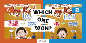
It’s wild how one or two details in a book cover can make a big difference in how people respond to it.
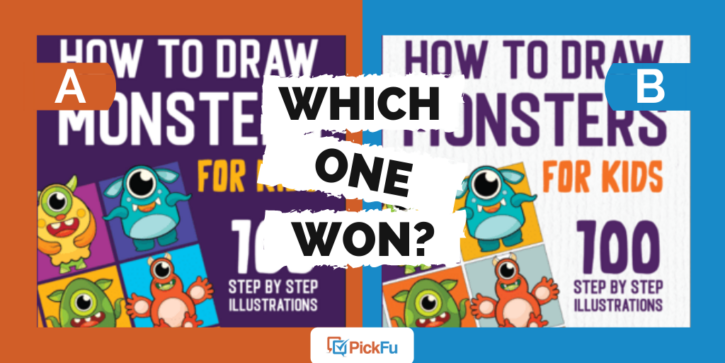
That’s what one PickFu user discovered after testing two cover designs for a kids’ art book, How to Draw Monsters for Kids, with a general audience of 50 people.
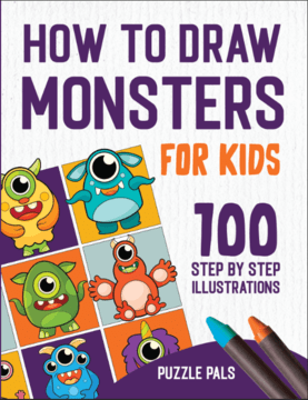
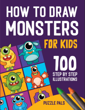
The most obvious difference between the two options is the background color: dark purple (Option A) vs. white (Option B).
Can you guess which one won?
And the winner is…Option A, with a score of 66 to Option B’s 34! Let’s find out what respondents had to say.
Purple really pops
The adorable monsters are hard to miss, but the contrast between the purple background and white title font really made Option A stand out.
That contrast also makes the cover text easier to read, respondents said.
Several people pointed out that white is bland and boring — to kids and adults.
“If I was looking at a store at kids’ books, this would stand out due to the shades of colors,” wrote a male respondent in the 35-44 age group who voted for Option A. “I feel like most books are white and they just blend into each other. [This is] coming from a dad who buys many, many kids books a year.”
(Always, always listen to the people buying books for kids, folks.)
Another small detail made a difference, at least for one respondent. See the color of the crayons? There’s one green and one orange crayon in Option A, whereas Option B trades the green crayon for a blue one.
The respondent who noticed this detail said green “matches the overall scene better” and makes for a better color scheme.
This makes sense when you think about color theory. Opposite colors on the color wheel complement each other, and purple and green are more or less opposites. Purple and blue, on the other hand, are right next to each other on the color wheel.
Other highlights
- 69.4% of male respondents and 53.8% of female respondents preferred Option A, as did the lone non-binary respondent
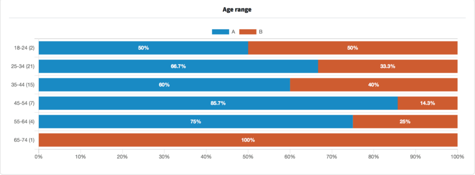
- The majority of respondents ages 25-44, the typical age range for parents of young kids, voted for Option A
What they said
“I chose Option A because I thought that the white text with a purple background was easier to read than the purple text with a white background in Option B.”
“I think the white background’s better because it’s bright and super visible. It makes all the characters stand out.”
“I find high color contrast to be quite visually appealing, and I think children do as well, so I prefer Option A in this comparison. I find white to be quite a plain color, especially in products designed for kids, so I wouldn’t go with Option B here.”
“I chose [Option A] because I like the darker color…Kids love purple and I think they would like the color as well. I think adults would like this book too. I would!!”
Key takeaways
It only takes one look at a playground or indoor play place to know that kids love color. So it stands to reason that they’d like a book with a purple background instead of a plain white one.
Interestingly, the publisher of this book has a similar guide, released in March 2021, on how to draw animals featuring a white background.
The poll for the monster drawing book ran in June 2021. This suggests that the publishing team saw the need for a new approach to the cover design.
That’s what successful businesses do: figure out what is and isn’t working, make changes, and gather feedback along the way.
Check out our guide to split testing for more on how to use testing and consumer feedback to your advantage.
Want to dive deeper?
Results by commonly used words:
Results by age range:
