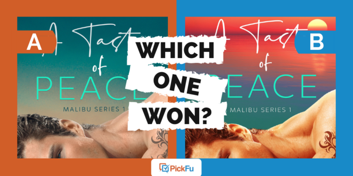
Every romance novel has to have a gorgeous hunk on the cover, right? This PickFu poll comparing two book cover designs confirmed as much — but the user running the poll discovered something surprising in the process.
The poll asked a target audience of 50 romance book readers this question: “Based on the cover, which book would you rather buy?”
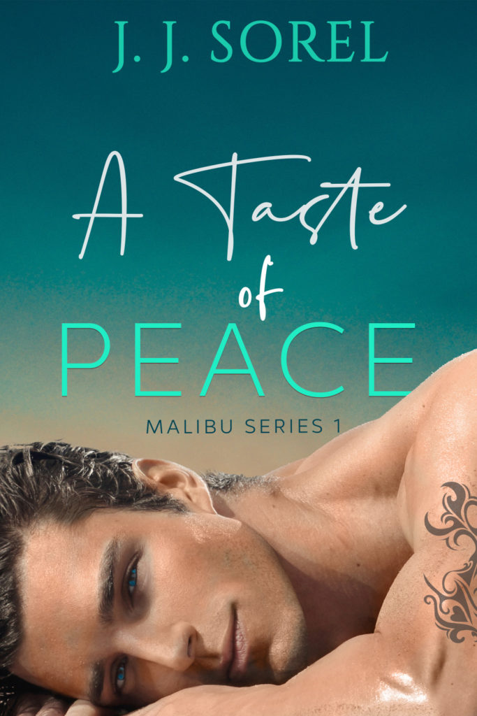
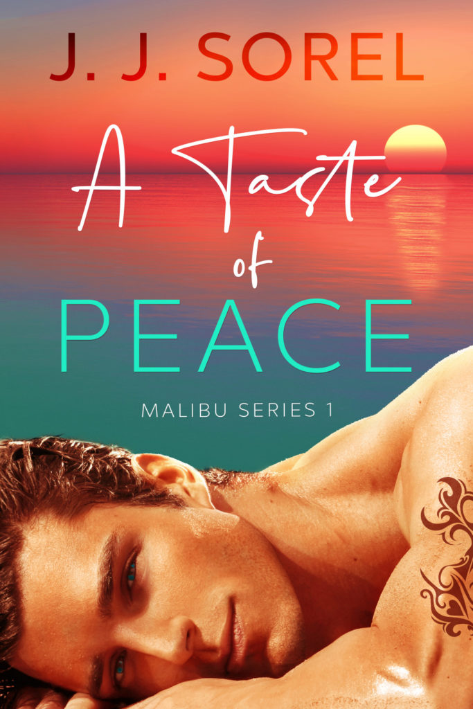
Both covers feature a shirtless man with a tattooed bicep staring smolderingly at the reader, but the colors schemes are different. Option A’s is a cool blue. Option B, on the other hand, has the glow of a fiery sunset.
Can you guess which one won?
And the winner is…Option B! Option A got only 9 votes, for a score of 18 to Option B’s 82. Let’s find out why.
Here comes the sunset
Those who voted for Option A said its “calming” blue and teal tones best fit the book’s title, A Taste of Peace.
Option B’s camp begged to differ. The warm orange glow of the sunset is “romantic,” “sultry,” and “sexy,” all essential elements of a juicy romance novel. Plus, it’s a very Southern California vibe, respondents said, noting the Malibu Series part of the book’s title.
“I love how the sun is setting and turning the sky orange in this cover since that makes it feel very much like Malibu,” one person wrote.
Still, while Option B was the favorite, it has its flaws, respondents said.
“Option B seems more fun and interesting, even though the guy is orange. I would tone down the filter on him,” one suggested.
“The gradient of [Option] B grabs my attention. The tattoo on both covers looks fake and should be photoshopped better,” said another.
Other highlights
- The word love was mentioned nine times — all by female respondents
- About half of the people who voted for Option B mentioned the word sunset
- As respondents’ income level rose, so did their preference for Option B
What they said
“I prefer the background of Option B. However, I would recommend using the photo of the guy from Option A. The guy in Option B looks unnaturally orange.”
“The blue [on Option A] looks a little more classy, the red has almost a bit of a trashy feel to it on [Option] B.”
“I love the sunset on the cover of [Option] B.
Also the man’s skin tone is warmer. He looks like a vampire in [Option] A.”“I love the lighting of this book. [Option B] looks very warm and comforting. It is the kind that I would want to open every time I am free to read.”
“I prefer [Option] B because the sunset adds extra details to the book cover. May I suggest the author’s name be in black.”
“I like the sunset in Option B more, it feels much more Malibu. I think the sans serif font of Option B for the author works better as well.”
Key takeaways
Even if your two top cover options are similar, test them with your target readers. You might be surprised by how much they prefer one cover over the other.
Also, read the comments thoroughly and take note of critiques and suggestions, even from those in favor of the winning option.
In this case, the designer has an opportunity to fix the issues in Option B — the overly orange man, the fake-looking tattoo — before sending this romance novel out into the world.
Want to dive deeper?
See responses by commonly used words:
See responses filtered by gender (there were no non-binary respondents in this poll):
Want to find out how to pick the best cover for your audience? Learn more in our article about split testing book covers, titles, and blurbs.
