Along with optimizing your app’s name, writing an app description that sells, and choosing a memorable app icon, mobile apps also need to think about what app store screenshots will best entice users to download. I asked successful app developers for their advice on screenshots, and these common themes emerged.
Your screenshots don’t have to be actual screenshots
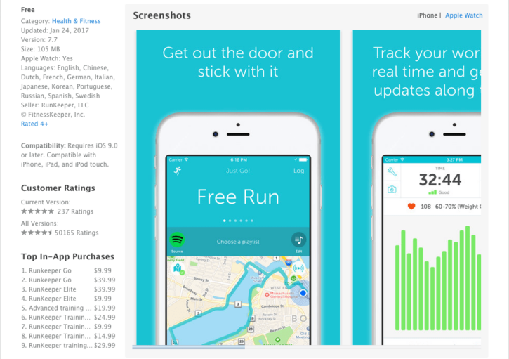
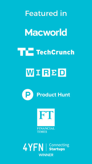
“The greatest misconception about app store screenshots is that they actually need to be screenshots!,” says Jonathan Kerns, co-founder of Comparakeet. Hugh Kimora of Mobile Action agrees, noting, “the biggest mistake is taking screenshots of random screens or menu screens inside the app and not highlighting a specific benefit.” Instead, he suggests, “Use a text banner to specify the exact benefit of the app that you are trying to highlight in each screenshot.” In addition, Kerns advises, “Take a look at major gaming apps and the types of things that they do for inspiration. Incorporate a mix of imagery from within the app with short marketing messages and calls to action.” One such marketing message, says Adam Davis, CMO of Thingthing, is to “have one screen showcasing any awards or press coverage you’ve had by adding their badges and logos. This can be very powerful as it adds a great deal of credibility to your app.”
Focus on the user’s goal
“The screen shots must be of screens that show how the user gets the most value from the app or has the most fun if it is a game,” asserts Alex Genadinik of Problemio. “Show users succeeding in what the person who is looking at the screen shots wants to succeed in – like losing weight or being on vacation. Inspiring images will make people imagine getting the benefit of the app.” You should also list the most important product benefits first. “The first two screens are what are immediately seen in your app store listing (and part of the third in the Google Play Store),” Davis says. “Put your strongest selling points here.”

One of Clumsy Ninja’s screenshots
Maximize the real estate
“Fill all of the screenshot slots,” implores Kimora. “Be sure to optimize for screen orientation. For example, if you have an iPhone app, portrait screenshots might work best.” He also adds, “app developers should make sure that their screenshots can be seen clearly on smaller devices.” Davis recommends another way to use all of the available space: “A common mistake I see is including the phone in your image when it isn’t needed. Losing the phone from the images allows you to make your screen area bigger and draw more attention to the value of your app.”
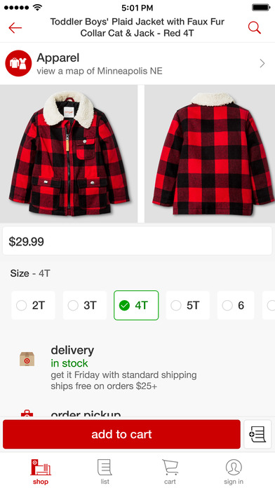
One of Target’s screenshots
Use the right App Store screenshot size
In the iOS App Store, you can create sets of screenshots for all device types. The smallest is the 5.5″ iPhone display; the largest is for the 12.9″ iPad display. You’ll need to provide at least these two sets, but it’s a good idea to include other sizes as well. See the complete list of App Store screenshot size specifications.
Use a screenshot generator
If you don’t have design resources in-house, consider a screenshot generator. “These tools allow you to choose backgrounds and titles for each screenshot, which can help sell users on the app’s key benefits,” says George Hartley, Director of SmartrMail.
Some tools that interviewees recommend include
Experiment and test
“Try something new now and then, and ensure your screens stay fresh,” Davis recommends. “In the Google Play Store, for example, you can use one large image in place of 2-3 screens, effectively testing a large format display ad. You can also be creative with your imagery, visually connecting one image to the next and creating a journey for viewers to follow.” Another idea is to “test the order of your images and key selling points. Try putting awards and recognition in the first or second position, and see if it boosts your downloads.”
“You may need to do a lot of testing before you find something that works well,” adds Kimora. For instance, “test a video in your first screenshot position. It might work better.”
Rather than losing valuable time waiting for approvals, conduct tests outside of the app stores, using software like PickFu. Gauge which screenshots users like better, and gain an understanding of how respondents interpret your marketing messages by reading through dozens — even hundreds — of their unbiased comments. You can target respondents by iOS or Android device, or poll mobile gamers, starting at only $20. We also sometimes have coupons and promotions (as high as 50% off), see our promos and coupons page for more information!
Do you have any further suggestions for app store screenshots? Include them in the comments, or tweet us @PickFu.
