Chandrima Das, the
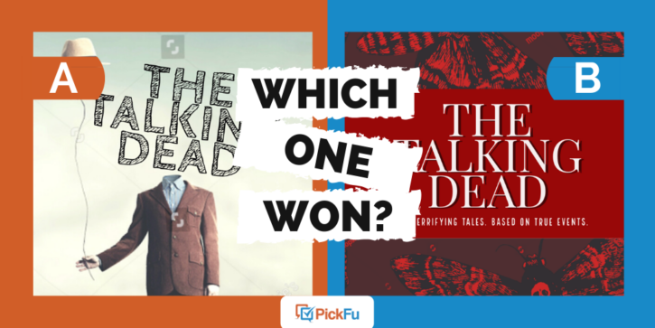
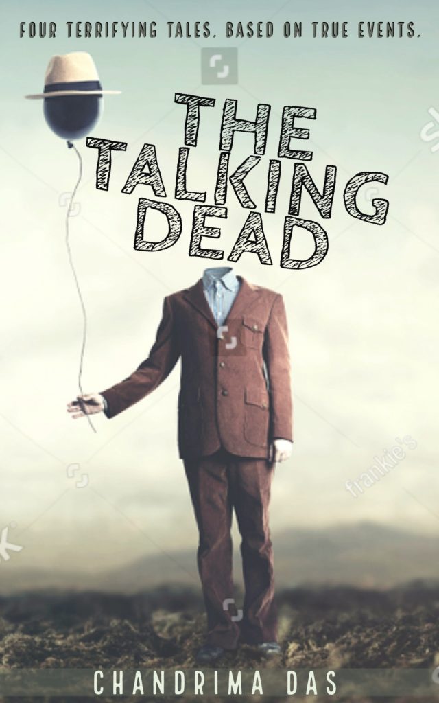
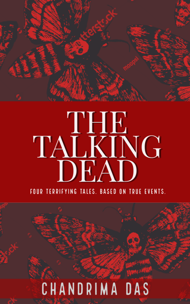
Option A features a headless man holding a balloon with a hat on it. This creepy image is made spookier by the weirdly fun title font. In Option B, the headless man is gone. In his stead, there’s a blood-red cover with a centered title in a classic font, with deeply creepy skeleton moths hovering around it.
Can you guess which one won?
And the winner is…Option A! With a score of 74 to Option B’s 26, there’s no doubt which of these horror book covers the author should go with.
Let’s find out why these fiction readers preferred the headless man in a suit.
It’s ‘whimsical in a horrifying way’
Respondents loved the mix of whimsy and creepy in Option A. The headless man is unsettling, but there’s also room for levity. Humor, even. Something more complex and nuanced than a slasher horror book.
Said one respondent, “This cover calls to me as being more creative. It is whimsical in a horrifying way. The other cover seemed too generic and was way too red.”
Another added, “The picture makes it look like a thriller without being too scary. Option B’s picture is too dark and disturbing.”
The headless man is just plain eye-catching
One young male said, “The headless man looks really cool and spooky.”
Another male said, “I was captivated by this book cover as soon as the page loaded.”
That’s definitely what an author wants
As one respondent said, Option A “looks different than what you can expect in general. I think the balloon as the head is a nice touch. I would definitely pick this book up to find out more about it.”
“Silence of the Lambs” already took the moths
If you’ve ever seen the movie poster for Silence of the Lambs, you’ll recognize the disturbing moths on Option B. This made the red cover a lot less unique to PickFu respondents.
One male said, “I’d be more likely to pick [Option A] up rather than the moths because I would assume the moths were a Silence of the Lambs connection.”
Another added that Option A “seems more interesting and less like a knockoff of Silence of the Lambs.”
In short, the moths have been taken. To many, they’re no longer original. And combined with the red cover, the effect is simply too much for some fiction readers: “[Option B] is too creepy for me and would give me nightmares just having the book in my house with that picture.”
Horror book covers: key takeaways
Literary fiction readers want something scary and weird yet unexpected in a thriller/murder book, and that’s what Option A’s cover delivers. Plus, it doesn’t borrow themes from a widely known (and feared) film, giving readers an impression the author may not have meant to give.
Can we all agree that pretty much any of us would pick up Option A if we saw it in a store? That cover, with that title, is a perfect combo.
Do you need help finding the perfect cover for your thriller? Create your own PickFu poll and test your ideas with an audience of fiction readers for quick, meaningful results.


