Have you ever wondered if pop culture trends can help you create fantasy book covers that sell? This week’s featured poll might help you decide.
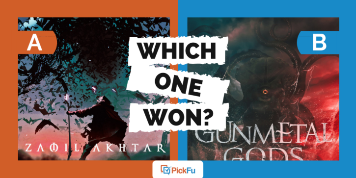
An author recently split-tested two fantasy book covers on PickFu, asking a group of fiction readers, “Based on the cover, which epic fantasy novel would you buy?”
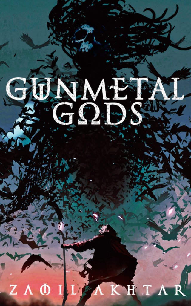
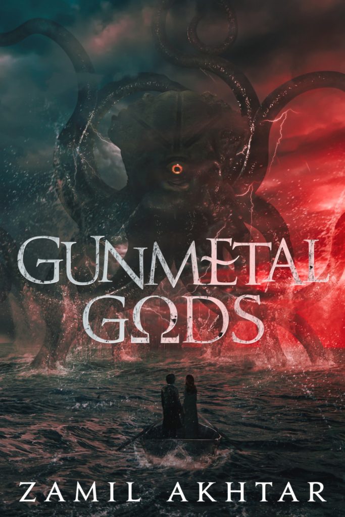
In Option A, a skeleton engulfed in birds towers over a person. In Option B, a giant squid-octopus monster rises out of the sea, facing down what appear to be a man and a woman.
Can you guess which one won?
And the winner is…Option B, with a total of 62 points to Option A’s 38. Let’s see what PickFu respondents had to say.
Dreams of ‘Stranger Things’
If you saw Option B and instantly thought of the Demogorgon from the hit sci-fi TV series “Stranger Things,” you’re not alone. The octopus-creature isn’t a carbon copy of the monster from the show, but something about it brings “Stranger Things” to mind.
Said one male fiction reader, “[Option B] makes me think more ‘Stranger Things’ as far as coloring/monster design. I really enjoyed that series, and I love the color palette.”
Other fiction readers also loved the monster. “Seeing the gigantic sea monster really makes the image jump out to me and it makes me want to learn more about this story,” said another male.
Part of what makes “Stranger Things” such a hit is that it appears to be based in a realistic world, one with a terrifying flip side. Option B achieves something similar, with one respondent saying, “I prefer [Option B] because it has a higher degree of realism and I can better place myself into the scenario.”
Characters on the cover
If the book has two main characters, readers want to know this from the start.
“The image of the two people changes my perception of the book,” said one reader. “It looks like some kind of adventure book in [Option B].”
Another respondent thought that the couple in the boat hinted at romance. “It looks like [Option B] is a romantic fantasy and this intriguing to me.”
Said one female, “I like that [in Option B] there are two people on a boat and they seem helpless. It’s more appealing than the man screaming at the birds.”
In short, having a couple on the cover hints at romance, adventure, and true danger. If you have these elements in your fantasy novel, include them on the cover. There’s not just one person to think about, but two. And in the case of this particular book cover, the sea monster is a whole lot bigger than the people are, making for some delicious tension and terror.
Easy-to-read font
Several respondents pointed out that the author-name font in Option A obscures the m, “making it look like the author’s name is ZAOIL instead of Zamil.” Adds one respondent, “[It] helps sales when people can read your name.”
Always make sure that whatever font you use is easy to read, whether it’s for the author’s name or the title.
Fantasy book covers: key takeaways
If it fits your book’s theme, alluding to a pop culture reference in the cover design can help readers feel familiar with and attracted to your book, even if they can’t place why.
And if your fantasy fiction book features two characters in any sort of relationship, featuring them both on the cover — especially in a tense situation — is a win.
Are you ready to split-test book covers for your fantasy novel? Get started by creating a poll on PickFu today. And if you’re stuck in the writing phase, check out our guide to how to start a fantasy novel.


