Purchasing a product is a visual activity. When you’re shopping in a store, you might pick an object up and turn it over a few times in your hands. You examine the packaging, how the product feels, and its overall visual impact. While the features and price of the product will help you to make your purchasing decision, around 93% of your choice to spend money will depend on visuals alone.
In the online shopping world, visuals are even more important. When you’re browsing through products online, you don’t have the ambiance of the store to influence your decisions or a customer service rep to answer your questions. You have to rely on the e-commerce photography provided in the listing.
With images so critical to online sales, how can sellers make sure that they’re creating the right kind of imagery? Follow these five tips.
1. Get that crucial white background shot right
Marketplaces like Google Shopping and Amazon demand white backgrounds for products to be successfully listed.
From an aesthetic perspective, a white background offers a clean, professional finish. It also means that the smallest details of your product can stand out.
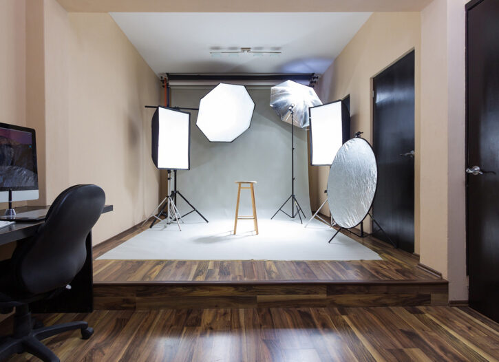
Using a shooting tent or curved backdrop (sometimes called a cyclorama or an infinity background) gives the background imperceptible edges, reducing shadows and canceling out any sharp angles that leave your image looking less than perfect.
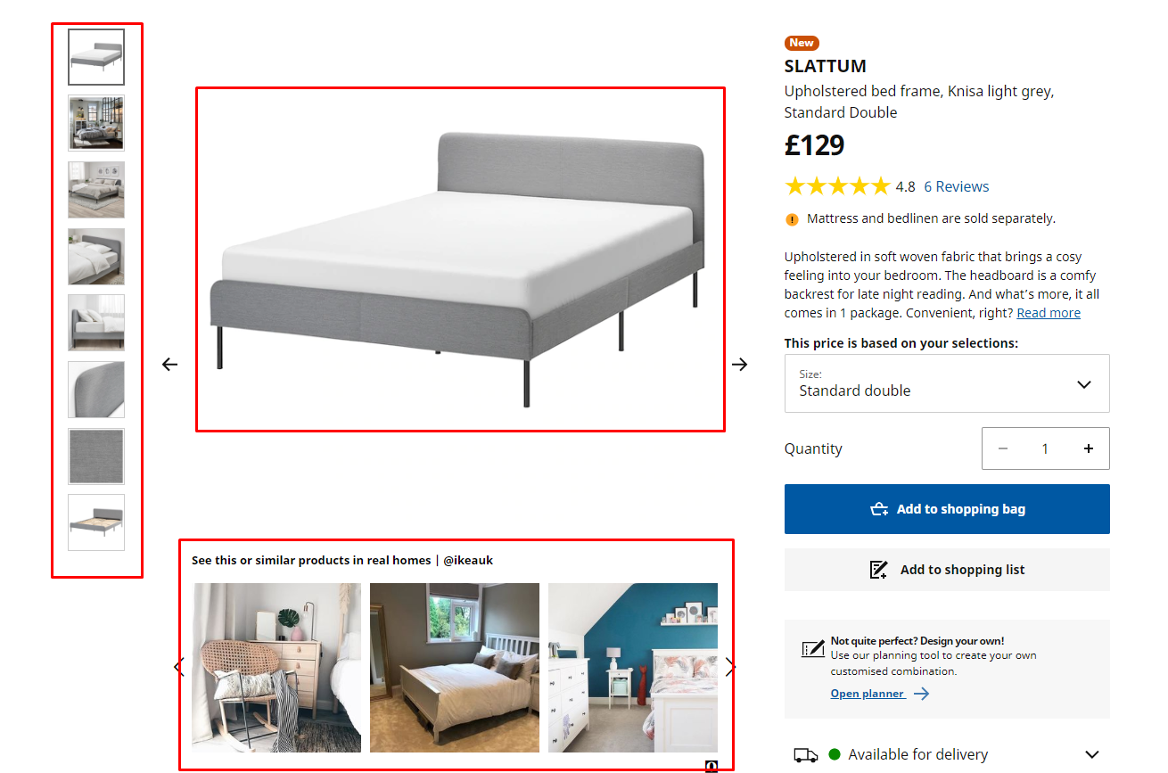
Supplement your white background shots with secondary images with your products in their lifestyle environments. Ikea, for example, gives shoppers the option to see its bed against a white background, in a bedroom setting, and even in user-generated customer photos too:
2. Use lighting to impart character onto your e-commerce photography
I’ve written before on just how vital lighting can be to your product images. But lighting will make a difference to the images on any page of your website. Whether you’re creating pictures for the “About Us” section of your site, or you’re snapping hero images for your homepage, lighting is what determines whether your photos are inviting or daunting. Too many shadows and dark points in your pictures make them appear mysterious — and not in a good way.
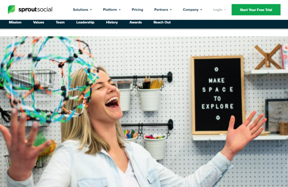
Notice how bright but still natural-looking this picture from the “About Us” page on Sprout Social is:
Many products photograph well in natural light, but if you can’t get the right blend of soft highlights and shadows, consider using a lightbox.
Another good option is to use a flash diffuser to avoid overcast shadows on your images. If you don’t have a professional diffuser, simply position a white plastic bag over the flash to make sure that the flash is larger than the product.
3. Capture your e-commerce photography in high resolution
While it’s sometimes tempting to save your images in a smaller file, the last thing you want is to sacrifice picture quality to lossy compression. Have you ever browsed a product page on Amazon, clicked on the “view larger” option, and gotten the picture in the same size? Well, then you know how annoying an overly-compressed image can be.
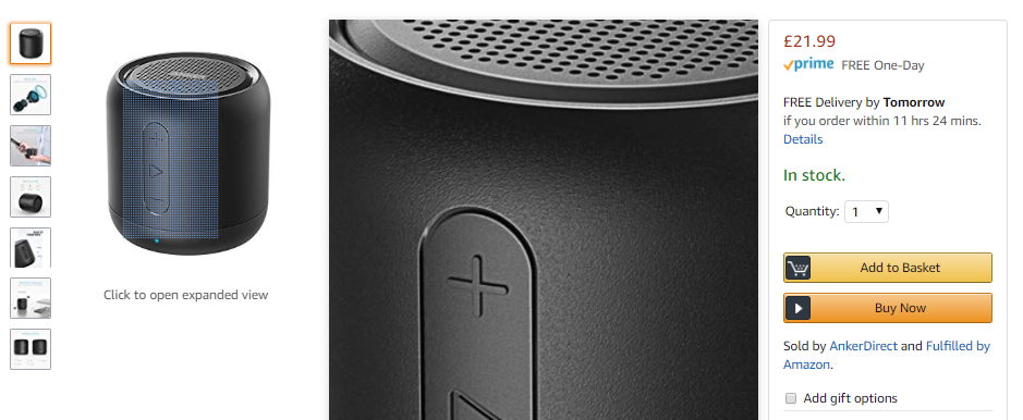
Customers want large, high-quality images to make their purchasing decisions. The ability to enlarge the pictures to see details and texture will give your product credibility and a touch of drama. If possible, when you’re designing your e-commerce store, favor layouts with large product images. Leave plenty of room on each page for a dominant image, and give customers the option to zoom in. Look at how you can easily zoom into parts of a product on Amazon, for instance:
You can always compress an image to the right size after you’ve captured it in the highest possible quality. However, you can’t add pixels or improve the quality of an image that’s already been taken.
4. Take shots from lots of different angles
Capture your product from every conceivable angle. For a theatrical effect, for example, try placing the camera below the product and shooting upwards.
There are two reasons why taking shots from different angles is a good idea. First, having lots of options means you can run your images by people on your team and see which ones make the most impact (and then test them on PickFu to make sure their hunches were right!)
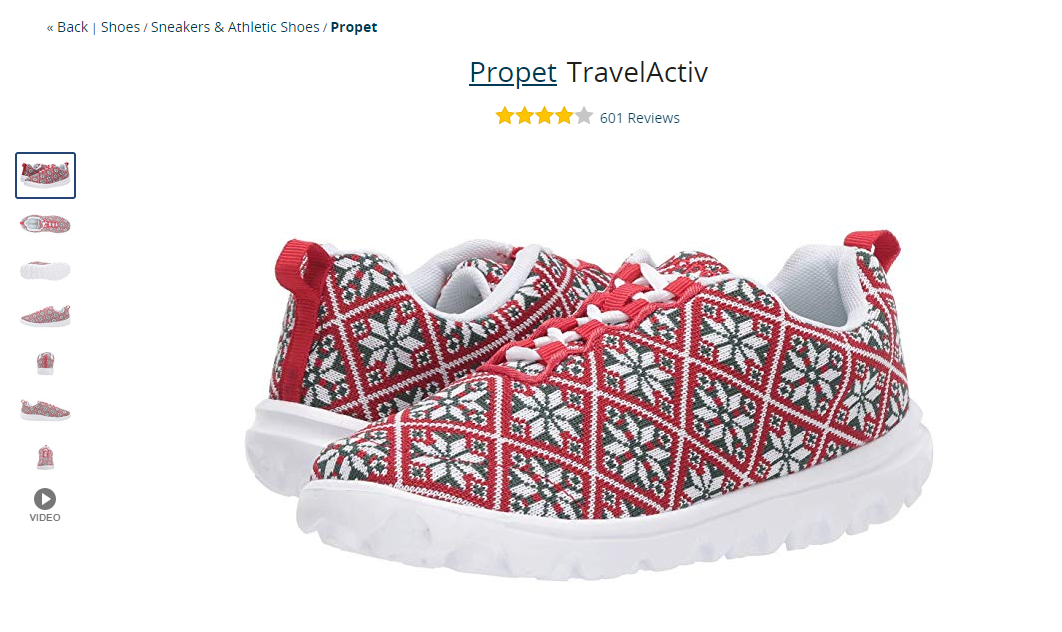
Secondly, when you take pictures of your products from multiple angles, you give your customers a more complete overview of what they’re buying. In a brick-and-mortar store, customers can pick up an item and examine it from all sides. Online, alternate angles give you a way to showcase all of the features of your products.
Zappos is excellent at showing products from multiple angles, as you can see below:
When you’re taking photos for other parts of your e-commerce site, like your Contact page or your hero images, think about which angles present your brand in the most fitting way.
5. Stay consistent across products
It’s a good idea to play around with different angles and e-commerce photography formats when you’re first getting started. But once you find a look that works for you, stick with it. After you’ve picked the best background and selection of angles for your products, maintain the same look from one page to the next.
Your customer doesn’t want to be bombarded with a different selection of images with every product they click on. They want to get the same visual experience wherever they land on your website, even though they may be looking at different products.
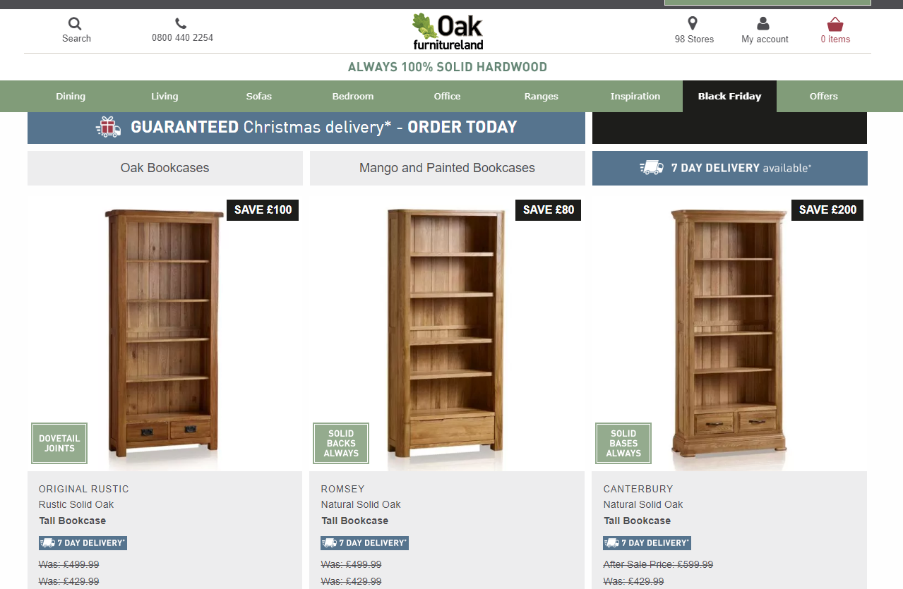
Though you want to leave room for dynamism and creativity, everything should seem as though it belongs in the same photoshoot. Consistency ensures that your customers are getting answers to all of the questions they may have about your products or company, and it gives your website an ownable look.
Look at how seamless the collections are on the Oak Furnitureland website, for instance:
What tips would you add for e-commerce photography? Sound off in the comments!
