If you write an e-book, you might assume you can get away with spending less time on your book cover than someone who’s publishing a physical book.
But e-book covers matter just as much as physical book covers. When potential customers browse an online selection, the cover is the first thing they see. For some books, covers are especially important because they reflect what the book is selling.
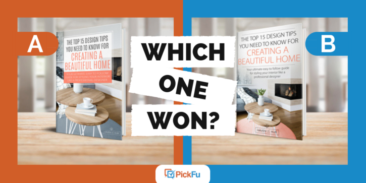
Take this recent PickFu poll, run by the author of a DIY interior design e-book aimed at women. The pollster created a ranked poll on PickFu to find out which of their covers attracted the audience best.
Option A features a book cover with a tidy text box against a clean, modern-looking room. You can’t see a whole lot of the home because the focus is on the tables, but the title and subtitle look professional.
Option B removes the box and shifts the title upward, helping potential readers to see more of the room.
Option C introduces new font colors and shifts a banner of text over the fireplace.
Can you guess which one won?
And the winner is…Option B! With a total score of 64, Option B came out far ahead of Option A’s 36 points and Option C’s 28.
In a book about creating a beautiful home, coziness is key
Several respondents loved how the cover in Option B allowed the fire in the fireplace to claim noticeable space. In Options A and C, you can’t see the fireplace because something’s blocking it.
Because the book is about creating a lovely home, readers liked seeing a cozy fire light up the room. One respondent said, “I think [Option] B showing the fireplace in the background shows more what a ‘beautiful home’ looks like and more subject-related than [Options] A or C.”
Another respondent agreed that Option B allows the room’s homey feeling to shine: “I like [Option] B the best because it doesn’t cut off the flowers in the vase.”
These small details are more important than you might’ve guessed.
Less clutter is always better
Lots of respondents felt that Option C squished too much onto the page. They also felt that Option A packed too many words into its salmon-colored box.
Option B, on the other hand, allows the room to share the spotlight.
Said one respondent, “I think [Option B] makes the [home] scene more noticeable so I would be more likely to think the book has something useful to tell me.”
By placing the text in such a way that the room had space to breathe, readers felt the book had valuable information to share with them.
Another respondent added that she chose Option B as her favorite because she preferred “the photo of the room less obscured by the text of the book’s title.”
Key takeaways
When you write an e-book that holds the answer to a specific set of problems, put the answer to that problem on the cover. For this author, the problem being solved is a cluttered, poorly designed house.
So in the winning cover, a cozy, modern, clean room is on full display. Readers will click on the cover and drop the book into their shopping carts because they need to know how to get that beautiful homey look for themselves.
Have you written an e-book about a DIY topic? Try testing your different covers on PickFu with a ranked poll to find out which one convinces readers to click and buy.
