Most business owners are interested in books about marketing. But what if you wrote a book about account-based marketing (ABM) — a strategy in which the standard funnel gets flipped on its head — and wanted it to catch a reader’s attention? You’d need to demonstrate the upside-down nature of ABM through creative book cover design ideas.
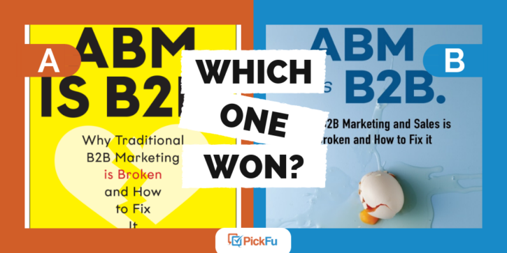
One pair of authors tested two different cover designs for their book, ABM is B2B. Why Traditional Marketing is Broken and How to Fix It in a recent PickFu poll.
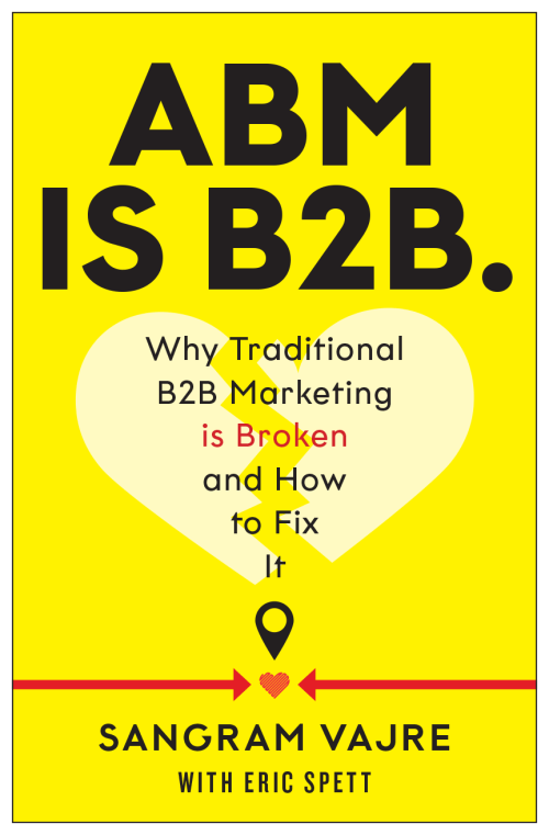
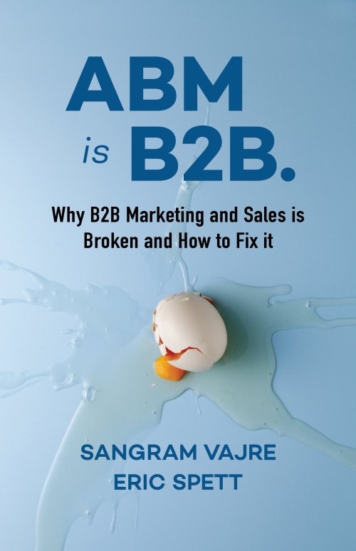
Option A’s bright yellow cover features a broken heart behind the subtitle. Option B features a soft blue cover with an egg cracked in the middle of it.
Can you guess which one won?
And the winner is…Option B! With a score of 72 to Option A’s 28, Option B is the clear winner.
Let’s find out why.
Which of these creative book cover design ideas conveys ABM better?
Several of the respondents who voted for Option A’s eggless cover had strong feelings about the egg on the winning cover. “The egg cover is a bit silly,” said one.
“I don’t think everyone would like to see a broken egg,” said another. Someone else agreed, saying, “The egg on the front looks gross and distracting.”
Even though these respondents felt repulsed by the egg, there were more respondents who loved the egg as a symbol for broken marketing.
“The egg is dramatic and engaging,” said one male. A female called the egg an “incredibly powerful visual.” Most of the respondents who voted for Option B agreed that the broken egg grabs readers’ attention and is a fresh graphic, as opposed to a broken heart.
Broken hearts imply romance
Obviously, a book about account-based marketing isn’t romantic. But many respondents felt that the broken heart behind the subtitle in Option A suggested romance. And that wasn’t a good thing.
Respondents found the heart “very cliched and overdone,” and a strange choice for a book about marketing.
Too-large fonts can swallow a cover design
When picking a font size for a book cover, authors are usually inclined to go large. But if your text is too big, it can overwhelm potential readers. That’s what happened with Option A’s huge title text.
“The type on the [Option A] is actually too large,” wrote a respondent in the 65+ age range. Combined with a bright yellow cover, the large type feels like an assault on the eyes.
Creative book cover design ideas: Key takeaways
Many respondents who voted for Option B loved the egg — it’s an unusual, underused symbol for disaster that fits well with a book on fixing disastrous marketing tactics.
When coming up with creative book cover design ideas, it’s best to stay away from clichéd symbols, such as broken hearts. Find something fresh, fun, and fitting instead. (Like an egg!)
Always make sure that your background colors and font sizes don’t hurt the eye. You want your cover to attract attention, but not the kind that makes people squint and turn away.
Do you have book covers you need to test? Try creating your own PickFu poll to find out which cover images bring potential readers flocking to your work!
