When designing a book cover, it’s important to consider the emotions that you want your audience to feel. This often determines whether the person buys the book.
In other words, people buy with their emotions.
We saw this connection between emotion and book design in a recent PickFu poll.
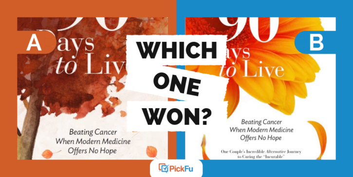
Two authors recently tested two different covers for a book targeted at cancer patients. The authors targeted a female audience and asked which cover they preferred.
Option A shows a painting of a tree with its leaves falling and with a beige background.
Option B shows a photograph of a flower with its petals falling and with a white background.
As a best practice, the text on both cover designs is exactly the same.
Can you guess which one won?
Out of 50 respondents, 24% preferred Option A and 76% preferred Option B.
Brightness & Hope
Almost half of those who preferred Option B used the word bright to describe it. And many respondents connected that brightness with hope. Using PickFu’s text filter on the word hope, we find responses like these:
“The brighter, vibrant color gives a more hopeful feeling.”
“[The] brighter colors seem to fit better with the message of hope the book seems to want to convey.”
“B is brighter, more ‘hopeful.’ I imagine someone battling cancer would be drawn to hopeful items.”
Respondents also connected the bright color scheme with positivity. While 9 respondents who preferred Option B used the word positivity, no one used that word when discussing Option A.
Poll participants made a strong connection to what the book cover looked like to what they felt readers wanted to feel after reading the book. In other words, the book gave them the emotional answers they sought.
Considering Emotions
These responses help show how viewers connect cover components with emotions. Respondents weren’t drawn to the design that showed what the reader might be feeling in that moment. Instead, they preferred the cover that showed what the reader might want to be feeling. In this case, a cancer patient may want to feel a sense of hope, rather than sadness.
Questions to Ask
When designing your own book cover, here are some helpful questions to ask to make sure your cover aligns with your readers’ emotions:
- What emotions do I want my readers to feel?
- What answers are my readers seeking?
- What feelings are my readers hoping to feel right now?
- What colors/images can help depict that feeling?
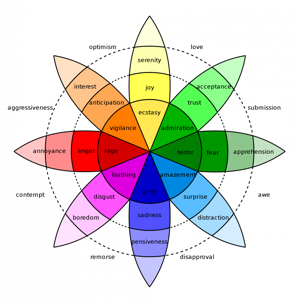
If you aren’t sure which colors connect with which emotions, the Plutchik color wheel is a great tool to use:
[Source: Plutchik, Robert (16 September 1991). “The Emotions”]
Find the colors closest to the emotions that you want your reader to feel and select those colors.
Go Beyond Colors
You can also use the darkness and brightness of your cover to communicate these emotions. As we saw with the 90 Days to Live poll, readers connected the brightness (especially the bright background) with hope. Font size and type are other variables that might impact emotions.
Test Your Book Cover Design
Once you’ve created your design, seek out some idea validation. You can test this with a targeted audience by creating a PickFu poll. Poll how respondents react to covers with different hues and brightness levels until you find your winning cover.


