Congratulations, you’ve created a coloring book. But what’s the best cover art to showcase the coloring book inside?
While it’s tempting to think that you can slap bright colors and fun pictures on a book for kids and call it good, kids are discerning customers. They either like things or they really, really don’t.
So if you’re creating coloring book cover art, you’d better make sure it passes the kid test.
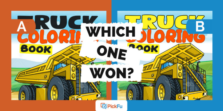
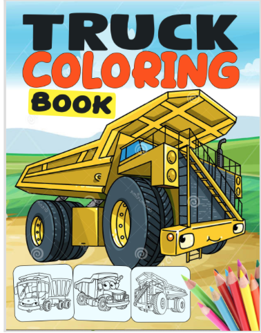
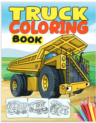
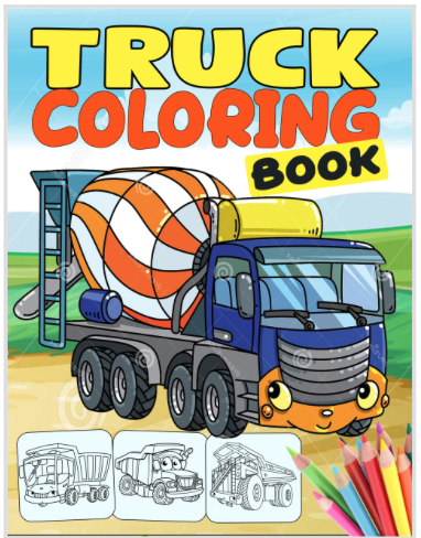
One coloring book author recently took four covers to PickFu, asking a group of 50 moms, “Which book cover is catchier? Which one stands out more and makes you want to buy it?”
Options A and B feature the same yellow tractor, but Option A has a black and red title. Option B features a yellow and red title.
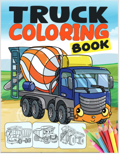
In Options C and D, the truck is a cement mixer. Like in the first two choices, the two have different title colors: Option C has yellow and red coloring while Option D features black and red.
Can you guess which one won?
And the winner is…Option D! The runner-up was Option C.
Here’s what respondents had to say.
Colorful cover art is important
While all the coloring book covers feature bright colors, Option D’s cement mixer allows for more coloring adventure. Respondents felt that kids would enjoy coloring the mixer’s fun stripes.
One woman said, “The more varying color in the cover, the more appealing and eye-catching it is.”
Another added, “I chose my selections based on what I can picture my toddlers asking me to purchase,” saying that “[Option D is] far more creatively inviting for small children who adore monster trucks.”
Even though tons of kids love yellow tractors, your coloring book cover art needs some spice. From the cover alone, kids want to see that the coloring book will challenge them in a fun way.
And parents will look for covers that promise more than just a moment of entertainment for their kids.
Bold font colors are almost always best
The second reason respondents chose Option D? The bold titular font colors.
One woman said, “The black font actually stands out better than the yellow,” and several others chimed in with the same response.
The black font in the word Truck is the only difference between Options C and D, yet Option C scored a 42 to Option D’s 58.
Respondents who voted for Options A and B, where the only difference between the two was the titular font color, also chose Option A with the black font.
In short, a bolder, darker title can make a huge difference in how much a coloring book cover attracts kids and parents alike.
Key takeaways: Coloring book cover art
If you’re designing a coloring or activity book for kids, make sure the front cover suggests the full scope of fun inside. Like any other book, the cover must tantalize readers and make them open the book.
With a coloring book, the pages will be black and white, as-yet-uncolored. This means it’s even more important
Are you creating a coloring book or an activity book for kids? Split-test your covers with a group of moms on PickFu to find out which one your young audience will love the most. Create your first poll today!
