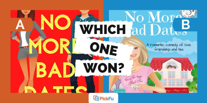
Chick lit is the new chick flick. Or maybe it’s better, because for those who crave the lighthearted humor of a romantic comedy, a book lasts longer. But should chick lit book cover art be as frothy as the subject itself? Bestselling author Kate O’Keeffe took her latest novel to PickFu to find out.
She asked a general audience of respondents the following question: “Which cover do you prefer for a fun, feel-good book about finding love?”
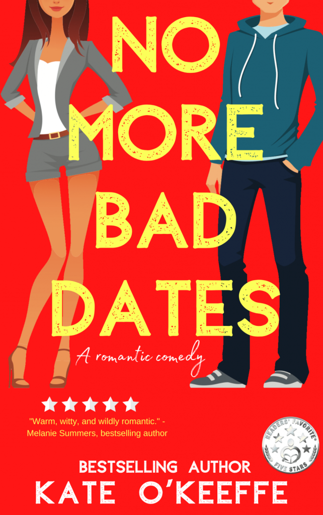
Option A shows a bright red cover with illustrations of two characters (sans their faces) and yellow font.
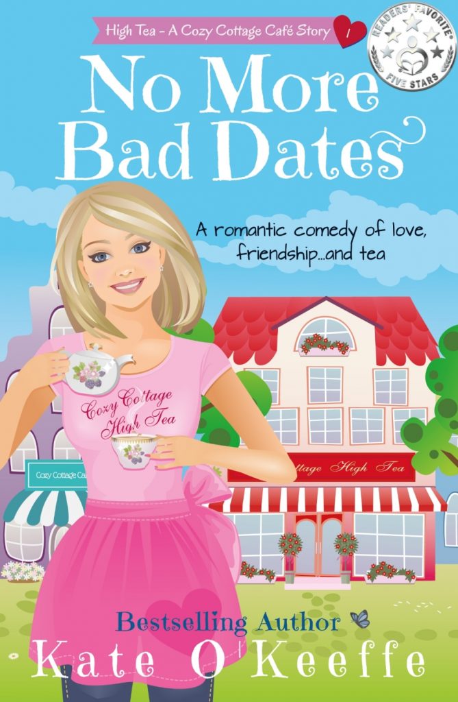
In Option B, the cover takes a totally different turn. With a pink-clad woman and a light-blue background, this cover is as light as a cupcake. It also lacks the blurb by a fellow bestselling author.
Can you guess which one won?
And the winner is…Option A! With a score of 78 to Option B’s 22, it appears readers do not prefer overly cozy book covers for rom-com novels.
Barbie days have come and gone
A common complaint among respondents is that Option B looks like the cover for a middle-grade book for girls. Or, put more pointedly, for people who like Barbie dolls.
It’s eye-opening how many respondents negatively referenced Barbie.
One male respondent said, “[Option] B seems lost in another time because the character on the cover looks like she is inspired by Barbie.”
This insightful comment reminds us that the days of books dominated by bland, white Barbie-like characters are leaving us, if not gone already.
A female added that the cover for Option B “resembled a Barbie doll. It was not appealing to me at all.”
Another woman put it bluntly when she said, “If your target audience likes to play with Barbies, go with [Option] B. But if your target is grown-up women, [Option] A is much more appropriate.”
If you decide to write a rom-com, first make your characters as real, flawed, and diverse as people truly are. Then reflect that on the book’s cover! Otherwise, you may never know how many readers your book cover will turn off.
One male wrote, “The cover of Option A shows both a male and female, which indicates that this book can be useful for either [gender]. The second option (B) seems to just highlight a blonde white person which is not my demographic, for starters, but also seems to indicate that it is only for one type of person.”
Additional pluses: no faces, blurbs, and a pop of color
Respondents loved that the author left the faces in Option A up to the reader’s imagination.
Said one respondent, “I always like it when you can’t see character’s faces like this because then you don’t form an impression of how they look and you can self-insert.”
Another appreciated the “punchy, catchy red” color with popping yellow type.
Still another praised the presence of the author blurb, which you’ll see on most book covers these days.
In short, Option A is the cover choice that welcomes the most readers and looks the most professional.
Key takeaways: Chick lit book cover art
Just because you’re writing a romance novel doesn’t mean you can forget about appealing to a broad audience. It might surprise you how many types of people might buy and enjoy your book.
And never forget your blurbs from other authors. They’re like preliminary 5-star reviews pasted right on the cover for all to see.
Need help deciding between two covers for your novel? Ask readers what they think with PickFu today!


