The design of your app can make or break your business. No matter how good your app idea is, it must have a great design behind it. The app functionality is important, but so is the user experience, layout, and brand color palette.
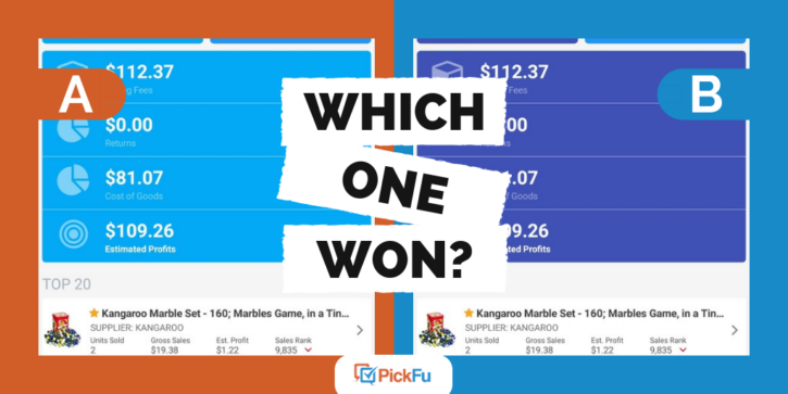
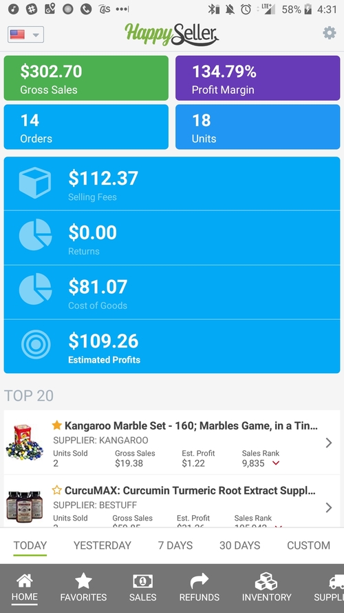
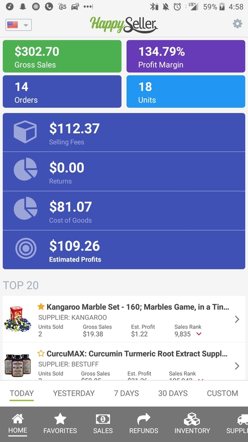
After coming up with two different color schemes for the HappySeller app, this mobile app developer used a PickFu poll to determine which was more popular. Since this was a main screen in the app, it was important to get the color palette right the first time around.
Both color palettes were bright and cheerful. Option A featured green, purple, and a bright blue, while Option B featured green, purple, and a dark blue. Changing just one color makes a difference, as we’ll see in the results of this poll.
Can you guess which brand color palette won?
Option B won most people over, taking 82% of the overall votes in this poll. Option A took just 9 out of 50 votes, while Option B came away with a big 41 votes!
Wondering why more voters chose Option B? Let’s see what they had to say.
The readability of your app matters
The few people who voted for Option A mostly did so because they liked how bright the shade of blue was. As one respondent pointed out though, the bright blue came at a cost. “The first one is more eye-popping. The second looks more congruent, but is less eye-popping.”
Turns out that more voters cared about how congruent and cohesive all the colors were together. With the darker blue, one respondent commented that “the overall color scheme seems to go together better. The darker color in the middle seems more serious.”
However, the readability of the design ended up being more important than the initial look of the colors together. Many voters felt the darker blue made it easier to read the text of the app. As one voter explains, “the darker blue provides a better contrast with the white numbers/letters. Easier to focus on them.”
How to pick a color palette
This particular PickFu poll shows us when choosing a color palette for your app, you must consider both the overall look and the readability. Fortunately, there are plenty of online tools to help choose a color palette, even if you’re not a designer or artist.
HubSpot has a very thorough guide to colors that covers basic color theory, how to use a color wheel, and how to pick a color palette. If you need some inspiration to get you started, play with color generators like Coolors and Adobe Color. These online tools will help you choose the right colors for your app and business.
Test your brand color palette
Once you’ve got a few ideas for your app’s color scheme, the easiest way to test them is with a PickFu poll. PickFu enables you to test ideas with real people. Receive 50 instant poll responses including votes and written feedback starting at $50.
Need inspiration? Check out how PickFu helped the mobile game Super 80s World, learn how to get the most from your app store screenshots, and learn to improve your app icon.
