Few things are more off-putting to visitors to your Etsy listing than blurry product images. A product image that looks too large, too small, or is strangely cropped signals a lack of professionalism, no matter how appealing your products may be. What is the best sizing for Etsy listing photos? How do you take good Etsy product photos? This guide will walk you through every step.
Etsy photo basics
Before we dive into best practices for product listing images, let’s run through Etsy’s basic requirements.
Etsy only supports .jpg, .gif, and .png files, so make sure your product photos are in these formats. You can’t use animated .gif or transparent .png files.
For product listings, you can upload up to 10 photos. The best listings have at least five photos, and each photo gives shoppers a new piece of information about the product.
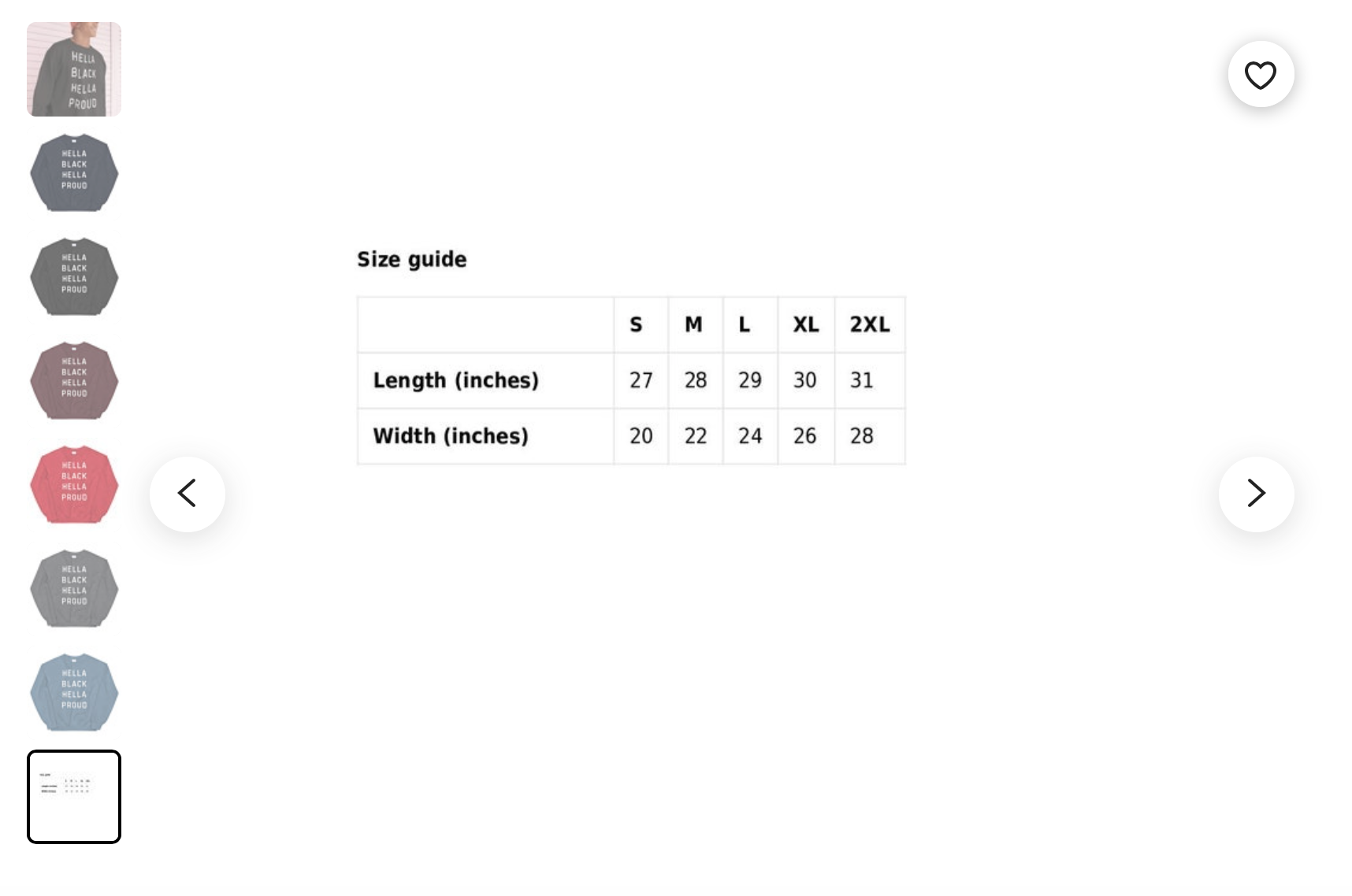
The sweatshirt listing below uses eight photos. The photos show a man wearing the sweatshirt, the different colors the garment comes in, and how the sizing works.
What size should images be on Etsy?
Each type of image has its own size requirement. We’ll briefly cover the size requirements below to make it easy for you to find the information you need.
Listing images: Any listing image you upload must be a minimum of 2000 pixels (px) per square inch or 72 pixels per inch (PPI). Images larger than 1MB may have trouble uploading.
Shop icon: 500 x 500px
Profile picture: 500 x 500px
Team logo: 170 x 100px
Order receipt banner: 760 x 100px
Mini shop banner: 1200 x 160px (minimum) or 1600 x 213px (recommended)
Big shop banner: 1200 x 300px (minimum) or 1600 x 400px (recommended)
Carousel banner: 1200 x 300px
Collage banner: 600 x 300px for two images, 400 x 300px for three images, and 300 x 300px for four images
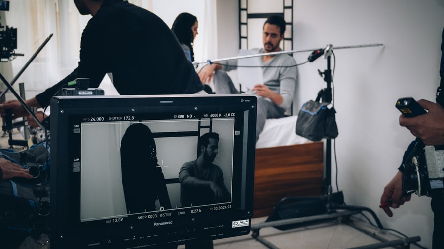
To resize your images, use Adobe Photoshop if you’re a pro or Canva if you need a little extra guidance (and a suite of free image editing tools!).
It’s important to note that while making an image smaller won’t lower its resolution, making it larger will.
What is the best size for my main Etsy photo?
Ideally, the first photo in your listing will be 3000px wide and 2250px tall in
It’s helpful to have it in landscape formatting because it automatically appears in a cropped thumbnail format in the search results.
What is the best size for thumbnail images on Etsy?
When it comes to thumbnail images on Etsy listings, sizing gets a little complicated.
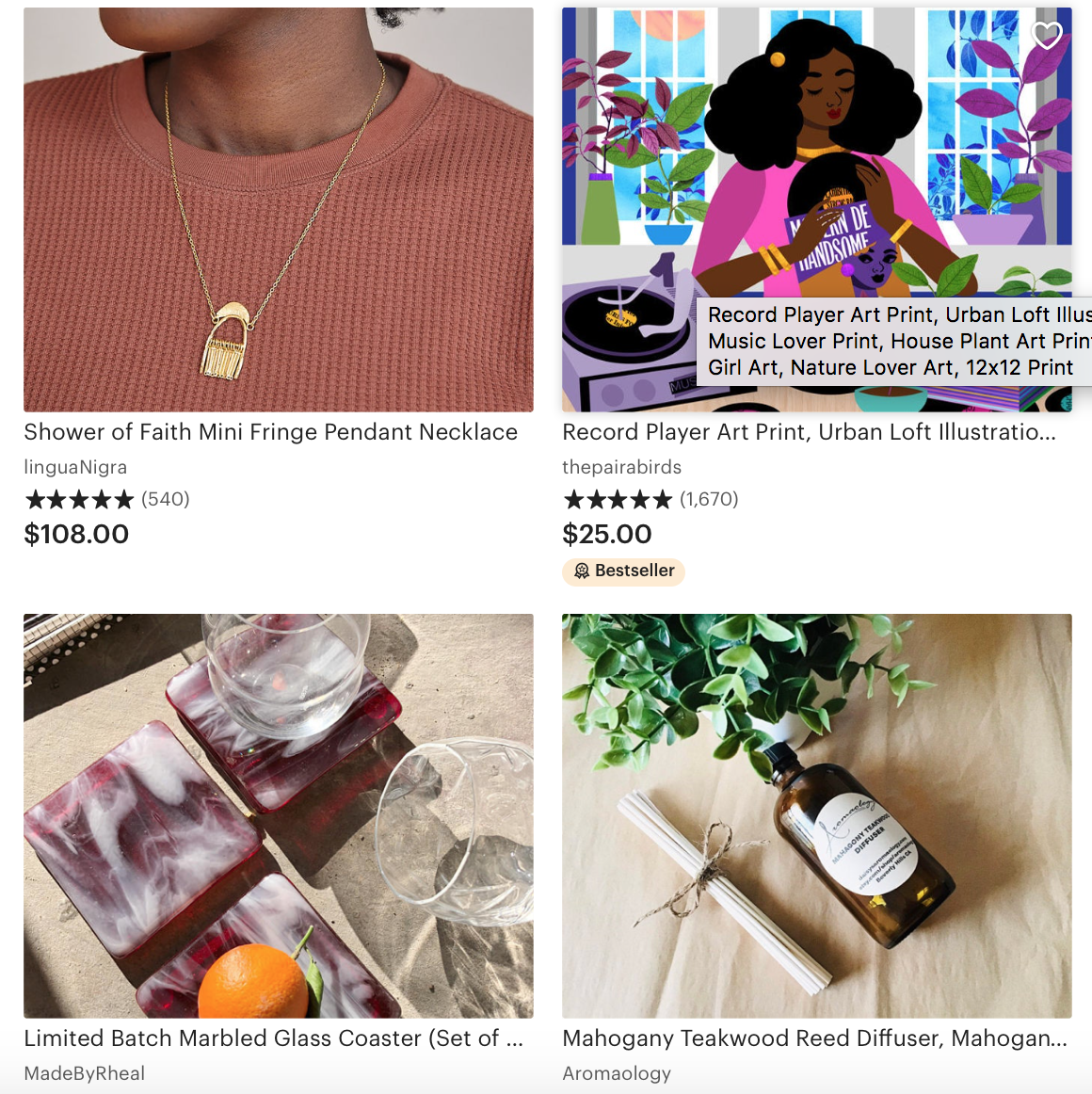
The way a thumbnail image looks on Etsy is determined by the size and orientation of the first photo in a product listing. Use a photo with plenty of white space around the edges so that when it’s cropped, viewers will still be able to see the product. The ideal aspect ratio is 4:3.
To make sure you like the way the thumbnail looks, upload a photo into the first image slot.
Click the Adjust thumbnail button below the first photo. Zoom in or out, changing the way your image is positioned inside the square, until you’re happy with what viewers will see.
Remember to hit Save when you’re done!

How to take a perfect Etsy listing image photo
You can use a fancy camera like a Nikon or a Canon to take Etsy product photos…or use your smartphone. Not all smartphones have top-of-the-line cameras, though.
According to TechRadar, the top three smartphones for photography are:
- Samsung Galaxy S21 Ultra
- Huawei Mate 40 Pro
- iPhone 12 Pro Max
Older versions of these smartphones are also excellent choices for shooting Etsy product photos.
Here are a few photography tips to keep in mind:
- Take a few photos from farther back than you think you need to. This gives the image a hefty border that lends well to cropping.
- Shoot horizontally, not vertically.
- Shoot from a variety of angles (above, eye level, from the side, diagonal), show the product in use, and isolate key details by taking photos from a close range.
- Follow a theme with your photo shoot so that all of the images are cohesive. For example, don’t use wildly different backgrounds or props for each photo.
For more tips on taking winning product photos, including how to photograph everything from vintage items to jewelry to handmade crafts, see Etsy’s ultimate guide to product photography. This article on DIY product photography lists our top five dos and don’ts.
Before you rush off to upload your photos, there’s one final yet crucial tip: split test those images with your target audience.
Split testing Etsy photos with PickFu
PickFu is a consumer research platform that lets you upload photos and ask an unbiased audience of 50 respondents or more which ones they like best. Respondents not only vote on their favorite, but they also tell you why.
You can choose from a list of traits to narrow the audience participating in your poll. If you’re selling dog sweaters on Etsy, for example, choose an audience of dog owners on PickFu.
One PickFu user tested two main product images for their new greeting card business. One image has a blue background; the other shows a plain white background.
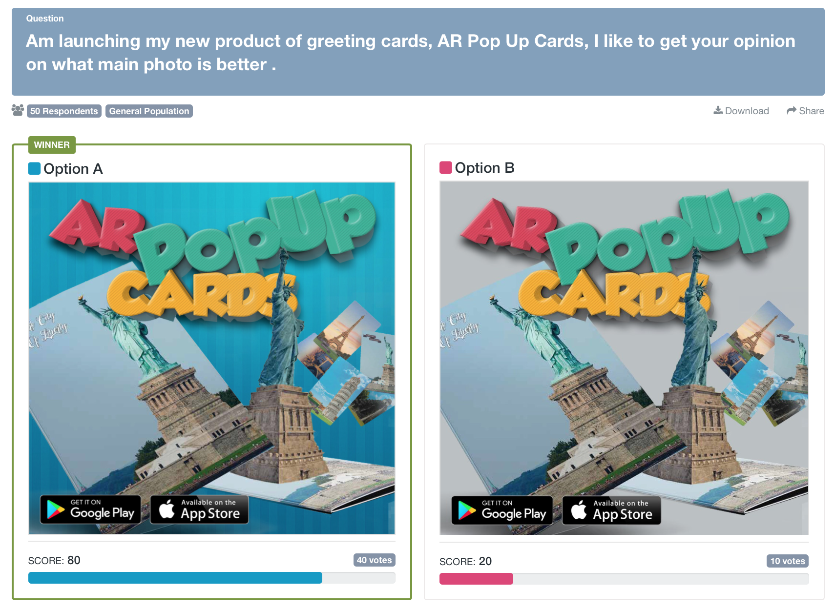
Option A with the blue background was the winning image. Here’s what PickFu respondents had to say:
- “Having the darker background helps the cards to stand out better and draws my attention more to the ad.”
- “I like the striped blue wallpaper background with the shadowing effect of the 3D letters. It adds a lot more depth to the image than the plain background. It makes the 3D letters stand out more and adds a pop-up effect of its own.”
- “I’m not convinced that dark blue is the correct color either. I also think you should make the words Pop Up a darker, more primary green color or an entirely different color like
purple, because those words don’t stand out very well in their current color.”
The feedback that PickFu respondents give is gold. Many go further in their responses, giving tips for how they might improve a photo, which is helpful for Etsy sellers.
As you figure out the best sizing for your Etsy listing photos and choose images to post, consider using PickFu as a tool to help you select the most attractive and informative ones.
For more tips on selling on Etsy, check out our guide to the best Etsy seller tools.
