Even though PickFu is simple to use, there are ways your polls can become even more effective. As many customers have told us, the more polls you run with PickFu, the better you get at it. Luckily, you don’t have to run lots of polls to get there. You can benefit from the wealth of knowledge our team has already amassed after years of polling and learning.
- 1. Only test one thing at a time
- 2. Keep your options consistent
- Another important note about consistency in images
- 3. Choose your audience wisely
- 4. Decide how much you want to reveal
- 5. Look for recurring themes and reactions
- Additional resources
1. Only test one thing at a time
Testing more than one thing at a time skews your results. Your business name is distinct from your logo and will be judged differently. The same is true for a book’s title and cover design, or a product’s name and its packaging, your company name with a tagline, and on and on.
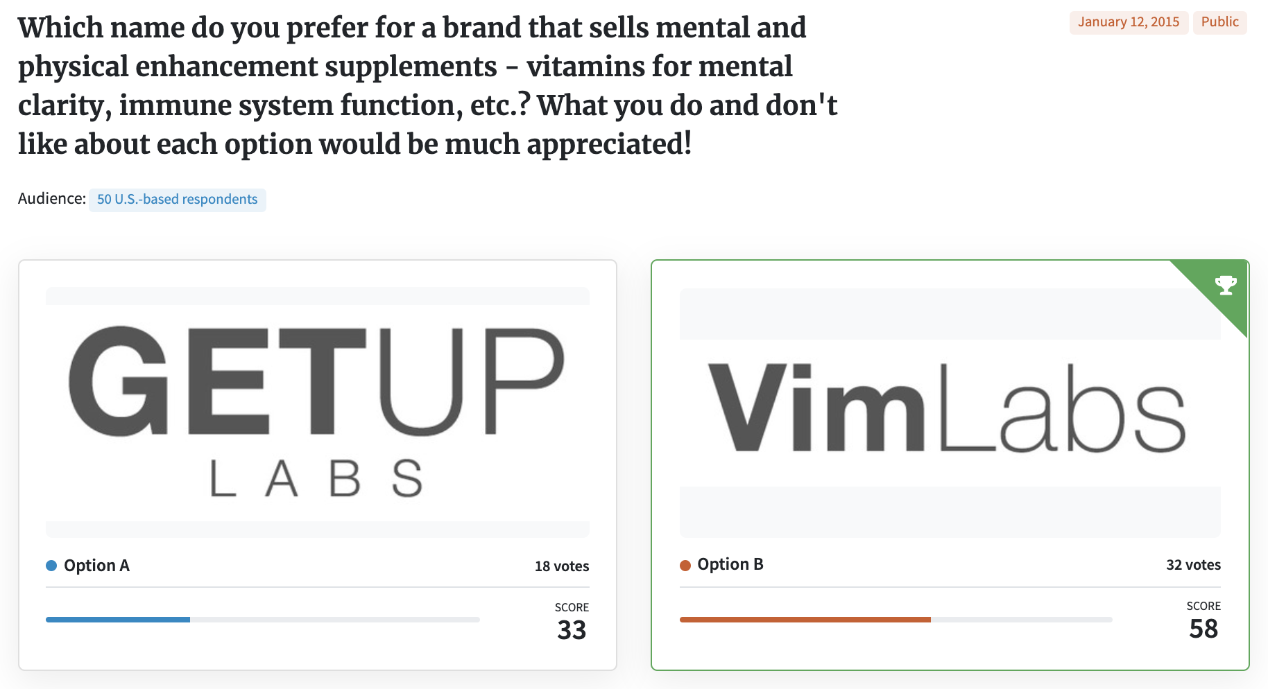
Below is an example where an entrepreneur wanted to test two business names. However, when he posed the question, he submitted the names in two different type treatments that some saw as an early logo concept. Respondents to this PickFu poll commented on both the name and the logo design. Sounds like twice the value, right? Wrong.
This is a type of polling bias called a double-barreled question. A double-barreled question asks two separate things, but only leaves room for one answer. Respondents usually only react to the one that means the most to them. And even if the respondent only reacted to the name in a written comment, that reaction was likely subconsciously influenced by the logo and vice versa.
Some responses that reference the name:
- “I chose ‘Get Up,’ because Vim is entirely foreign to me as a company name/product name. Get Up makes me think of the things I may be able to achieve with this product.”
- “[Vim] sounds like it might have to do with vitamins. The other would lead me to believe it was a male enhancement product.”
Some responses that reference the logo:
- “[Option B has a] cleaner look and name.”
- “[Option A] has an appealing font and name.”
When testing your business or product name, test the name only. Whether your logo design bad or good and any other considerations for later tests.
2. Keep your options consistent
On a related note, consistency is key in testing creative options. For example, if you’re testing book covers, make sure that each design option includes the same information. If you test two designs but each has a different title, you won’t know whether respondents prefer the design layout or the title on that design layout. Remember, only test one thing at a time.
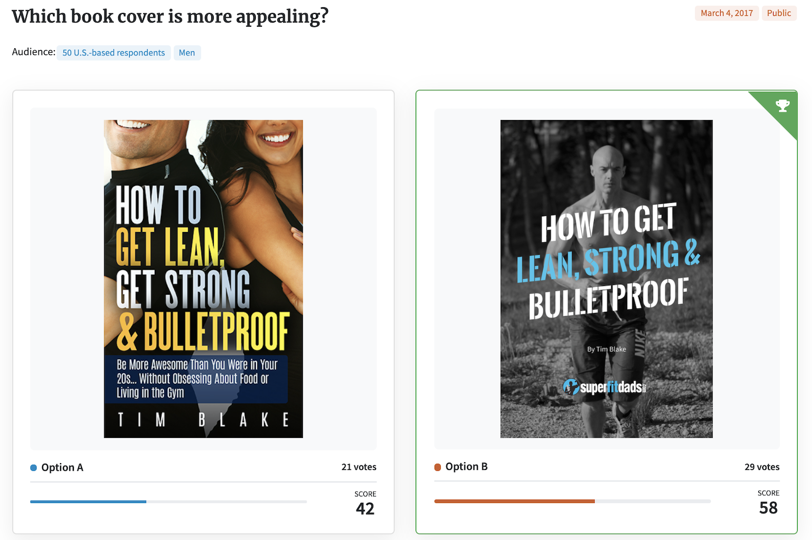
Below is an example of an author who tested two book covers. However, the two titles are slightly different, only one option included a subtitle, and only one option included the “superfitdads” logo. Any of these variances may have skewed the results.
This poll would be less biased if each cover included the same title, subtitle, and author attribution. Then, the only test parameter would have been the cover design.
Another important note about consistency in images
When testing images, keep the dimensions of the images the same. If the images are different sizes, respondents sometimes react to the size of the image rather than the image itself (ex: “I think the bigger image makes it look more important.”)
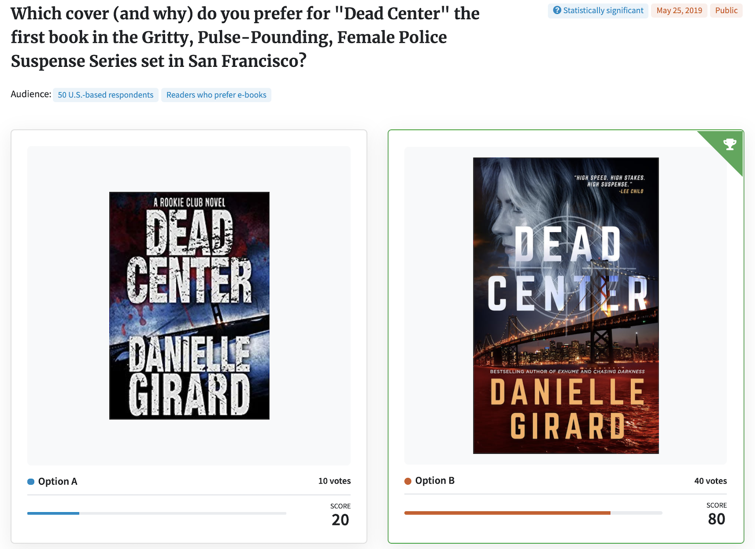
Here’s an example of a book cover poll where the cover options were different sizes:
Some respondents reacted to the image quality rather than the image itself, for example, “[Option B is] much bigger so it stands out more.”
3. Choose your audience wisely
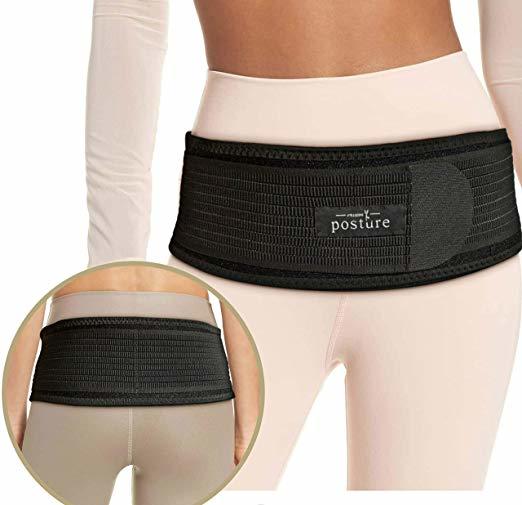
In this PickFu poll, an online seller ran a split test asking respondents to choose between two featured images for an exercise belt.
Option A depicts a model wearing the belt with an inset showing the back view of the product. Option B shows a model wearing the belt, but with a different pose. An inset advertises that a wrist wrap is included. In Option A, the brand name on the belt is “posture.” In Option B, it is “GO4FIT.”
The test revealed a gender divide: 25 males in this poll preferred the more sexy Option B, compared with 6 males who preferred Option A. However, the majority of women in this poll preferred Option A, with 12 out of 19 votes. Based on the women’s comments in favor of A, some of them actually had a bad reaction to B because of the sexy image.
Think about whether men or women are your target customer — who is more likely to buy the product? Once you know that, surveying only people who identify as that gender may be more helpful than surveying a mixed-gender audience.
PickFu enables you to customize your audience in myriad ways. You can target poll respondents by demographic and behavioral traits such as exercise frequency (which might have also been relevant in this poll), Amazon Prime membership, homeownership, marital status, and many more. You can also combine targeting parameters to test with the kind of people who matter most to your brand.
Once again, this poll demonstrates the importance of consistency. The images tested in the poll had a lot of different variables: the model, the wrist wrap, and the brand name. The difference in brand name may have colored the audience’s opinion of the overall image. For example, two of the respondents that picked Option A did so because they thought the model’s pose aligned with the brand name “posture.” Because the product image and the brand name are both hugely important business decisions, they deserve to be polled independently.
4. Decide how much you want to reveal
Your question is the heart of your PickFu poll, the basic information to which respondents react. Writing an unbiased question helps to ensure unbiased results.
As you write your question, consider what (if anything) to tell the poll respondents about your business or service.
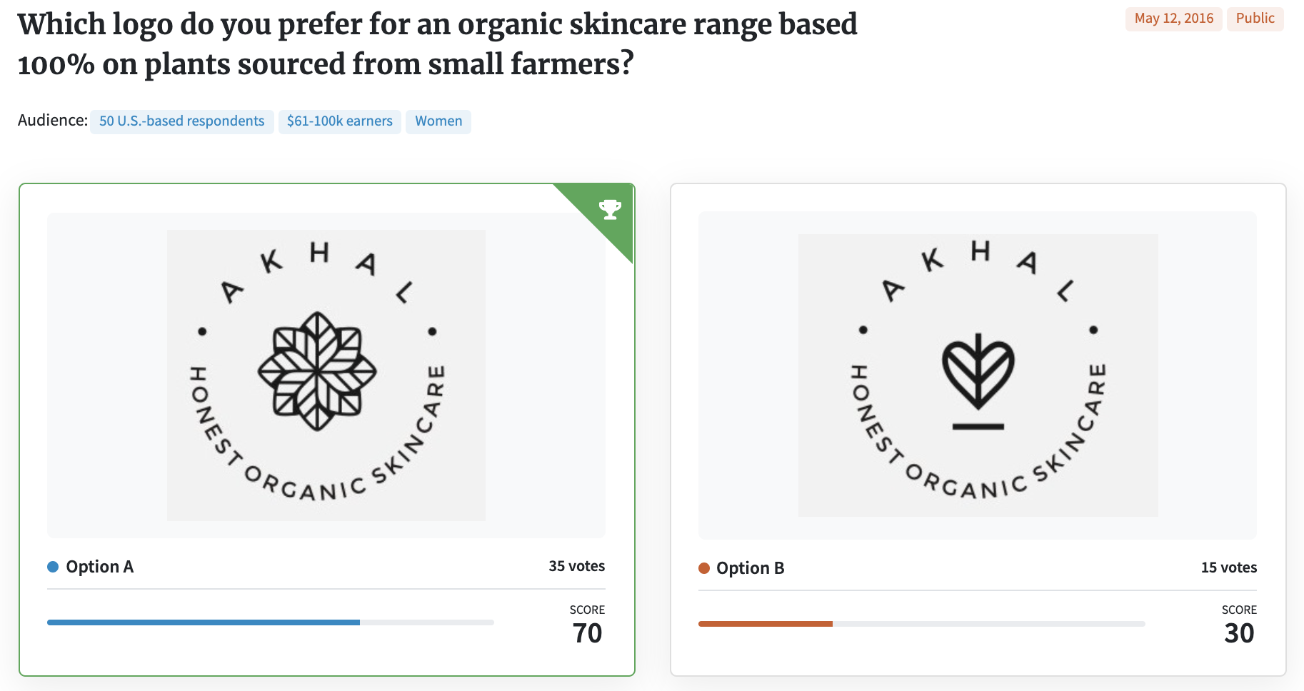
For example, this business owner was deciding between two logos and gave the respondents a basic overview of the business: an organic skincare line made from plants sourced from small farmers. In doing so, the pool of respondents, made up of females earning over $60K, were able to offer thoughts like
- “… the flower speaks more to the product than the heart does.”
- “I see more of a plant focus in this logo since the design looks like a flower. Option B can be anything and doesn’t really tell me it’s about plants.”
- “The picture in choice A makes me think of plants. It feels like a mandala which I would equate with spiritual, natural, and exotic.”
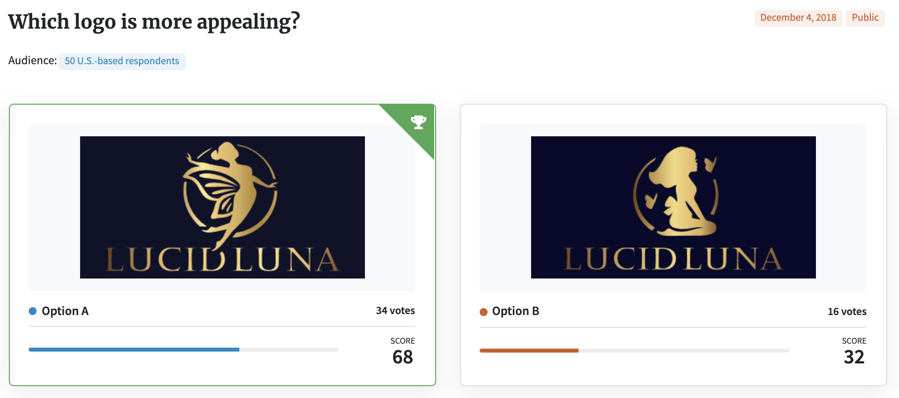
However, there are times when you want the creative idea to speak for itself. In these situations, asking a more basic question such as “which logo design is more appealing?” enables you to see how respondents react without prompting, and glean whether they are reading similar messages in your design.
In this example, respondents offered reactions such as
- “The name sounds quite ethereal and so I think that Option A is a better choice for this name. I like the fairy and what is symbolizes and it seems to go quite well with the name.”
- “I chose A because I like the fluidity of the image, the fairy-like figure. It has more of a feeling of flight and airiness to it that is very appealing.”
- “I picked Option A because the logo expresses soaring to heights and reaching further. I feel more inspired by that logo.”
When writing your question, decide whether some background information should be included. If so, keep the language succinct and objective.
5. Look for recurring themes and reactions
PickFu respondents not only vote on your options, but they write comments to explain their choices. This feedback is often the most valuable and insightful part of polling with PickFu. You can filter poll results by recurring words or by audience segments to make it easier to group similar comments.
When Michael Cowden wanted to name his mobile game, he tested two potential names: Outrun the 80s and Super 80s World. Super 80s World won, but only by a margin of six votes. Should those six votes be decisive?, he asked himself.
In the end, the decision was yes. Based on the comments, those who voted for Super 80s World were closer to his game’s intended target.
- “It reminds me of Mario.”
- “I love the 80s and Super 80s World sounds more exciting.”
- “I don’t like [Outrun the 80s] because it makes it sound like you are trying to run away from the 80s, and that was my childhood! I like [Super 80s World] because it celebrates the fun 1980s.”
As he wrote on his blog, “I could immediately tell that Super 80s World communicated the game concept much better. The folks that liked that name got what the game was about and, more importantly, wanted to play it!”
Another gaming poll demonstrates a similar theme. A poll of 50 mobile gamers split right down the middle when choosing between the names Squid Attack! and Squid Squad.
Many respondents liked the alliteration of “Squid Squad” and thought it was fun to say. But respondents repeatedly commented that a “squad” suggests cooperative play (which the game is not), while “attack” sounds more like a player vs. player game (which it is).
Additional resources
These five best practices highlight ways your polls can become even more effective. And you can continue to learn from other PickFu polls so that your own polling skills will get better and better.
For example, each Wednesday on the PickFu blog, we post a column called Which One Won? This weekly feature looks at a real customer poll and offers in-depth analysis on how to read the results and the implications it might have in your own business.
In addition, you can look at hundreds of past polls in our Public Poll Gallery and see how others have used our testing service. We have examples of e-commerce, mobile apps, books, and business-related polls.
Our team is also available to answer specific questions and offer recommendations on how to make your testing better. Simply visit our Help Center to get started.
Happy polling!
