When you’re designing a minimalist book cover, it’s smart to split test your options. Minor changes are often what make a cover sink or swim, as one author discovered in this PickFu poll.
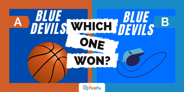
The author asked a general audience of 50 people which cover design appealed to them more for a book titled Blue Devils: Equanimity and the Art of Coaching Basketball.
Both book covers are blue, but Option A is a darker shade than Option B and features an image of a basketball. Option B puts a whistle front and center.
Can you guess which one won?
And the winner is…Option A, with a score of 74! Option B lagged behind with 26 percent of the vote.
Let’s dig into the reasons for Option A’s victory.
No foul ball
Out of the 37 respondents who chose Option A, 27 mentioned that they liked seeing a basketball on the cover.
Even though this book is about coaching basketball versus playing it, the ball lets readers know what to expect: that this is basketball book.
One respondent brought up a really good point: in Option B, the whistle makes it look like it could be a book about refereeing, which is entirely different than coaching.
Another important point? When it comes to color scheme, the orange basketball complements the dark blue cover more than the blue whistle does on the light blue cover, respondents said.
Of course, the reference in the book’s title to a certain NCAA basketball powerhouse and famed coach whose team color happens to be this same shade of blue doesn’t hurt, as two respondents noted.
Other highlights
- Male and female respondents voted similarly, with the majority of each favoring Option A (there were no nonbinary respondents)
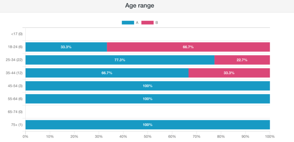
- Respondents in the youngest age group (18-24) preferred Option B; among those 45 and older, not a single one voted for Option B
What they said
“I preferred the darker blue, as well as the contrast on these letters and the background in Option A. Option B has a decent contrast on the letters on the bottom of the image, but the top has this blue lettering that is very hard to discern. Overall I hated the look of the whistle too. Option A for sure.”
“I love the bright basketball in the middle, it caught my eye immediately.”
“Option A of the basketball picture helps the reader know the book will be about basketball without having to read the description. Option B of the whistle could mean any kind of sport, as whistles are commonly used in all sports.”
“I prefer Option B as I think the whistle makes it seem more generic and more applicable to more circumstances than just basketball.”
Key takeaway
This might sound obvious, but we’ll say it anyway: if you’re going to write a book about basketball, put a basketball on the front cover (or else have a good reason not to).
Still need help with your book title? Here’s how to write and choose the best title.
Want to dive deeper?
Results by commonly used words:
Results by gender:
