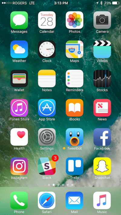
When Steve Jobs talked to Fortune in 2000 about the Mac OS X’s Aqua interface, he delivered a classic line:
“We made the buttons on the screen look so good you’ll want to lick them.”
Today, an app’s icon needs to meet that standard if it’s going to gain traction with users. We reached out to app creators and UX designers to understand how to think about your app’s icon. Here’s what they shared:
Keep it simple, stupid
Like all good design, simplicity is key. “Your icon occupies invaluable real estate on your customer’s phone screen and as a developer, you need to treat every pixel like gold,” said Bryan Clayton, CEO of GreenPal.
“The best app icons out there are easily recognizable, consist of few design elements and use a limited color palette that is consistent with the brand,” adds Victoria Gerchinhoren, Head of Design & UX at Thingthing, an iOS keyboard app.
Simplicity Part II: Remember you’ll use it elsewhere
“Simplicity is also important for scalability,” Gerchinhoren says. “Your app icon will be shown in several places across different platforms and in various sizes. It must be clear and recognizable in all cases, large and small.”
Simplicity Part III: Familiarity = Freedom
infiltr’s app icon
When your app is new, it needs to convey more. It must clearly communicate how it meets a user’s needs. Philippe LeVieux, co-founder of infltr, said, “We currently use a camera icon with an infinity sign inside because we offer an infinite number of filters in our photo editor and camera app. With time, we want to evolve and drop the camera, and simply use the infinity sign. When you launch a new app, you want users to understand as much as possible from the icon. When you are established, you can start to simplify!”
Use color wisely
“In my experience, the most effective approach is to use the brand’s iconic mark or logo as the app icon, with the background color of the icon being the brand’s primary color,” said Nick Saporito, a freelance graphic designer. “Users tend to identify apps by color while scanning through their catalog of apps, and the background color is what’s most visible, so it makes sense to use your brand’s prominent shade.”
Tell a story
A clean, minimalist logo should still be able to say something about your brand and evoke emotion. “I went through multiple designs for the app icon, and finally settled on one that tells a story,” said Jeanie Galbreath, creator of The Petter App. “The turquoise in the icon is actually a hand that pets the animal.”
Continue to iterate
Adam Davis, Thingthing’s CMO, said that “although [our icon is] professional, easily recognizable and connects to what the app is about, we’re in the process of taking it further to more effectively communicate what makes [our] keyboard unique and better connect it to people’s productivity needs.”
A new icon helps convey a major update to users, like the addition of new levels in a game, or the introduction of more features.
When iterating icons, many developers turn to app icon testing on PickFu. For just a few dollars and in only minutes, companies can test versions of app icons to gauge audience reaction. Best of all, testing takes place before a live update in the App Store, saving approval time should multiple design revisions be needed. Simon Newstead, CEO of Frenzoo said, “When we created our unique 3D Fashion Game for iOS and Android, we used PickFu extensively to poll different icons, section names, and even the name of our game itself! It’s a cost-effective, fast, and very helpful service.”
See more examples of App Icon tests, and then give it a try yourself!


