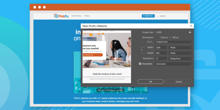
PickFu was founded in 2008, and until this week, our website showed our age.
We would never call the site ugly — it’s our baby, after all. It reflected the bootstrapped, catch-as-catch-can nature of a budding startup. And it helped a lot of businesses and entrepreneurs, collecting over 3 million written responses to over 100,000 creative ideas.
Pictured: the before.
But it’s a new day at PickFu, and as an online service, we wanted our website to showcase it. This redesign is more than a cosmetic facelift — we’ve reworked the product inside and out to make it easier to use, more accessible, and more representative of our company today.
What’s changed
The best answers come from the best questions
Like everything we do, this redesign started with you, our customers. We listened to your frustrations and realized that many of you got hung up on writing your PickFu poll question. We put our heads down and got to work. Now, PickFu offers over 70 suggested questions based on what industry you’re in and what you’re looking to test.
We designed these questions to eliminate polling biases and to zero in on the exact feedback you’re seeking. Because we’ve always prided ourselves on flexibility, you can use these suggestions as a starting point and edit them as you please, or you can write your own question altogether.
You have more options for adding options
You used to have to upload your creative options one at a time. Now, you can bulk upload up to 8 files using drag-and-drop or the file browser. Save time and hassle so you can get to the good part — digging into all your consumer research.
Get more from your redesigned dashboard
Did you know you could tag and label your PickFu polls? Most users didn’t. By surfacing some features and rethinking how we organize the dashboard, we’ve made it easier to sort and group your polls however it makes sense for you.
We speak your language
True story: we once named a product the “Advanced Poll Authoring Upgrade.”
Like many tech companies, we’re susceptible to jargon. We know many of our customers may not be as comfortable reading American English, and we didn’t make interpreting our sometimes wonky words any easier. In the hopes you’ll forgive us, we’ve taken a company-wide red pen to our marketing language, aiming for clarity and simplicity.
We’ve also made the headings across our website more readable. We now capitalize headings like sentences rather than formal titles because all those extra capital letters can seem uptight. We want our site to sound like the friendly, helpful, flawed human beings that we are.
We’ve formalized our people-first mentality
The value PickFu delivers is the instant connection to real people giving honest opinions. How we talk about these people, how we address them as a group, and how we segment their input requires thoughtful discussions around identity and culture. We’ve taken a close look at how we label our audience traits, how we write about poll results, and how we report audience information, all with a careful eye toward inclusivity.
Our company style guide officially outlines this people-first approach. To the best of our ability, we don’t make assumptions about people, we adopt gender-neutral language, and we don’t use identity markers unless it’s relevant to the context.
Our people-first approach is also why our site has been redesigned with photography at the forefront. Our panelists aren’t an abstract group of faceless illustrations, as our old website sometimes portrayed them. The PickFu Panel is made of living, breathing, thinking people. And we adopted a colorful photographic style to capture their essence.
You have better access to a wealth of product and industry education
We’re constantly publishing helpful explainers and detailed articles about PickFu and the industries we serve. Now, our blog is even better.
We’ve dramatically simplified the layout, cutting away the noise so you can focus on what’s important. We also reorganized the stories into categories that have been given more prominence on the blog homepage so they’re easier to find.
What you can’t see is as important as what you can
Our code base is more flexible, giving us exciting options as we head into the future. What’s under the hood at PickFu is easier to edit, without the cascading effects that our old code sometimes wrought. It’s more secure than ever, too.
What hasn’t changed
Just like the early days, we’re listening. We’re feeling pretty fancy in our new digs, but we are still the same data nerds we’ve always been. Our team wants to hear your feedback and ideas for improvement.
Help us geek out on all things UI, writing, and graphic design. Tell us what you like and don’t like so we can make it better. That’s the whole essence of PickFu. And you’re the reason why we do it.


