99designs is a great site for startups and small businesses – for just a few hundred dollars, you can launch a design contest for a logo, WordPress template, PowerPoint deck, signage, and more. Graphic designers around the world compete to win, you provide feedback, and after seven days, you pick a winner.
Here at PickFu, we crowdsourced our own logo using 99designs. Once the contest began, however, something became clear: even though receiving over 350 designs was valuable from a cost perspective, choosing a winner among them all was beyond overwhelming.
“We’re programmers, not designers,” said Justin Chen, PickFu co-founder. “Other than my own visceral reaction, it was hard to judge the value of all the colors, typefaces, and icons.”
Red and blue or blue and green? Serif font or non-serif font? Checkmarks or speech bubbles? It was hard to know.
The two co-founders culled the contenders down based on their personal preferences and then used PickFu polls to see what audiences preferred and to ask what message was conveyed by the various designs. To try to control for color biases, they asked the designers to use a blue/green color palette.
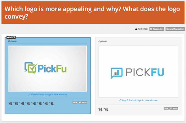
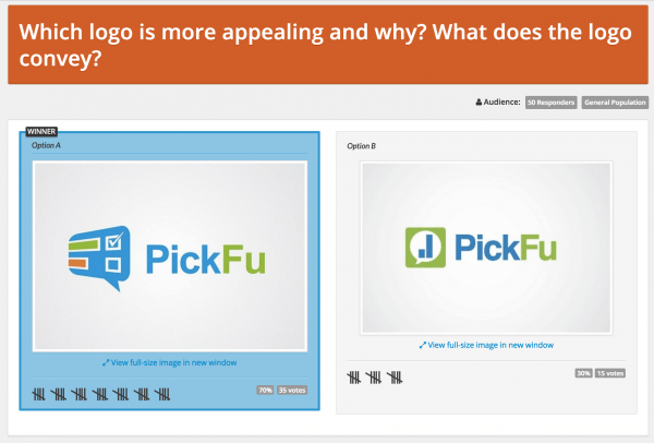
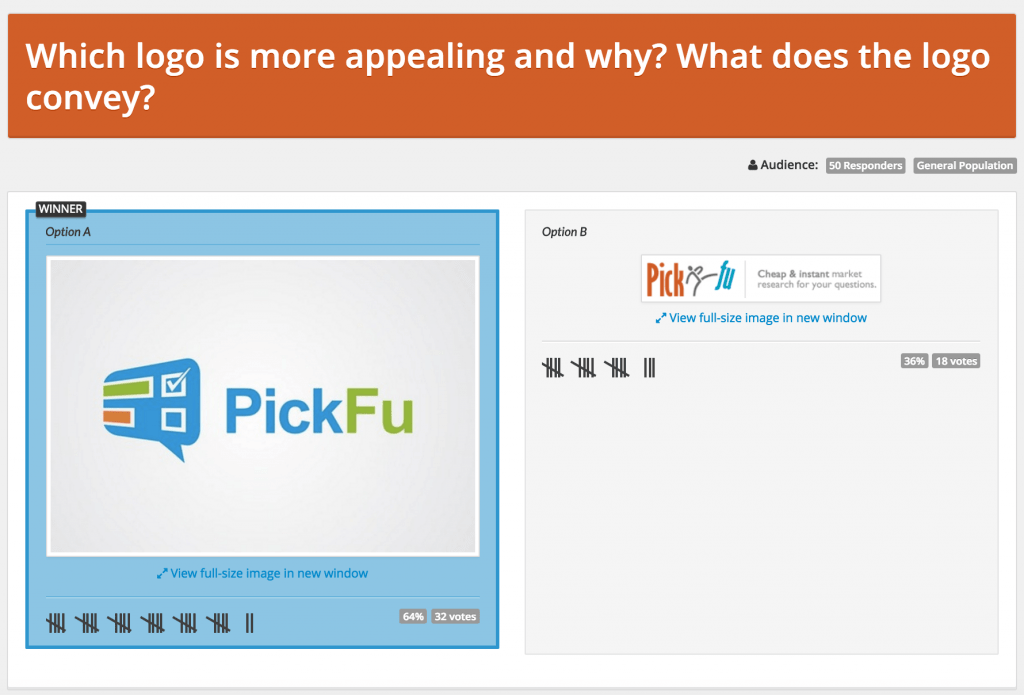
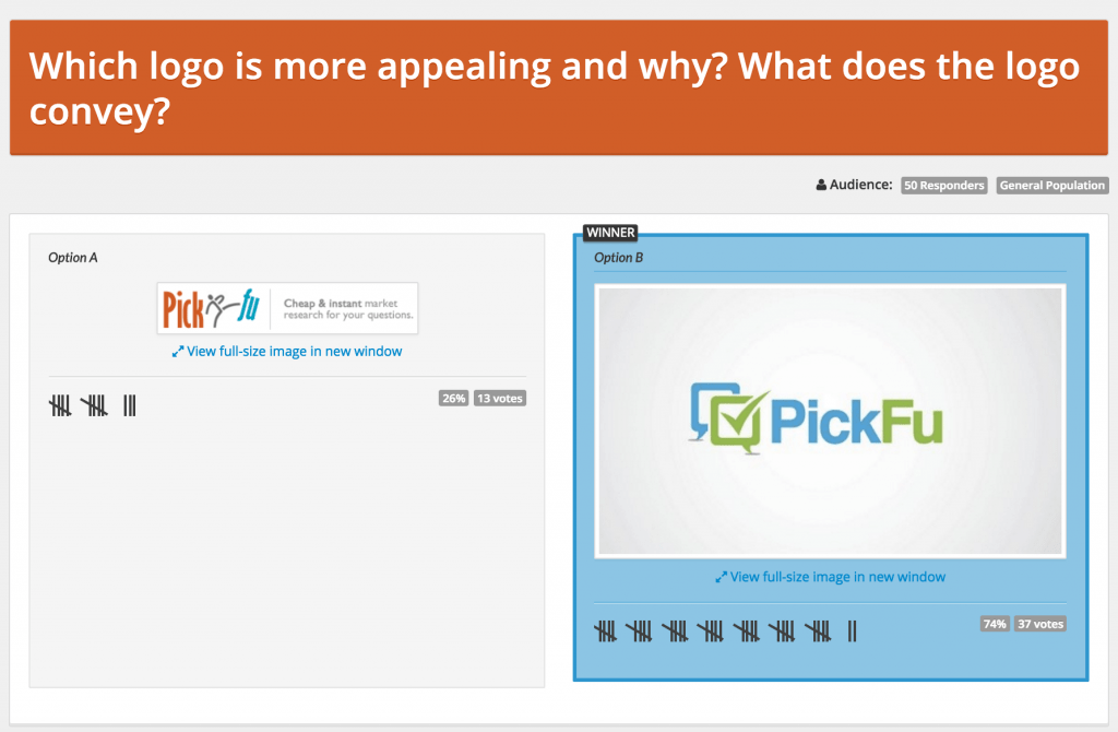
Here are two of the early polls they ran:
The checkmark seemed to resonate because, as several poll respondents noted, it was more about making a choice. One male wrote that “[Option] A implies a voting aspect, [Option] B simply looks like a results displaying service.”
Using these first few polls, the field was narrowed by over half, making the contenders more manageable. PickFu cofounder John Li noted that, “Even though we only tested blue and green versions of the logos, color was still frequently commented on by the respondents since there were different shades and sometimes other complimentary colors used. So we went back to the designers and asked them to create black-and-white versions.”
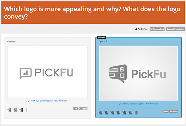
With the second round of polls, certain elements were becoming clear. Respondents favored a modern, thin sans-serif typeface, and preferred when the type was set in mixed case (PickFu) versus all caps (PICKFU). The checkmark continued to be a powerful symbol of choice, while speech bubbles conveyed varied thoughts and opinions. Bar graphs seemed more statistical in nature, sometimes even to the point of being off-putting.
Armed with this information, the two co-founders were able to provide more incisive guidance and feedback to the designers. “One thing we definitely learned is that in the course of the design contest, you have to be really active,” Li said. “We were constantly in touch with the designers, and used their responsiveness and ability to take criticism to help us decide if we’d want to work with them again.”
PickFu had an existing logo, so after the field of contenders on 99designs was narrowed to two finalists, the PickFu team ran two more polls, just to make sure they weren’t abandoning something worth keeping.
Does that last logo look familiar? After the contest was over, the PickFu team continued to work with the 99designs winner to hone the color palette and logo that is used today.
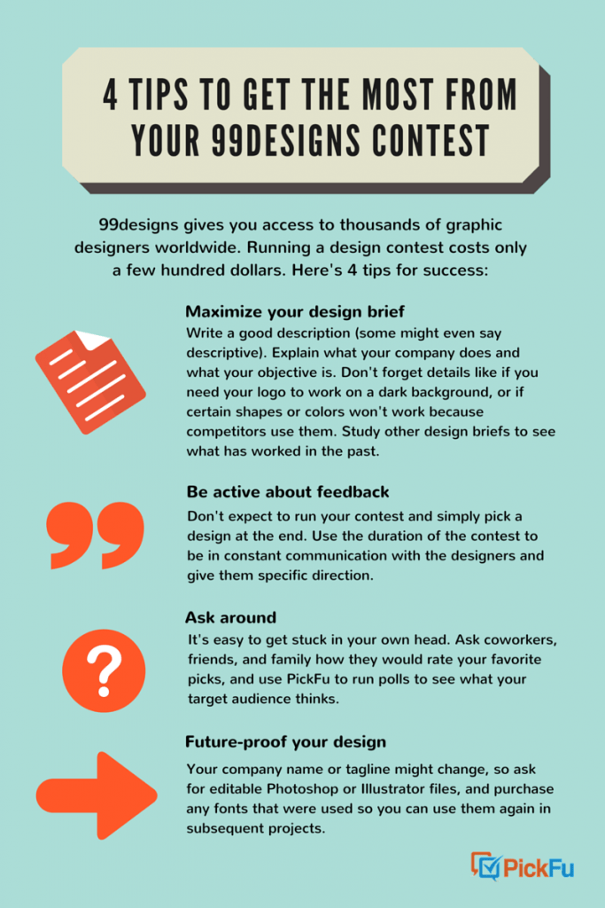
If you’re considering 99designs, you’re in good company. Docker, an enterprise tech company, was valued this year at over $1 billion. But in its infancy, Docker ran a logo contest on 99designs, and still uses the winning $799 logo now. Here are four tips that we at PickFu want to share for success with 99designs:
